

Carey Davis
Creative specialist with over 15 years of agency experience, delivering web, digital, and print for Fortune 500 and leading brands across B2B, B2C, and partner ecosystems.
Known for solving UX, production and scale problems by utilizing AI solutions, building design systems, modular templates, and workflow frameworks. Able to operate hands-on as cross-functional support to creative, production and leadership teams.
Key Brands Served


Case Study
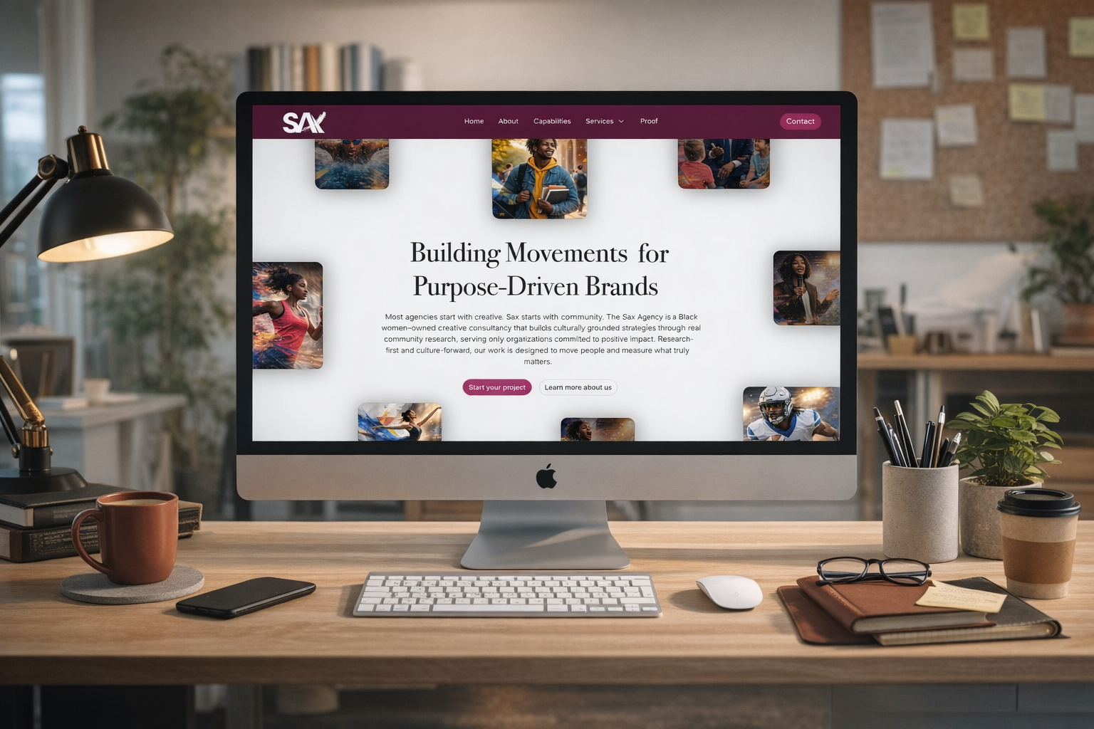
Rebuilding the Digital Presence of a Purpose-Driven, Black Women–Led Consultancy
Client
The Sax Agency
Industry
Multicultural Marketing & Strategic Communications
The Challenge
The Sax Agency had outgrown its previous website.
While the firm had established itself as a trusted partner to public agencies, universities, sports organizations, and cultural institutions, the digital presence did not fully reflect:
- Its consultancy-level rigor
- Its research-first methodology
- Its purpose-gated positioning
- Its verified certifications (WBE | MBE | SBE)
- The scale of its institutional partnerships
The previous narrative leaned heavily on multicultural marketing but did not clearly articulate the agency’s deeper differentiator:
Sax does not simply create culturally relevant campaigns.
Sax builds culturally grounded strategies through real community research — and only for purpose-driven organizations.
The challenge was twofold:
- Clarify the strategic position.
- Elevate perception to match institutional credibility.
Strategic Objectives
- Establish Sax as a consultancy, not a content factory.
- Differentiate from generic multicultural agencies.
- Highlight research-first methodology.
- Integrate public sector credibility and procurement readiness.
- Reduce “we”-centric language and shift toward client-centered outcomes.
- Strengthen conversion for government, foundation, and institutional buyers.
The Core Tension
Most multicultural agencies position themselves around creativity and cultural fluency.
Sax’s advantage lies elsewhere:
- Community listening before creative
- Purpose-gated client selection
- Black women–led ownership as structural leadership
- Institutional-scale execution
The website needed to communicate both conviction and discipline.
The Solution
1. Reframed the Hero Positioning
From service-based language to strategic contrast:
“Most agencies start with creative. Sax starts with community.”
This establishes immediate differentiation and sets the tone for research-first engagement.
2. Introduced a Clear Methodology Framework
The new site formalized the process:
- Listen Deeply
- Diagnose Honestly
- Design Strategically
- Activate with Purpose
- Measure What Matters
This shifted perception from “agency” to “movement architect.”
3. Clarified Audience Targeting
Rather than appearing open to all brands, the new site explicitly defines ideal partners:
- Public agencies
- Universities
- Sports organizations
- Foundations
- Corporate leaders serious about DEI and ESG
This sharpened alignment and filtered unqualified leads.
4. Elevated Institutional Credibility
Integrated:
- $16M statewide campaign leadership
- 58-county activation
- Multilingual voter education
- Certified WBE | MBE | SBE status
- Los Angeles headquarters with national reach
Certifications were reframed not as badges, but as procurement readiness indicators.
5. Structured Services Around Strategic Architecture
Rather than listing departments, services were positioned as:
- Cultural & Strategic Intelligence
- Narrative & Identity Systems
- Experiential & Digital Activation
This reinforced consultancy discipline.
6. Shifted Voice from Self-Promotion to Client Impact
The copy reduced “we” statements and focused on outcomes:
Instead of:
“We are a culture-forward agency…”
Shifted to:
“Your mission deserves strategy grounded in community insight.”
This created a partnership tone rather than a pitch tone.
Key Challenges Overcome
1. Balancing Activism with Institutional Authority
The agency’s roots are community-centered and advocacy-driven.
The website needed to retain that conviction while signaling executive-level credibility.
Solution:
Structured language, disciplined frameworks, and measurable impact data.
2. Differentiating in a Saturated Multicultural Market
Many agencies claim cultural fluency.
Solution:
Position Sax around research depth, stakeholder engagement, and purpose-gated partnerships — not surface-level diversity marketing.
3. Avoiding Generic “Full-Service” Language
Full-service language weakens strategic positioning.
Solution:
Elevate architecture, define process, and remove commodity descriptors.
4. Aligning Messaging with Certifications
Certifications were reframed from labels to institutional leverage — qualifying Sax for federal, state, and corporate supplier diversity programs.
The Outcome
The new website:
- Clarifies Sax’s true USP
- Strengthens perception as a consultancy
- Signals procurement readiness
- Filters misaligned prospects
- Aligns brand voice with Black women–led leadership
- Reflects the scale of institutional trust already earned
The result is not simply a refreshed website —
it is a repositioned digital headquarters for a movement-building agency.
CUSTOM HERO PARALLAX INTERACTION IN WEBFLOW
OVERVIEW
This case study documents the development of a custom mouse-driven parallax system for a full-screen hero section built in Webflow. The goal was to achieve layered depth, smooth inertial motion, and subtle 3D rotation while maintaining clickable interface elements and eliminating abrupt interaction resets. Because Webflow’s native mouse-move interactions created structural limitations, a custom JavaScript-based solution was implemented.
PROJECT OBJECTIVES
• Build a parallax system that responds to mouse movement only within the hero section.
• Create visual depth using multiple layered elements.
• Allow each layer to move differently based on perceived distance.
• Add subtle rotational motion to reinforce depth.
• Prevent snap-back behavior when the cursor leaves the hero.
• Keep CTA elements fully clickable.
• Maintain performance and smooth animation.
INITIAL PROBLEMS
- POINTER EVENT CONFLICT
The initial setup used an interaction layer to capture mouse movement. This layer intercepted pointer events and blocked clicks on CTA elements underneath. Disabling pointer events solved clickability but also prevented mouse tracking. - SNAP-BACK ON EXIT
Webflow’s mouse-move interactions automatically return elements to their resting state when the cursor leaves the trigger area. This caused abrupt movement and broke the intended cinematic motion. - LIMITED DEPTH CONTROL
Native interactions lacked flexible control for layering, easing, and real 3D-style motion.
FINAL STRATEGY
A lightweight JavaScript parallax engine replaced Webflow’s mouse-move interaction system.
The solution works by:
• Tracking mouse position relative to the hero section.
• Normalizing cursor coordinates into a range of -1 to 1.
• Using interpolation (inertia) to smoothly follow movement.
• Applying per-layer depth, z-space, and rotation values.
• Returning smoothly to center when the mouse leaves instead of snapping.
FINAL WORKING CODE
<style>
[data-parallax]{
  will-change: transform;
  transition: transform 160ms linear;
  transform-style: preserve-3d;
}
.header142_component{
  perspective: 1200px;
  transform-style: preserve-3d;
}
</style>

<script>
(() => {
  const hero = document.querySelector('.header142_component');
  if (!hero) return;

  const movers = Array.from(hero.querySelectorAll('[data-parallax]'));
  if (!movers.length) return;

  // Tuning
  const maxMovePx = 80;     // overall travel magnitude
  const ease = 0.01;        // lower = more glide (0.05–0.12 good)
  const restOnLeave = true; // glide back to center on mouseleave

  let targetX = 0, targetY = 0;  // desired (-1..1)
  let curX = 0, curY = 0;        // current (-1..1)

  const read = (el, name, fallback) => {
    const v = el.getAttribute(name);
    const n = v === null ? fallback : parseFloat(v);
    return Number.isFinite(n) ? n : fallback;
  };

  const render = () => {
    // inertia
    curX += (targetX - curX) * ease;
    curY += (targetY - curY) * ease;

    for (const el of movers) {
      const depth = read(el, 'data-depth', 1);
      const z = read(el, 'data-z', 0);
      const rot = read(el, 'data-rot', 0);

      const dx = curX * maxMovePx * depth;
      const dy = curY * maxMovePx * depth;

      const rx = (-curY) * rot * depth;
      const ry = (curX)  * rot * depth;

      el.style.transform =
        `translate3d(${dx}px, ${dy}px, ${z}px) rotateX(${rx}deg) rotateY(${ry}deg)`;
    }

    requestAnimationFrame(render);
  };

  const onMove = (e) => {
    const r = hero.getBoundingClientRect();
    targetX = ((e.clientX - r.left) / r.width  - 0.5) * 2;
    targetY = ((e.clientY - r.top)  / r.height - 0.5) * 2;
  };

  hero.addEventListener('mousemove', onMove);

  hero.addEventListener('mouseleave', () => {
    if (!restOnLeave) return;
    targetX = 0;
    targetY = 0;
  });

  hero.addEventListener('mouseenter', () => {
  });

  requestAnimationFrame(render);
})();
</script>
CODE EXPLANATION
CSS SECTION
[data-parallax]
This targets every layer that participates in parallax motion.
• will-change: transform
Prepares the browser for frequent transform updates and improves performance.
• transition: transform 160ms linear
Adds micro-smoothing between updates.
• transform-style: preserve-3d
Allows nested 3D transforms.
.header142_component
Defines the hero as a 3D environment.
• perspective: 1200px
Creates depth perception. Smaller values exaggerate depth; larger values flatten it.
• transform-style: preserve-3d
Ensures 3D transforms render properly.
JAVASCRIPT SECTION
Initialization
const hero = document.querySelector('.header142_component');
Selects the hero container. If it does not exist, the script exits safely.
const movers = Array.from(hero.querySelectorAll('[data-parallax]'));
Collects all elements marked as parallax layers.
Tuning Variables
maxMovePx
Defines maximum movement distance in pixels.
ease
Controls inertia speed.
• Smaller values = slower, smoother glide.
• Larger values = faster response.
restOnLeave
Determines whether layers glide back to center when the cursor exits.
Motion State
targetX / targetY
Where the animation wants to move (based on cursor).
curX / curY
Current eased position.
The difference between target and current creates smooth motion.
Attribute Reader
read(el, name, fallback)
Reads custom attributes from each layer:
• data-depth (movement multiplier)
• data-z (z-space offset)
• data-rot (rotation amount)
This allows each element to behave differently without changing the JS.
Render Loop (Core Engine)
curX += (targetX - curX) * ease;
curY += (targetY - curY) * ease;
This is the inertia formula. Motion eases toward the target instead of snapping.
requestAnimationFrame(render);
Continuously updates the animation at display refresh rate.
Layer Motion
depth
Controls perceived distance.
• lower value = farther away
• higher value = closer
dx / dy
Calculates movement amount.
rx / ry
Adds subtle opposing rotation for natural depth.
translate3d + rotateX + rotateY
Combines movement, depth, and tilt into a single transform.
Mouse Tracking
targetX = ((mouseX - left)/width - 0.5) * 2
Converts mouse position into a normalized range:
• -1 = left/top
• 0 = center
• +1 = right/bottom
Mouse Leave Behavior
When the cursor exits:
targetX = 0;
targetY = 0;
Because motion is eased, layers glide back to center smoothly instead of snapping.
RESULT
The final system achieved:
• Smooth, cinematic parallax movement.
• True layered depth through per-element scaling.
• Subtle rotational realism.
• Controlled easing and resting-state glide.
• Hero-only activation.
• Fully clickable UI elements.
• Stable performance and scalable architecture.
This implementation replaced Webflow’s limited mouse-move behavior with a flexible, physics-style interaction system that can be extended with additional layers or effects without structural changes.
FEATURE BREAKDOWN — ENHANCED PARALLAX EFFECTS
This update expanded the original parallax system to include directional shadows and responsive background motion while keeping everything controlled by one interaction engine.
- Directional Shadow System (No Duplicate Elements)
Purpose
Create realistic shadow movement without duplicating layers.
What was added
A dynamic CSS drop-shadow() is calculated from the inverse of the mouse position so the cursor behaves like a light source.
Key code section:
const shadowDistancePx = 28;
const shadowBlurPx     = 22;
const shadowAlpha      = 0.35;
const shadowEase       = 0.08;

const shTargetX = (-curX) * shadowDistancePx;
const shTargetY = (-curY) * shadowDistancePx;

shX += (shTargetX - shX) * shadowEase;
shY += (shTargetY - shY) * shadowEase;

el.style.filter =
  `drop-shadow(${x}px ${y}px ${shadowBlurPx}px rgba(0,0,0,${shadowAlpha}))`;
Result
Shadows shift naturally opposite the cursor without adding extra DOM complexity.
- Background Headline Scene Integration
Purpose
Allow the headline to move with the scene but remain subtle and distant.
What was added
The headline was added to the same parallax system using low depth values.
Example setup:
data-parallax
data-depth="0.06"
data-z="-120"
Core movement logic:
const dx = curX * maxMovePx * depth * inv;
const dy = curY * maxMovePx * depth * inv;
Optional:
data-invertThis allows opposite-direction movement if the headline is treated like a ground plane.
Result
The headline feels integrated into the spatial environment rather than static.
- Per-Element Motion Control
Purpose
Fine-tune movement intensity without breaking depth relationships.
What was added:
const moveScale = read(el, 'data-move', 1);

const dx = curX * maxMovePx * depth * moveScale * inv;
const dy = curY * maxMovePx * depth * moveScale * inv;
Example:
data-move="0.6"Result
Precise control over how much each element moves.
- Unified Render Engine
All effects run through one animation loop:
curX += (targetX - curX) * ease;
curY += (targetY - curY) * ease;

requestAnimationFrame(render);
Result
Smooth synchronized motion, efficient performance, and scalable architecture.
Final Outcome
- Foreground elements move strongly.
- Shadows react directionally to cursor movement.
- Background typography moves subtly for depth.
- All layers remain synchronized through a single lightweight system.
Heading 1
Heading 2
Heading 3
Heading 4
Heading 5
Heading 6
Lorem ipsum dolor sit amet, consectetur adipiscing elit, sed do eiusmod tempor incididunt ut labore et dolore magna aliqua. Ut enim ad minim veniam, quis nostrud exercitation ullamco laboris nisi ut aliquip ex ea commodo consequat. Duis aute irure dolor in reprehenderit in voluptate velit esse cillum dolore eu fugiat nulla pariatur.
Block quote
Ordered list
- Item 1
- Item 2
- Item 3
Unordered list
- Item A
- Item B
- Item C
Bold text
Emphasis
Superscript
Subscript
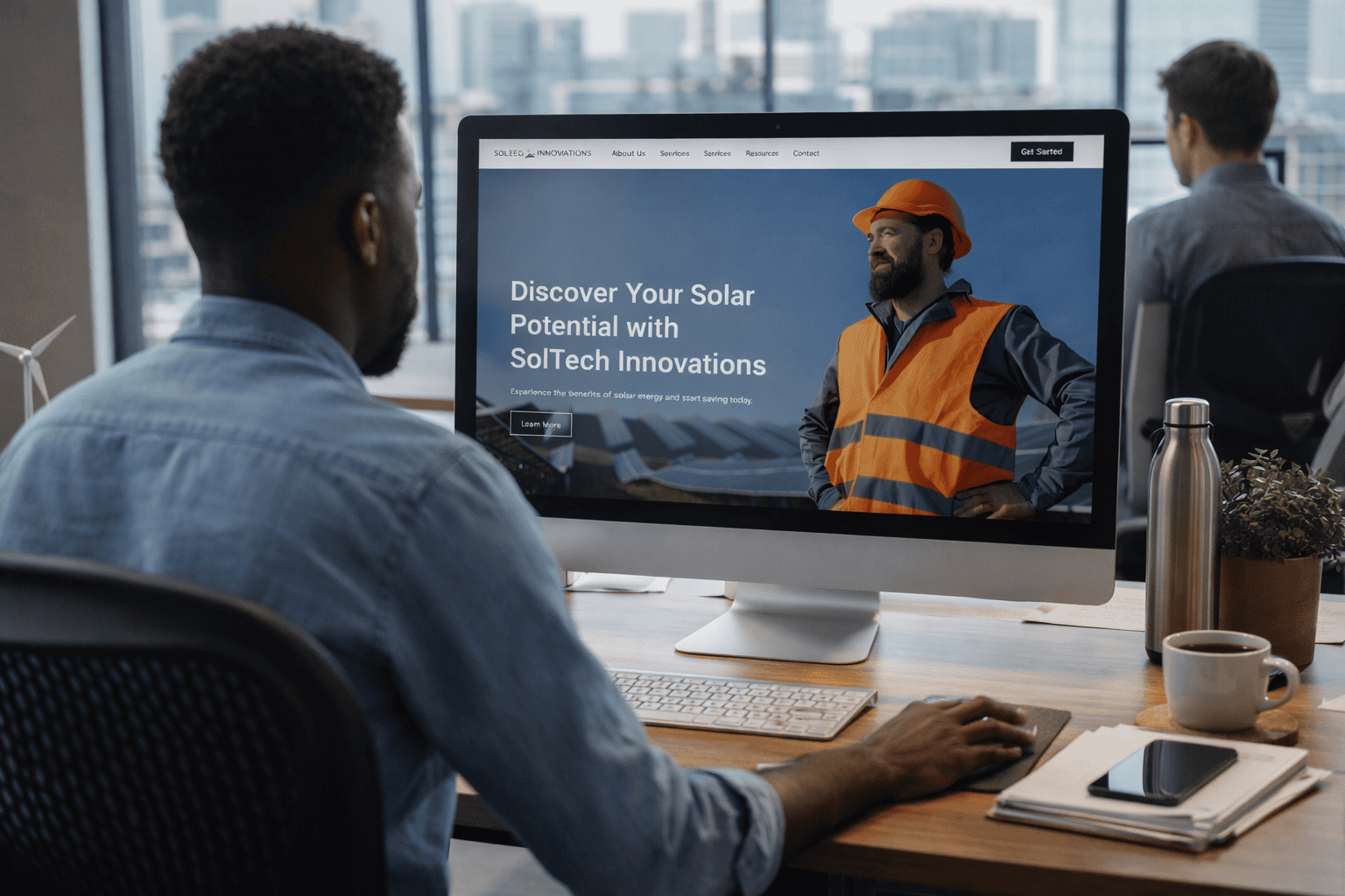
SolTech Innovations Website & Brand Design
Design System
Website, Design System & UX Framework
Client: SolTech Innovations
Role: Brand & Digital Designer
Scope: Website Design (Figma), UX Architecture, Design System, Components & Modules
Overview
SolTech Innovations is a solar energy services company focused on helping residential and small commercial customers evaluate, understand, and adopt solar power. I designed a complete website experience in Figma, developing not just high-fidelity screens, but a scalable UX and visual system that supports education, conversion, and long-term growth.
The project emphasized clarity and trust—positioning SolTech as an advisory partner rather than a transactional installer.
Information Architecture & UX Planning
The foundation of the site was built through structured planning and systems design:
- Sitemap & Page Architecture
Defined a clear hierarchy for services, tools, education, and consultation pathways—supporting both first-time visitors and high-intent users. - Wireframes
Low-to-mid fidelity wireframes mapped user flow, content prioritization, and conversion points before visual design began. - User Journey Focus
The experience was designed to move users from awareness → education → quantified value → consultation.
Design System & Style Guide
A flexible design system was created in Figma to ensure consistency and scalability:
- Typography system designed for clarity, hierarchy, and trust
- Color palette supporting sustainability, professionalism, and legibility
- UI tokens for spacing, type scale, and color usage
- Accessibility-conscious contrast and layout decisions
This system allows the site to evolve while maintaining brand cohesion.
Components & Modular Design
The website was built using reusable components and content modules, enabling efficient iteration and expansion:
- Navigation systems and headers
- Service overview and comparison modules
- Educational content blocks
- Data and value-framing sections
- CTAs and consultation pathways
Modules were designed to be rearranged and reused across pages, supporting both marketing flexibility and future development handoff.
Visual & Interaction Approach
The visual design balances technical credibility with approachability:
- Clean, modern layouts reduce cognitive load
- Structured content blocks simplify complex solar concepts
- Visual hierarchy emphasizes value, savings, and next steps
- The interface supports both quick scanning and deeper exploration
Outcome
The final Figma deliverable provided SolTech Innovations with a complete website blueprint—from structure to system—ready for development. By combining sitemap planning, wireframes, a robust style guide, and modular components, the design supports clarity, trust, and conversion within a high-consideration industry.
Heading 1
Heading 2
Heading 3
Heading 4
Heading 5
Heading 6
Lorem ipsum dolor sit amet, consectetur adipiscing elit, sed do eiusmod tempor incididunt ut labore et dolore magna aliqua. Ut enim ad minim veniam, quis nostrud exercitation ullamco laboris nisi ut aliquip ex ea commodo consequat. Duis aute irure dolor in reprehenderit in voluptate velit esse cillum dolore eu fugiat nulla pariatur.
Block quote
Ordered list
- Item 1
- Item 2
- Item 3
Unordered list
- Item A
- Item B
- Item C
Bold text
Emphasis
Superscript
Subscript
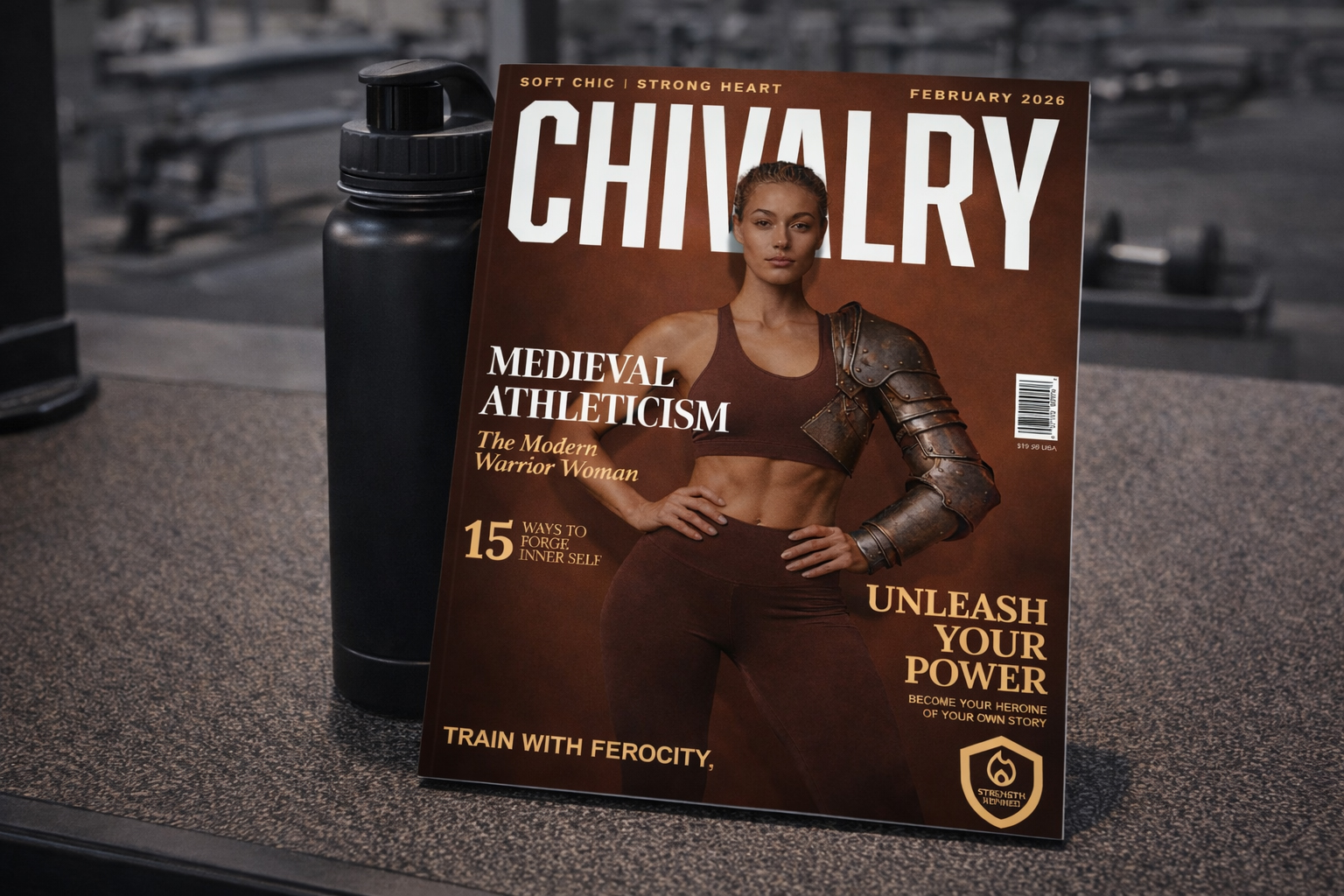
Chivalry Magazine
Print Design
Editorial Brand Concept
Project Type: Self-Initiated / Conceptual
Role: Art Direction, Visual Design, Brand Storytelling
Overview
CHIVALRY is a conceptual editorial brand that explores modern femininity through strength, discipline, and emotional resilience. The project reinterprets traditional notions of chivalry through a contemporary lens—centering women as self-defined heroes rather than supporting characters. The brand world is built to feel powerful, intentional, and identity-driven.
Concept & Brand Idea
The core editorial theme, “Soft Chic | Strong Heart,” juxtaposes elegance with ferocity. Drawing inspiration from medieval armor, modern athleticism, and high-fashion editorial design, the concept reframes strength as both physical and emotional—discipline balanced by grace. CHIVALRY positions empowerment not as aggression, but as self-mastery.
Art Direction & Visual System
The cover design blends athletic styling with symbolic armor elements to visually communicate protection, power, and resilience. Warm, grounded tones paired with confident composition create a premium aesthetic that feels timeless yet contemporary. Traditional magazine hierarchy is respected, while bold imagery and messaging subtly challenge expectations.
Typography & Messaging
Strong editorial typography anchors the composition, reinforcing authority and presence. Supporting headlines emphasize themes of self-forging, discipline, and inner strength. Language such as “Unleash Your Power” and “Train with Ferocity, Live with Grace” reframes fitness and self-development as identity-driven rather than appearance-focused.
Scalability & Application
While presented as a magazine cover, the identity was designed as a flexible system capable of extending across editorial spreads, digital content, social campaigns, and brand extensions. The project demonstrates how a cohesive visual language can support narrative-driven storytelling across multiple touchpoints.
Outcome
CHIVALRY showcases my approach to brand world-building and editorial storytelling—demonstrating how concept, art direction, typography, and imagery can work together to create an emotionally resonant, culturally relevant brand experience.
Heading 1
Heading 2
Heading 3
Heading 4
Heading 5
Heading 6
Lorem ipsum dolor sit amet, consectetur adipiscing elit, sed do eiusmod tempor incididunt ut labore et dolore magna aliqua. Ut enim ad minim veniam, quis nostrud exercitation ullamco laboris nisi ut aliquip ex ea commodo consequat. Duis aute irure dolor in reprehenderit in voluptate velit esse cillum dolore eu fugiat nulla pariatur.
Block quote
Ordered list
- Item 1
- Item 2
- Item 3
Unordered list
- Item A
- Item B
- Item C
Bold text
Emphasis
Superscript
Subscript
Long Beach City College Brochure Design
Print Design
Adult Learner & Workforce Campaign
Client: Long Beach City College
Role: Senior Graphic Designer / Campaign Creative Direction
Scope: Brand Campaign, Print, Digital, OOH, Web, Systems Design
Overview
I collaborated to create a campaign design for an integrated adult learner initiative at Long Beach City College, anchored by the brand platform “We Get You. We’ve Got You.” The work reframed LBCC not as an institution, but as a moment of confirmation—meeting adult learners emotionally before asking them to act.
The campaign spanned direct mail, print catalogues, campus signage, and digital extensions, with a parallel redesign of LBCC’s Workforce & Economic Development materials to create a unified, scalable system.
Campaign Challenge
Adult learners are often overextended, isolated, and uncertain about returning to school. Research showed that motivation wasn’t driven by more information—but by confirmation, belonging, and timing. The challenge was to move audiences from hesitation to action without relying on traditional enrollment messaging.
Strategic Insight
Adults act when something feels meant for them.
LBCC could become that signal.
Rather than persuading, the campaign focused on recognition and alignment—positioning the college as the nudge that bridges intention to momentum.
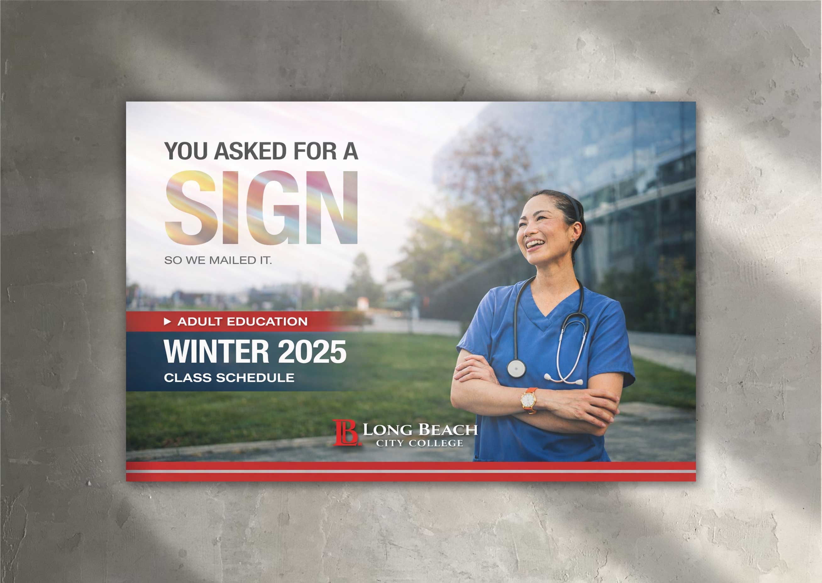
Hero Campaign: More Than a Sign
“You asked for a sign. We mailed it.”
The hero execution centered on a printed catalogue that arrived not as marketing, but as a personal moment of affirmation. Warm, cinematic photography and grounded language framed the piece as quiet confirmation rather than promotion.
Key themes
- Belonging over urgency
- Timing over pressure
- Emotion before action
Messaging leaned into cultural familiarity around signs, faith, and alignment—making the campaign polycultural, inclusive, and emotionally resonant without being niche.
Visual & Messaging System
- Tone: Warm, cinematic, affirming
- Visuals: Real adult learners, natural light, lived-in environments
- Typography: Bold, editorial hierarchy balanced with conversational copy
- CTAs: “Start Your Story,” “Say Yes to Yourself,” “Tomorrow Changes Today”
The system was designed to flex across formats while maintaining a consistent emotional throughline.
Campaign Architecture
The adult learner campaign functioned as the entry point, while the Workforce & Economic Development materials supported deeper, outcome-driven engagement.
Flow
- Adult Learner Mailer → emotional alignment
- Digital & Campus Extensions → reinforcement
- Signature Programs → clarity, pathways, action
This ensured momentum without overwhelming the audience.
Workforce & Economic Development Redesign
In parallel, I redesigned LBCC’s workforce and economic development materials to align with the core campaign while shifting tone toward outcomes and opportunity.
Focus
- Industry-responsive training
- Career pathways
- Regional economic impact
Shared templates, typography, and color systems ensured cohesion while allowing messaging to pivot from emotional readiness to career action.
Deliverables
- Adult learner print catalogue & mailer
- Campus posters & environmental signage
- Workforce & economic development brochures
- Digital and web-ready assets
- Modular templates for ongoing program use
Outcome
The campaign delivered a cohesive, emotionally grounded brand presence that reframed LBCC as both a place of belonging and a launch point for real opportunity. By meeting adult learners where they are—and guiding them toward clear next steps—the work demonstrated how strategy, storytelling, and design systems can work together to drive meaningful engagement.
Heading 1
Heading 2
Heading 3
Heading 4
Heading 5
Heading 6
Lorem ipsum dolor sit amet, consectetur adipiscing elit, sed do eiusmod tempor incididunt ut labore et dolore magna aliqua. Ut enim ad minim veniam, quis nostrud exercitation ullamco laboris nisi ut aliquip ex ea commodo consequat. Duis aute irure dolor in reprehenderit in voluptate velit esse cillum dolore eu fugiat nulla pariatur.
Block quote
Ordered list
- Item 1
- Item 2
- Item 3
Unordered list
- Item A
- Item B
- Item C
Bold text
Emphasis
Superscript
Subscript
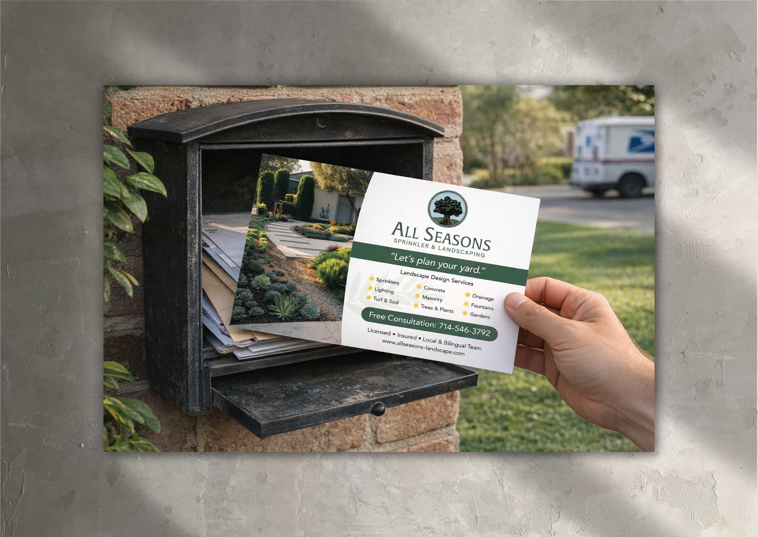
All Seasons Post Card Design
Print Design
Direct Mail Campaign
Client: All Seasons Sprinkler & Landscaping
Role: Senior Graphic Designer / Marketing Design
Scope: Direct Mail, Print Design, Local Growth Marketing
Overview
All Seasons Sprinkler & Landscaping partnered with me to design a targeted direct mail postcard aimed at expanding their customer base in the Newport Beach market. The piece introduced the brand to a higher-end residential audience while clearly communicating services and encouraging consultation inquiries.
Objective
Increase brand awareness and generate qualified leads within a premium coastal neighborhood by positioning All Seasons as a reliable, full-service landscaping partner.
Creative Approach
The postcard design balanced clarity, credibility, and approachability. A clean layout and inviting photography highlighted curb appeal and outdoor transformation, while concise copy showcased the full range of services—sprinkler systems, landscaping, lighting, and ongoing maintenance—without overwhelming the reader. The tone was friendly and confident, reinforcing trust with first-time prospects.
Messaging & Conversion Strategy
The front of the card focused on aspiration and visual impact, drawing attention through lifestyle imagery and polished design. The back delivered practical value with a clearly structured service list, local credibility cues, and a strong call-to-action offering a free consultation. The format was optimized for quick scanning, ensuring message retention even during brief engagement.
Outcome
The final postcard provided All Seasons with a professional, market-specific acquisition asset tailored to a new audience segment. It supported geographic expansion into Newport Beach while reinforcing the brand’s reputation as a dependable, full-service landscaping provider for residential homeowners.
Heading 1
Heading 2
Heading 3
Heading 4
Heading 5
Heading 6
Lorem ipsum dolor sit amet, consectetur adipiscing elit, sed do eiusmod tempor incididunt ut labore et dolore magna aliqua. Ut enim ad minim veniam, quis nostrud exercitation ullamco laboris nisi ut aliquip ex ea commodo consequat. Duis aute irure dolor in reprehenderit in voluptate velit esse cillum dolore eu fugiat nulla pariatur.
Block quote
Ordered list
- Item 1
- Item 2
- Item 3
Unordered list
- Item A
- Item B
- Item C
Bold text
Emphasis
Superscript
Subscript
Long Beach City College Brochure
Print Design
Adult Learner & Workforce Campaign
Client: Long Beach City College
Role: Senior Graphic Designer / Campaign & Systems Design
Scope: Integrated Campaign, Print, Digital, Web, Program Systems
Overview
I led creative direction for a multi-phase adult learner and workforce campaign for Long Beach City College, anchored in the brand platform “We Get You. We’ve Got You.” The work reframed LBCC as a moment of confirmation—meeting adult learners emotionally before asking them to act—while connecting broad enrollment messaging to specific workforce and economic-development pathways through a unified creative system.
Campaign Purpose
Adult learners are not chasing credits—they’re seeking alignment, momentum, and belonging. The campaign positioned LBCC as the signal that bridges intention and action, replacing traditional enrollment persuasion with emotional recognition and clarity.
Strategic Insight
Adults act when something feels meant for them. Rather than overwhelming audiences with information, the campaign delivered confirmation—honoring timing, lived experience, and shared cultural truths around readiness and self-belief.
Hero Campaign: More Than a Sign
The hero execution centered on a printed catalogue that arrived as a moment of alignment rather than marketing. Warm, cinematic photography and affirming language framed the piece as personal confirmation—inviting adult learners to recognize that the time to begin was now.
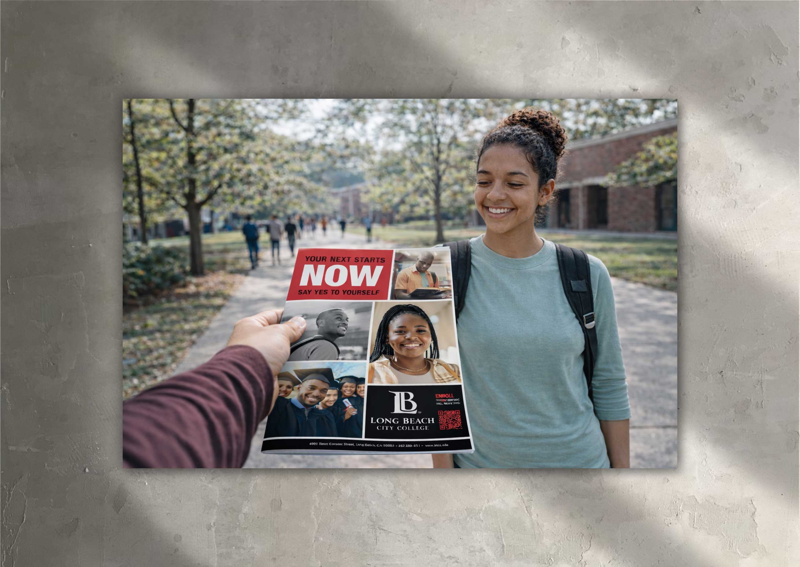
Campaign Variation: Next Starts Now
A complementary execution focused on agency and momentum. While More Than a Sign emphasized recognition, Next Starts Now emphasized decision—inviting adults to choose themselves and move forward with confidence.
Visual & Messaging System
A shared visual system supported both emotional and outcome-driven messaging:
- Warm, inclusive photography featuring real adult learners
- Editorial typography with clear hierarchy
- Grounded, conversational language
- Flexible layouts designed to scale across print, digital, and program-specific materials
Workforce & Economic Development Integration
In parallel, workforce and economic-development materials were redesigned to align with the campaign while shifting tone toward clarity and outcomes. Shared templates, typography, and color systems ensured continuity while allowing messaging to focus on training, credentials, and career pathways.
Deliverables
- Adult learner print catalogue and mailer
- Enrollment-focused print and environmental signage
- Workforce and economic-development program materials
- Digital and web-ready campaign assets
- Modular templates for long-term use across departments
Outcome
The campaign established a cohesive, emotionally grounded brand presence that guided adult learners from recognition to action. By connecting belonging with clear pathways, the system supported enrollment, workforce engagement, and long-term brand consistency across channels.
Workforce & Economic Development — Programmatic Style Guide
Brand Line
We Get You. We’ve Got You.
Tone
Confident, purposeful, supportive. Clear about outcomes while remaining human and inclusive.
Messaging Principles
- Industry-responsive training for in-demand jobs
- Clear career pathways with real outcomes
- Community-centered and regionally relevant
- Always connected back to the master brand promise
Visual Direction
- Real environments and hands-on training moments
- Learners in motion, focused on progress
- Consistent typography and color system shared with adult learner campaign
Layout System
Each program uses a consistent structure:
- Program name and outcome-driven headline
- Key skills or certifications
- Target audience
- Next steps or career outcomes
- Clear call-to-action
Logo & Partner Usage
Program and partner logos are secondary to LBCC branding, used in structured groupings to support credibility without overpowering messaging.
Heading 1
Heading 2
Heading 3
Heading 4
Heading 5
Heading 6
Lorem ipsum dolor sit amet, consectetur adipiscing elit, sed do eiusmod tempor incididunt ut labore et dolore magna aliqua. Ut enim ad minim veniam, quis nostrud exercitation ullamco laboris nisi ut aliquip ex ea commodo consequat. Duis aute irure dolor in reprehenderit in voluptate velit esse cillum dolore eu fugiat nulla pariatur.
Block quote
Ordered list
- Item 1
- Item 2
- Item 3
Unordered list
- Item A
- Item B
- Item C
Bold text
Emphasis
Superscript
Subscript
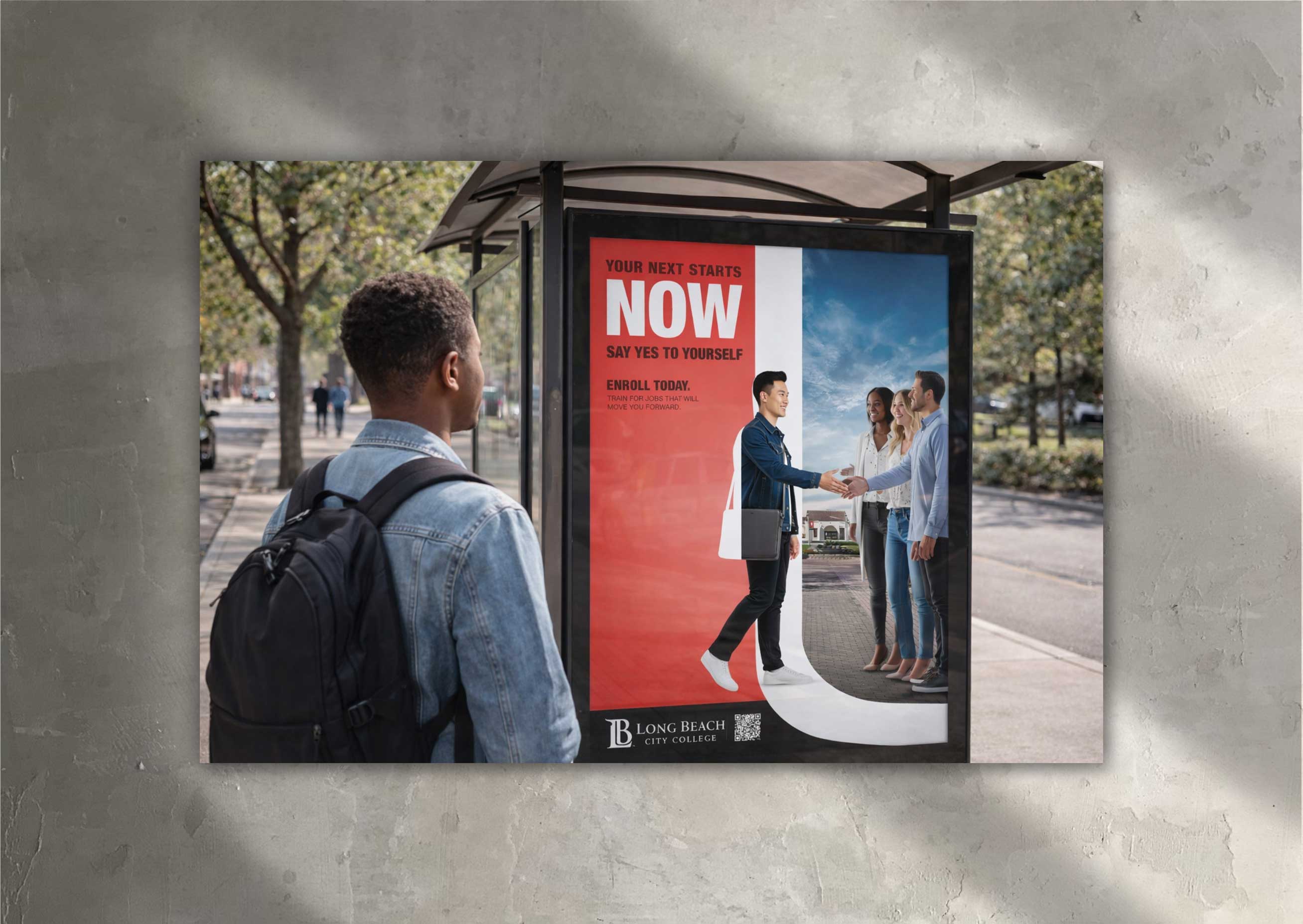
Long Beach City College Poster Design
Print Design
Next Starts Now (OOH & Environmental) Campaign
Client: Long Beach City College
Role: Senior Graphic Designer / Campaign Creative Direction
Scope: Brand Campaign, OOH, Environmental Design, Print, Digital, Systems Design
Overview
This execution extended the Next Starts Now campaign into large-format outdoor and environmental placements—bringing the message directly into public spaces where adult learners commute, pause, and transition between work and home. The goal was to make the decision to enroll feel immediate, visible, and present in everyday life.
Objective
Translate the emotional momentum of the adult learner campaign into high-frequency, real-world touchpoints that reinforce LBCC as an accessible, timely opportunity—meeting prospective students where decisions are actually made.
Creative Direction
The visual system leveraged bold color blocking and high-contrast typography to ensure instant legibility at a distance. A dominant red field anchored urgency and forward motion, while the photographic treatment conveyed movement and progression—visually reinforcing the idea of stepping from intention into action.
The composition emphasized confidence and clarity, ensuring the message could be absorbed in seconds within busy public environments.
Messaging Strategy
The headline “Your Next Starts Now”, paired with “Say Yes to Yourself,” reframed enrollment as an act of agency rather than obligation. Supporting language connected education to tangible outcomes—career momentum, stability, and personal growth—aligning learning with real-life progress.
Format & Application
Designed for posters, bus shelters, and roll-format installations, the layouts prioritized scale, clarity, and repetition. QR codes and enrollment CTAs were integrated seamlessly, supporting immediate action without disrupting the visual hierarchy.
System Alignment
This execution maintained the same typography, tone, and visual language as the broader Adult Learner & Workforce Campaign—demonstrating how the system flexes across channels while preserving a cohesive brand presence.
Outcome
The OOH and environmental placements extended the campaign’s motivational impact into the physical world—reinforcing LBCC as a visible, present option and supporting enrollment momentum through repeated, real-life exposure.
This work highlights my ability to scale a brand campaign across environments, maintain system integrity, and design for clarity, urgency, and action in public-facing contexts.
Heading 1
Heading 2
Heading 3
Heading 4
Heading 5
Heading 6
Lorem ipsum dolor sit amet, consectetur adipiscing elit, sed do eiusmod tempor incididunt ut labore et dolore magna aliqua. Ut enim ad minim veniam, quis nostrud exercitation ullamco laboris nisi ut aliquip ex ea commodo consequat. Duis aute irure dolor in reprehenderit in voluptate velit esse cillum dolore eu fugiat nulla pariatur.
Block quote
Ordered list
- Item 1
- Item 2
- Item 3
Unordered list
- Item A
- Item B
- Item C
Bold text
Emphasis
Superscript
Subscript
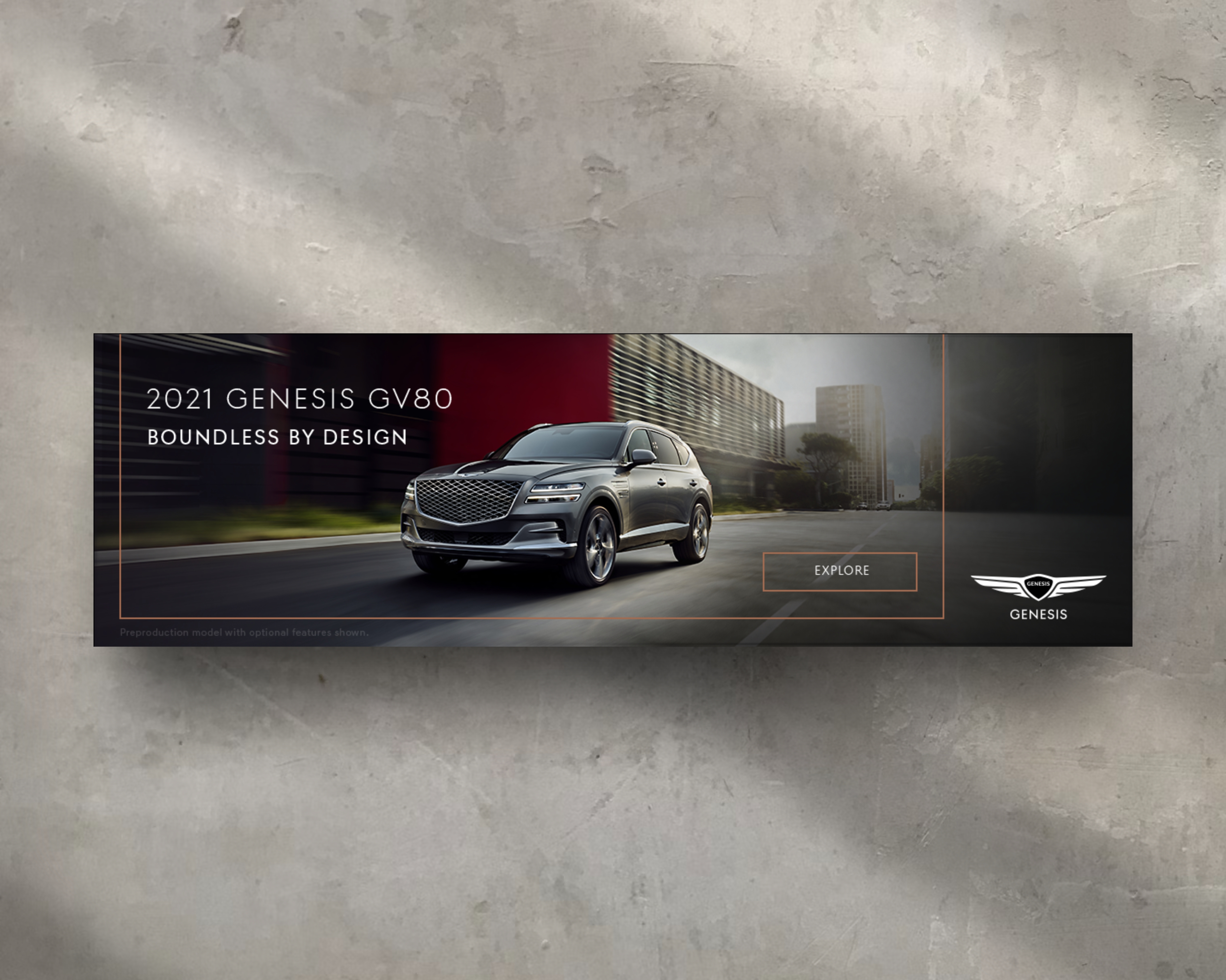
Genesis GV80 “First-Ever SUV” Campaign
Paid Media · Digital Advertising · Campaign Execution
Role: Senior Graphic Designer
Agency: Innocean Worldwide
Client: Genesis
Brand Overview
Genesis, Hyundai Motor Group’s luxury automotive brand, introduced the GV80 as its first-ever SUV—a milestone launch that required a refined, performance-driven digital campaign to establish credibility, luxury, and design leadership in a highly competitive segment. The campaign focused on elevating awareness and driving exploration through premium digital placements.
Strategy Components
1. Campaign Objective
The goal was to support the launch of the Genesis GV80 by delivering high-impact digital banner ads that reinforced the brand’s luxury positioning while driving users to explore the vehicle online. The campaign needed to feel confident, restrained, and design-forward—mirroring the GV80 itself.
2. Visual Hierarchy & Design System
Each banner was designed around a clear, luxury-first hierarchy:
- Hero vehicle imagery as the primary focal point
- Minimal, confident headline copy (“Our First-Ever SUV”)
- Subtle framing lines and negative space to create structure without clutter
- Refined CTA treatments (“Learn More,” “Explore”) aligned with Genesis’ premium tone
Layouts were intentionally understated, allowing craftsmanship, proportion, and motion to communicate value rather than overt promotional messaging.
3. Responsive & Scalable Execution
I designed a full suite of banners across standard IAB formats (leaderboard, MPU, skyscraper, mobile, etc.), using ratio-based spacing and scalable components. This ensured visual consistency regardless of size, aspect ratio, or placement—while accommodating variations in copy length and image crops without breaking hierarchy.
4. Platform & Performance Considerations
Banners were built for deployment across programmatic and premium publisher environments, with attention to:
- High-resolution image quality
- Clean compression for fast load times
- Clear readability in both static and animated executions
The system allowed Genesis to maintain a cohesive visual presence across multiple placements while maximizing performance in crowded digital environments.
Outcome
The GV80 digital banner campaign delivered a polished, premium introduction to Genesis’ first SUV—successfully reinforcing brand confidence and design leadership at launch. The flexible banner system supported broad media distribution while preserving luxury standards across every placement.
Heading 1
Heading 2
Heading 3
Heading 4
Heading 5
Heading 6
Lorem ipsum dolor sit amet, consectetur adipiscing elit, sed do eiusmod tempor incididunt ut labore et dolore magna aliqua. Ut enim ad minim veniam, quis nostrud exercitation ullamco laboris nisi ut aliquip ex ea commodo consequat. Duis aute irure dolor in reprehenderit in voluptate velit esse cillum dolore eu fugiat nulla pariatur.
Block quote
Ordered list
- Item 1
- Item 2
- Item 3
Unordered list
- Item A
- Item B
- Item C
Bold text
Emphasis
Superscript
Subscript
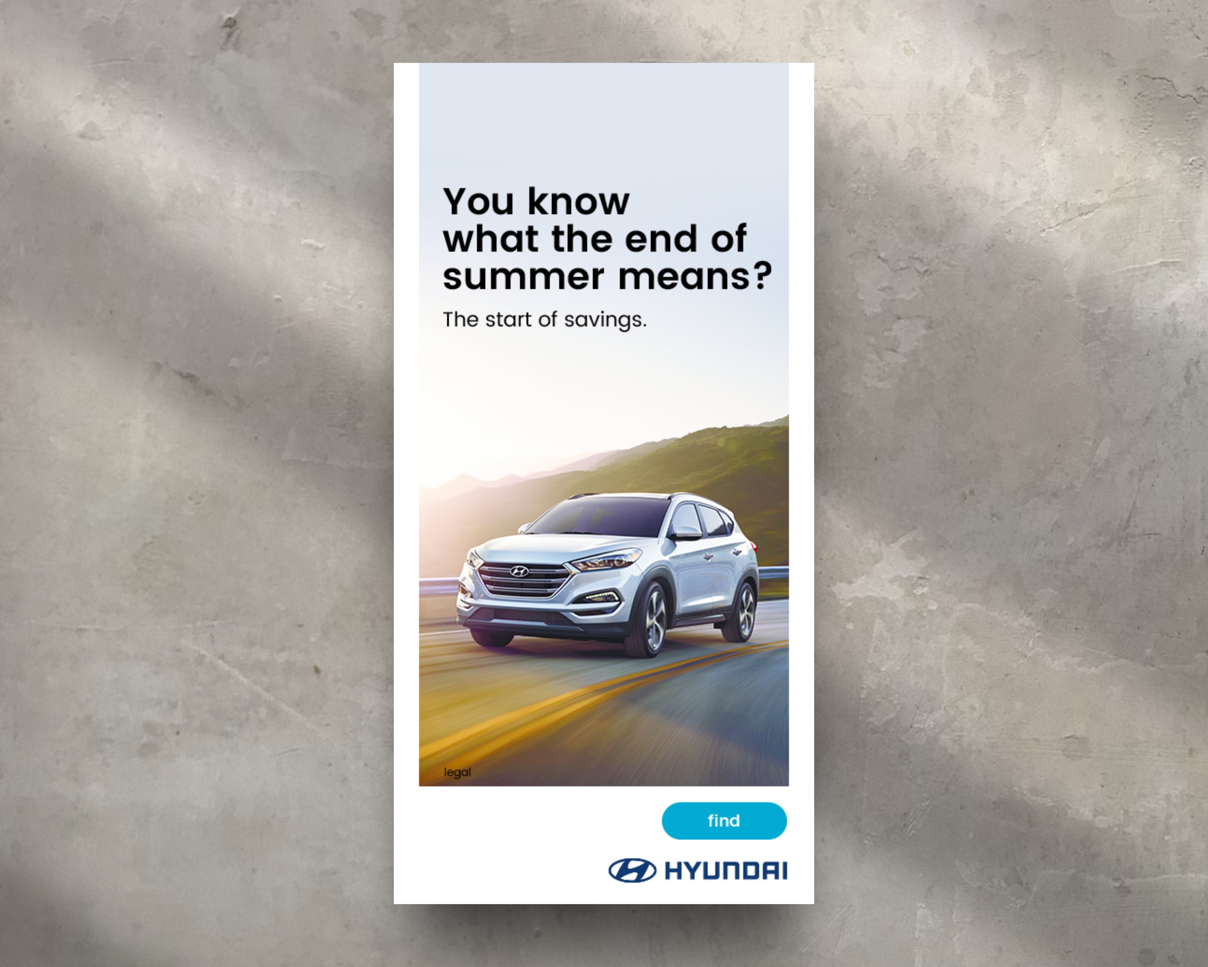
Paid Display Campaigns
Client: Hyundai Motor Company (Fortune 500)
Agency: Innocean Worldwide
I designed a full suite of dynamic, ratio-based display banners for Hyundai, built to scale seamlessly across all IAB standard sizes and served through Google DoubleClick.
Each banner was constructed using a modular layout system with ratio-driven spacing, allowing all elements—typography, CTA, vehicle imagery, and legal copy—to scale proportionally across formats. This approach ensured visual consistency while accommodating variable headline lengths, localized messaging, and changing image proportions without redesign.
The system supported high-volume paid media deployment and A/B testing, enabling Hyundai to maintain brand integrity while optimizing performance across placements. The work reflects a balance of brand-led storytelling and performance-driven execution within a fast-paced, enterprise-level advertising environment.
Heading 1
Heading 2
Heading 3
Heading 4
Heading 5
Heading 6
Lorem ipsum dolor sit amet, consectetur adipiscing elit, sed do eiusmod tempor incididunt ut labore et dolore magna aliqua. Ut enim ad minim veniam, quis nostrud exercitation ullamco laboris nisi ut aliquip ex ea commodo consequat. Duis aute irure dolor in reprehenderit in voluptate velit esse cillum dolore eu fugiat nulla pariatur.
Block quote
Ordered list
- Item 1
- Item 2
- Item 3
Unordered list
- Item A
- Item B
- Item C
Bold text
Emphasis
Superscript
Subscript
Better Campaign / Hyundai Rewards Program
Interactive Display · Paid Media · Loyalty Marketing
Agency: Innocean Worldwide
Client: Hyundai
Brand Overview
As part of Hyundai’s broader “Better” brand platform, the Hyundai Rewards program was designed to extend value beyond the point of purchase—rewarding customers throughout the entire ownership journey. The free, tiered loyalty program (Silver, Gold, Blue) incentivized engagement through service visits, vehicle purchases, and connected services, offering escalating discounts and perks tied directly to customer behavior.
Strategy Components
1. Campaign Objective
The goal of this banner execution was to clearly communicate the value of the Hyundai Rewards program while encouraging enrollment and ongoing participation. The unit needed to educate users on a multi-tiered system—without overwhelming them—while reinforcing Hyundai’s “Better” positioning around long-term ownership value.
2. Interactive Rich Media Execution
Similar to other high-impact Hyundai digital placements, this banner leveraged an expandable, interactive rich media format rather than a static unit. Upon interaction, the banner expanded to reveal a layered experience that allowed users to explore the rewards structure in a guided, intuitive way.
Navigation controls enabled users to move through different sections of the experience, reinforcing the idea of progression—mirroring how customers move through Silver, Gold, and Blue tiers over time.
3. Tier-Based Storytelling & UX
The expanded experience highlighted:
- Tier progression (Silver → Gold → Blue)
- Increasing benefits and discounts tied to engagement
- Rewards across EVs, ICE vehicles, and Bluelink connected services
Information was broken into digestible moments, using visual hierarchy and spacing to make a complex program feel accessible and motivating rather than transactional.
4. Value Communication & Brand Alignment
Messaging emphasized that Hyundai Rewards wasn’t just a promotion—it was a system designed to reward loyalty over time. The experience aligned with Hyundai’s “Better” platform by framing ownership as an ongoing relationship, not a one-time sale.
Design language stayed consistent with Hyundai’s digital ecosystem, ensuring the banner felt cohesive alongside TV, site, and dealer-facing communications.
5. Paid Media & Platform Considerations
The banner was built for paid media deployment, with attention to:
- Smooth expansion and interaction performance
- Scalable layouts across placements
- Clear CTA moments encouraging enrollment via MyHyundai
Outcome
The interactive banner successfully translated a multi-layered loyalty program into an engaging digital experience—encouraging exploration, improving comprehension, and reinforcing Hyundai’s commitment to rewarding customers beyond purchase.
This project demonstrates my ability to design interactive paid media, simplify complex value propositions through UX-driven layout, and execute brand-aligned digital campaigns for a Fortune 500 automotive client within a fast-paced agency environment.
Heading 1
Heading 2
Heading 3
Heading 4
Heading 5
Heading 6
Lorem ipsum dolor sit amet, consectetur adipiscing elit, sed do eiusmod tempor incididunt ut labore et dolore magna aliqua. Ut enim ad minim veniam, quis nostrud exercitation ullamco laboris nisi ut aliquip ex ea commodo consequat. Duis aute irure dolor in reprehenderit in voluptate velit esse cillum dolore eu fugiat nulla pariatur.
Block quote
Ordered list
- Item 1
- Item 2
- Item 3
Unordered list
- Item A
- Item B
- Item C
Bold text
Emphasis
Superscript
Subscript
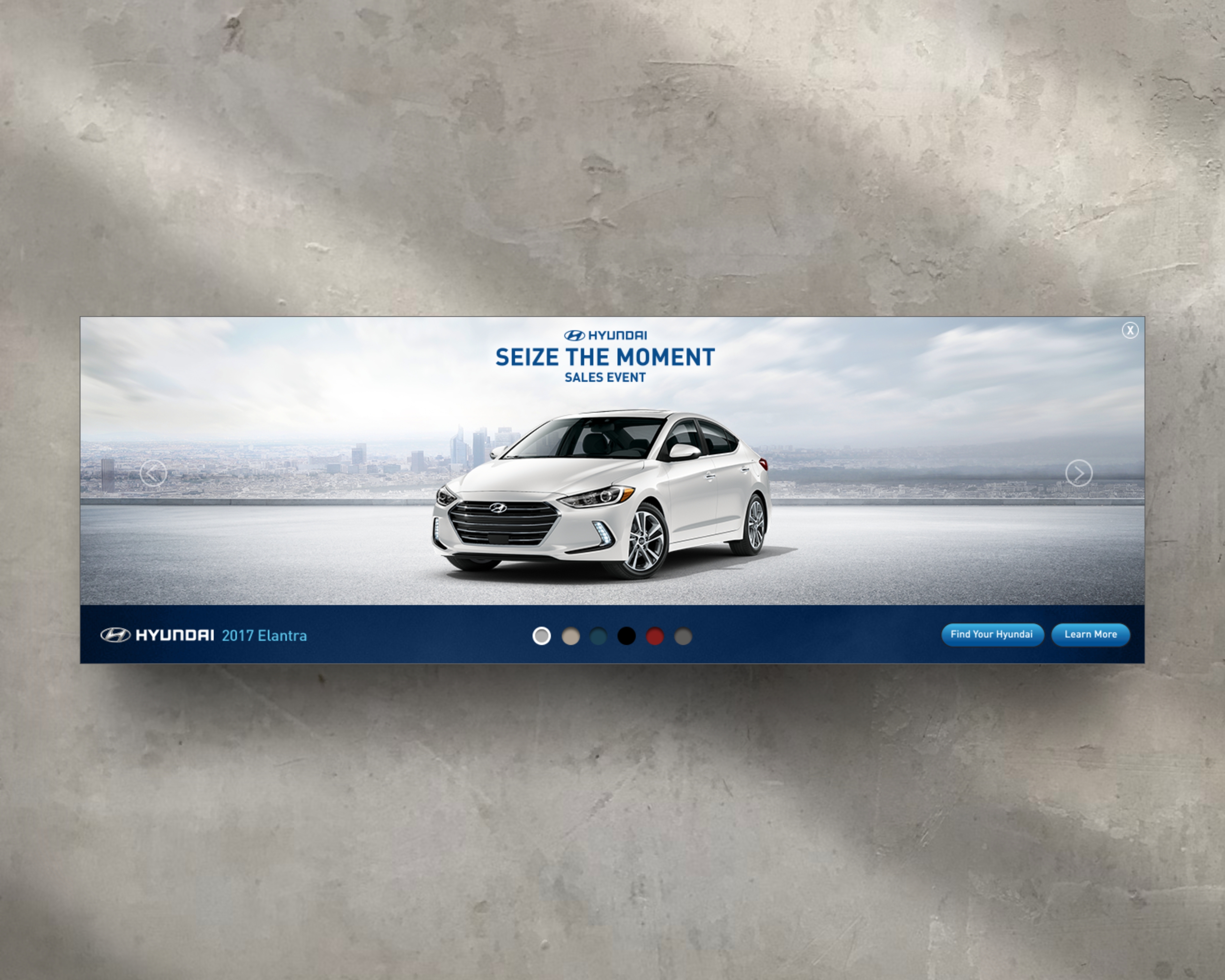
Seize the Moment Sales Event Campaign
Interactive Rich Media · Paid Media · Digital Campaign Execution
Role: Senior Graphic Designer / Developer
Agency: Innocean Worldwide
Client: Hyundai
Brand Overview
The Seize the Moment Sales Event was a major Hyundai promotional campaign running across 2015–2016, built around urgency-driven value messaging. The campaign promoted limited-time incentives—such as 0% APR financing and bonus cash—across key models including the Elantra, Sonata, and Tucson, encouraging consumers to act immediately and take advantage of peak offers.
Strategy Components
1. Campaign Objective
The goal of this execution was to support Hyundai’s Seize the Moment sales messaging by transforming a standard display placement into a high-engagement, interactive experience—designed to increase dwell time, highlight vehicle features, and reinforce the urgency of the promotion.
2. Interactive Rich Media Experience
Rather than a traditional static or simple expandable banner, I designed an interactive, expandable rich media unit that unfolded into a long, horizontal landscape. The experience simulated panning across a continuous environment, allowing users to actively navigate through scenes using on-unit navigation controls.
This approach turned the ad into a guided exploration rather than a single-frame message—encouraging discovery while keeping users within the ad environment.
3. Feature Highlights & Hotspot Interaction
Within the expanded canvas:
- Hover-activated hotspots revealed key vehicle features and benefits
- Navigation buttons allowed users to traverse different sections of the landscape
- The interaction model mirrored real-world motion and exploration, reinforcing Hyundai’s modern, feature-forward positioning
This structure allowed multiple messages to live within one unit without overwhelming the user.
4. Integrated Brand Video
A Hyundai brand video was embedded directly into the experience, providing a cinematic anchor within the interactive flow. The video reinforced Tucson design, technology, and lifestyle appeal while maintaining continuity with Hyundai’s broader TV and digital campaign assets.
5. Platform & Performance Considerations
The unit was built for paid media deployment across major ad platforms, ensuring:
- Smooth expansion and interaction performance
- Compatibility with rich media ad servers
- Scalable design logic adaptable across placements and screen sizes
Outcome
The Seize the Moment rich media unit elevated Hyundai’s sales messaging by pairing urgency with interactivity—transforming a performance-driven campaign into an engaging, exploratory experience. The execution increased user engagement, extended time spent within the ad, and delivered product education without requiring users to leave the placement.
This project demonstrates my ability to design interactive paid media, build rich media storytelling systems, and execute high-impact digital advertising for a Fortune 500 automotive brand within a fast-paced global agency environment.
Heading 1
Heading 2
Heading 3
Heading 4
Heading 5
Heading 6
Lorem ipsum dolor sit amet, consectetur adipiscing elit, sed do eiusmod tempor incididunt ut labore et dolore magna aliqua. Ut enim ad minim veniam, quis nostrud exercitation ullamco laboris nisi ut aliquip ex ea commodo consequat. Duis aute irure dolor in reprehenderit in voluptate velit esse cillum dolore eu fugiat nulla pariatur.
Block quote
Ordered list
- Item 1
- Item 2
- Item 3
Unordered list
- Item A
- Item B
- Item C
Bold text
Emphasis
Superscript
Subscript
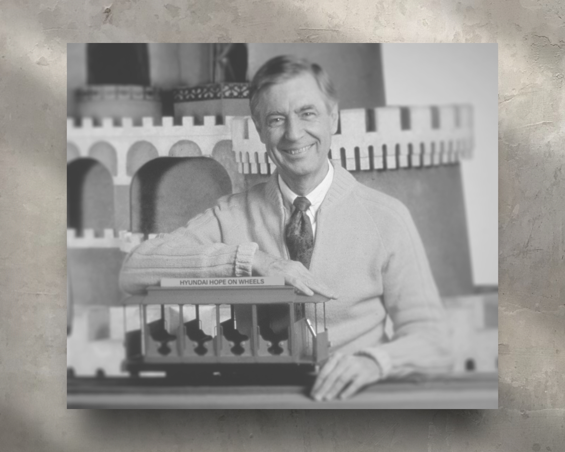
Hope on Wheels Campaign
Brand Campaign Concept · Storytelling · Cause Marketing
Role: Art Director
Agency: Innocean Worldwide
Client: Hyundai
Brand Overview
Hyundai Hope on Wheels is Hyundai’s national nonprofit initiative dedicated to funding pediatric cancer research and raising awareness around childhood cancer. This concept campaign—“It’s a Beautiful Day in the Neighborhood. Ride the Trolley of Hope.”—was designed to emotionally connect adults with the cause by tapping into shared childhood memory, empathy, and nostalgia, while reinforcing Hyundai’s commitment to making the world a better place.
Strategy Components
1. Campaign Purpose & Target Audience
The campaign targeted adults in a position to support pediatric cancer research—parents, caregivers, and community supporters. The strategy centered on reminding adults of their own childhood innocence and sense of safety, reinforcing the importance of protecting that experience for children facing life-threatening illness.
2. Cultural Anchor & Emotional Storytelling
The creative concept used Fred Rogers (Mr. Rogers) as an emotional bridge between generations. As a universally trusted and beloved figure in children’s education, Mr. Rogers symbolized kindness, advocacy, and emotional safety—qualities closely aligned with the mission of Hope on Wheels.
By reintroducing Mr. Rogers to younger audiences while triggering nostalgia in adults, the campaign created a multi-generational emotional connection to the cause.
3. Core Narrative Concept — “The Trolley of Hope”
At the heart of the idea was a symbolic reimagining of the iconic trolley from Mister Rogers’ Neighborhood:
- Children are invited aboard the Hope on Wheels Trolley
- They travel through a “tunnel of hope”
- They return healthier, stronger, and supported by research
The trolley served as a visual metaphor for progress, care, and the journey toward healing.
4. Video Concept & Execution
A short-form video concept featured a CGI interpretation of Mr. Rogers inviting children onto the trolley. Midway through the narrative, Mr. Rogers transitions into a medical researcher—symbolizing the bridge between compassion and science. The video concluded with a sobering but necessary fact about pediatric cancer, followed by a call to action explaining how viewers could support research through Hyundai Hope on Wheels.
5. Physical Gift & Experiential Extension
As part of the concept, select children would receive limited-edition trolley toys, modeled after the original Mr. Rogers’ Neighborhood trolley. The packaging included messaging about key milestones in pediatric cancer research—turning the toy into both a symbol of hope and an educational artifact for families.
6. Social & Cultural Amplification
The campaign envisioned amplification through social media, celebrity participation, and Hyundai-Innocean digital channels—helping the story reach beyond traditional advertising and into cultural conversation.
Outcome (Conceptual)
The Hope on Wheels: Trolley of Hope concept positioned Hyundai as a brand that leads with empathy, responsibility, and long-term commitment to children’s health. By merging cultural memory with purpose-driven storytelling, the campaign created a powerful emotional framework for awareness, education, and action.
This project highlights my ability to develop cause-driven brand campaigns, leverage cultural icons responsibly, and craft emotionally resonant narratives that align brand purpose with social impact—within a Fortune 500 automotive context.
Heading 1
Heading 2
Heading 3
Heading 4
Heading 5
Heading 6
Lorem ipsum dolor sit amet, consectetur adipiscing elit, sed do eiusmod tempor incididunt ut labore et dolore magna aliqua. Ut enim ad minim veniam, quis nostrud exercitation ullamco laboris nisi ut aliquip ex ea commodo consequat. Duis aute irure dolor in reprehenderit in voluptate velit esse cillum dolore eu fugiat nulla pariatur.
Block quote
Ordered list
- Item 1
- Item 2
- Item 3
Unordered list
- Item A
- Item B
- Item C
Bold text
Emphasis
Superscript
Subscript
St. Louis Cardinals West Sponsorship LED
Client: Hyundai
Agency: Innocean Worldwide
Partner Team: St. Louis Cardinals (West Division Sponsorship)
Role: Senior Graphic Designer
Scope: Live Sports LED Design, Brand Integration, Motion-Ready Graphics
Overview
I designed LED signage for Hyundai as part of a live sports sponsorship with the St. Louis Cardinals (West). Created while working at Innocean, the asset was developed for in-stadium LED ribbon and display systems—requiring bold visual clarity, brand precision, and instant legibility in a fast-paced, live-event environment.
Objective
Integrate Hyundai’s brand seamlessly into the MLB game-day experience while maintaining strong visibility, premium presentation, and alignment with both Hyundai’s global brand standards and MLB broadcast requirements.
Creative Approach
The design prioritized simplicity, contrast, and motion-readiness. Hyundai branding and messaging were structured to read clearly at a distance and at speed, ensuring recognition during live gameplay, replays, and televised moments. Layout decisions accounted for the elongated proportions, continuous flow, and modular nature of stadium LED systems.
Brand & Sports Integration
Hyundai’s visual system was adapted to sit naturally within the Cardinals’ stadium environment. Color balance, spacing, and hierarchy were carefully calibrated so the brand felt integrated with the team’s visual ecosystem—never disruptive—while still commanding attention within a highly competitive visual field.
Technical Considerations
- Designed to spec for stadium LED resolution and aspect ratios
- Optimized for high brightness, contrast, and legibility under varying lighting conditions
- Built to function seamlessly within looping and modular LED sequences
- Structured for adaptability across static and motion-enabled executions
Outcome
The final LED asset delivered a clean, high-impact sponsorship presence for Hyundai during live St. Louis Cardinals games. It reinforced Hyundai’s commitment to major league sports partnerships while demonstrating my ability to translate global automotive branding into performance-ready graphics for large-scale, real-time environments.
This project highlights experience in sports marketing, live-event design, and adapting brand systems for broadcast-visible, high-stakes venues.
Heading 1
Heading 2
Heading 3
Heading 4
Heading 5
Heading 6
Lorem ipsum dolor sit amet, consectetur adipiscing elit, sed do eiusmod tempor incididunt ut labore et dolore magna aliqua. Ut enim ad minim veniam, quis nostrud exercitation ullamco laboris nisi ut aliquip ex ea commodo consequat. Duis aute irure dolor in reprehenderit in voluptate velit esse cillum dolore eu fugiat nulla pariatur.
Block quote
Ordered list
- Item 1
- Item 2
- Item 3
Unordered list
- Item A
- Item B
- Item C
Bold text
Emphasis
Superscript
Subscript
Pittsburgh Pirates Sponsorship LED
Client: Hyundai
Agency: Innocean Worldwide
Partner Team: Pittsburgh Pirates
Role: Senior Graphic Designer
Scope: Live Sports LED Design, Brand Integration, Motion-Ready Graphics
Overview
I designed LED signage for Hyundai as part of a live sports sponsorship with the Pittsburgh Pirates. Created while working at Innocean Worldwide, the asset was developed for in-stadium LED ribbon boards and display systems—requiring bold visual clarity, brand precision, and instant legibility in a fast-paced, live-event environment.
Objective
Integrate Hyundai’s brand seamlessly into the MLB game-day experience while maintaining strong visibility, premium presentation, and alignment with both Hyundai brand standards and league requirements.
Creative Approach
The design prioritized simplicity, contrast, and motion-readiness. Hyundai branding and messaging were structured to read clearly at a distance and at speed, ensuring recognition during live gameplay, replays, and broadcast moments. Layout decisions accounted for the unique proportions, curvature, and continuous flow of stadium LED systems.
Brand & Sports Integration
Hyundai’s visual system was adapted to coexist naturally within the Pirates’ stadium environment. Color usage, spacing, and hierarchy were carefully balanced so the brand felt integrated—not intrusive—while still commanding attention within a visually dense sports setting.
Technical Considerations
- Designed to spec for stadium LED resolution and non-standard aspect ratios
- Optimized for high brightness, contrast, and legibility under variable lighting conditions
- Built to function seamlessly within looping and modular LED sequences
- Structured for adaptability across both static and animated executions
Outcome
The final LED asset delivered a clean, high-impact sponsorship presence for Hyundai during live Pittsburgh Pirates games. It reinforced Hyundai’s commitment to sports partnerships while demonstrating my ability to translate global brand systems into performance-ready graphics for large-scale, real-time environments.
Heading 1
Heading 2
Heading 3
Heading 4
Heading 5
Heading 6
Lorem ipsum dolor sit amet, consectetur adipiscing elit, sed do eiusmod tempor incididunt ut labore et dolore magna aliqua. Ut enim ad minim veniam, quis nostrud exercitation ullamco laboris nisi ut aliquip ex ea commodo consequat. Duis aute irure dolor in reprehenderit in voluptate velit esse cillum dolore eu fugiat nulla pariatur.
Block quote
Ordered list
- Item 1
- Item 2
- Item 3
Unordered list
- Item A
- Item B
- Item C
Bold text
Emphasis
Superscript
Subscript
.jpeg)
Heading 1
Heading 2
Heading 3
Heading 4
Heading 5
Heading 6
Lorem ipsum dolor sit amet, consectetur adipiscing elit, sed do eiusmod tempor incididunt ut labore et dolore magna aliqua. Ut enim ad minim veniam, quis nostrud exercitation ullamco laboris nisi ut aliquip ex ea commodo consequat. Duis aute irure dolor in reprehenderit in voluptate velit esse cillum dolore eu fugiat nulla pariatur.
Block quote
Ordered list
- Item 1
- Item 2
- Item 3
Unordered list
- Item A
- Item B
- Item C
Bold text
Emphasis
Superscript
Subscript
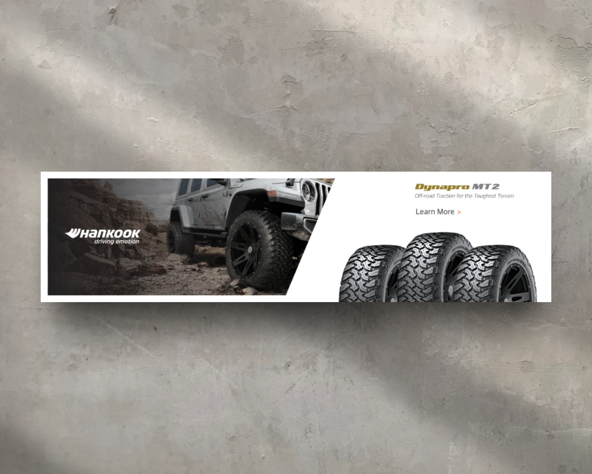
Hankook Dynapro MT2 Banner Ad
Banner Ads
Dynapro MT2 Off-Road Banner Ads
Client: Hankook Tire
Agency: Innocean Worldwide
Product: Dynapro MT2
Role: Senior Graphic Designer / Developer
Scope: Digital Display Advertising, Paid Media Banners, Scalable Layout Systems
Overview
I designed digital banner ads promoting the Hankook Dynapro MT2—an off-road tire engineered for extreme traction in rugged, unforgiving terrain. Created while working at Innocean, the banners were built for high-impact digital placements, balancing aggressive performance cues with brand clarity and premium execution.
Objective
Highlight the Dynapro MT2’s off-road durability and traction capabilities while reinforcing Hankook’s position as a serious performance tire brand within the truck and off-road enthusiast market.
Creative Approach
The design emphasized power, toughness, and control. The tire was positioned as the hero element, paired with rugged terrain imagery to immediately communicate real-world performance. Typography and layout choices reinforced strength and reliability, ensuring the message landed quickly within limited banner real estate.
Paid Media & Scalability Strategy
Each banner was built using a ratio-based layout system, allowing all elements—imagery, copy, and CTAs—to scale cleanly across multiple IAB sizes without compromising composition or hierarchy. This ensured consistency and efficiency across media buys while supporting A/B testing and campaign flexibility.
Technical Considerations
- Designed across multiple standard display sizes
- Ratio-based spacing for scalable copy and imagery
- Optimized for fast load times and high-resolution displays
- Structured for both static and motion-ready executions
Outcome
The final banners delivered a bold, performance-driven message that stood out in competitive digital environments. The work supported Hankook’s off-road product positioning while demonstrating my ability to design paid media assets that balance visual aggression, brand integrity, and platform efficiency.
This project highlights experience in automotive advertising, performance branding, and scalable digital banner systems built for modern paid media campaigns.
Heading 1
Heading 2
Heading 3
Heading 4
Heading 5
Heading 6
Lorem ipsum dolor sit amet, consectetur adipiscing elit, sed do eiusmod tempor incididunt ut labore et dolore magna aliqua. Ut enim ad minim veniam, quis nostrud exercitation ullamco laboris nisi ut aliquip ex ea commodo consequat. Duis aute irure dolor in reprehenderit in voluptate velit esse cillum dolore eu fugiat nulla pariatur.
Block quote
Ordered list
- Item 1
- Item 2
- Item 3
Unordered list
- Item A
- Item B
- Item C
Bold text
Emphasis
Superscript
Subscript
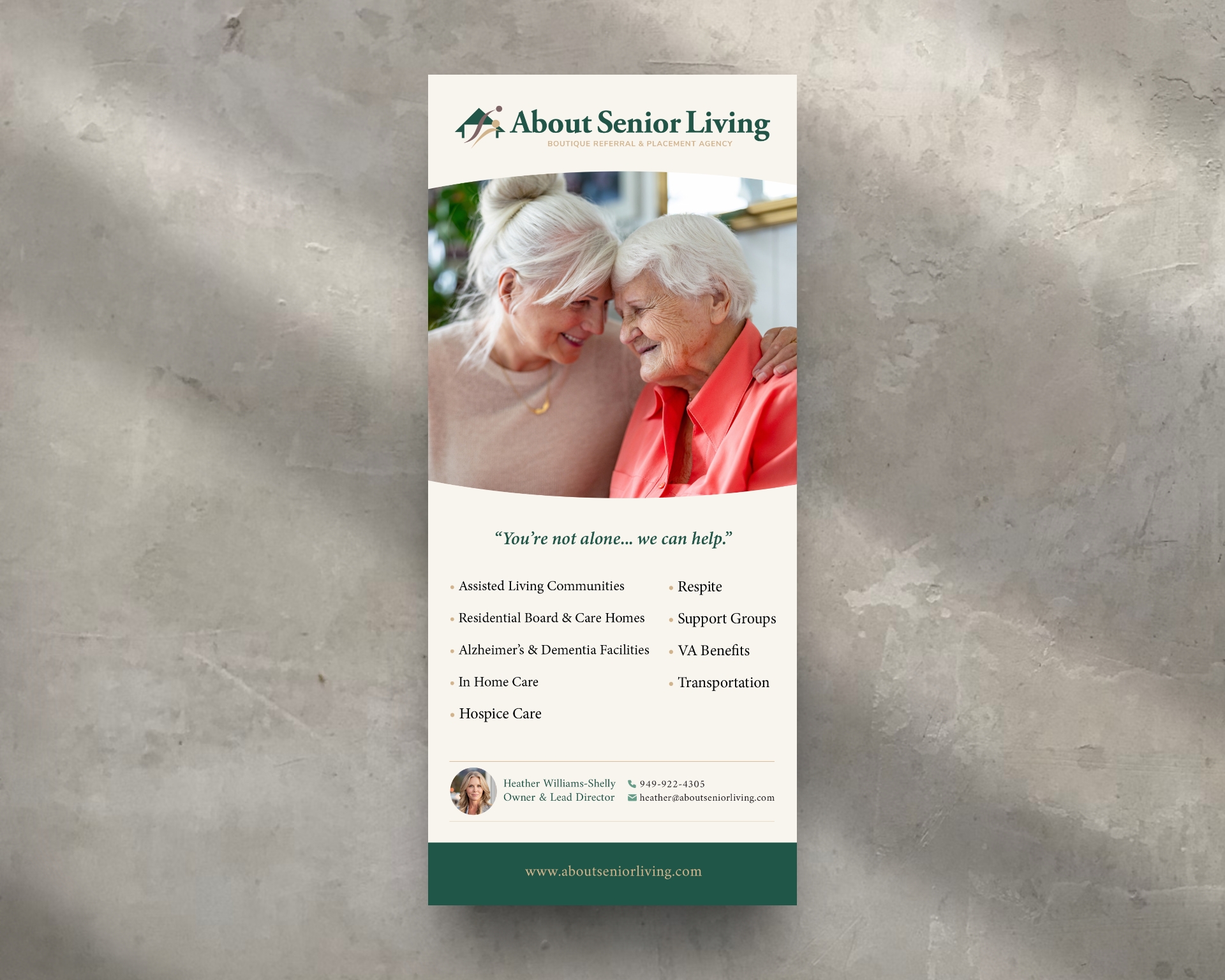
About Senior Living Marketing Collateral
Print Design
Marketing Collateral System
Client: About Senior Living
Role: Brand & Marketing Designer
Scope: Print Collateral, Brand Application, Lead-Generation Materials
Overview
I designed a cohesive suite of marketing collateral for About Senior Living to support outreach, referrals, and relationship-building with families, healthcare providers, and community partners. The system was created to feel calm, credible, and human—reflecting the brand’s role as a trusted guide during emotionally sensitive decision-making moments.
Creative Direction
The collateral translated the brand identity into tangible, client-facing touchpoints. Clean layouts, generous white space, and warm, understated imagery were used to create clarity and emotional ease. The overall approach avoided anything overtly sales-driven, instead reinforcing reassurance, presence, and trust.
Messaging & Tone
Language was intentionally direct and supportive, reinforcing the brand’s promise of partnership rather than pressure. Headlines such as “You’re not alone—we can help.” positioned About Senior Living as a steady resource during uncertainty, aligning the materials with the advisory nature of the service.
Design System Application
The collateral system adhered closely to brand foundations while remaining flexible across formats:
- Consistent use of the brand’s green and neutral palette to convey calm and trust
- Refined typography to balance professionalism with warmth
- Clear information hierarchy to support easy scanning during high-stress moments
- Subtle, empathetic photography emphasizing family, connection, and care
Collateral Suite
- Business Cards – Clear contact hierarchy with QR code integration for fast digital access
- Tri-Fold & One-Sheet Brochures – Outlining services, process, and support options
- Referral Leave-Behinds – Designed specifically for medical offices and care partners to encourage trusted handoffs
Outcome
The final collateral system provided About Senior Living with polished, cohesive marketing tools that reinforced credibility, strengthened referral relationships, and supported meaningful conversations with families navigating senior care decisions. The materials function as both brand reinforcement and practical lead-generation assets—extending trust beyond digital touchpoints into real-world interactions.
Heading 1
Heading 2
Heading 3
Heading 4
Heading 5
Heading 6
Lorem ipsum dolor sit amet, consectetur adipiscing elit, sed do eiusmod tempor incididunt ut labore et dolore magna aliqua. Ut enim ad minim veniam, quis nostrud exercitation ullamco laboris nisi ut aliquip ex ea commodo consequat. Duis aute irure dolor in reprehenderit in voluptate velit esse cillum dolore eu fugiat nulla pariatur.
Block quote
Ordered list
- Item 1
- Item 2
- Item 3
Unordered list
- Item A
- Item B
- Item C
Bold text
Emphasis
Superscript
Subscript
Email GIF Campaigns
Client: Genesis Motors
Agency: Innocean Worldwide
Role: Senior Graphic Designer / Motion & Visual Designer
Scope: Animated GIFs, Email Marketing, Digital Campaign Assets
Overview
I created a series of animated GIFs for Genesis Motors email marketing campaigns while working at Innocean. The GIFs were designed to bring movement, elegance, and storytelling into inbox environments—enhancing static email layouts while staying lightweight and performance-friendly.
Objective
Increase engagement within email campaigns by highlighting vehicle features, seasonal moments, and brand tone through subtle motion. The animations needed to feel premium and restrained, aligning with Genesis’ luxury positioning while remaining compatible with email platform limitations.
Creative Direction
The motion approach focused on refinement rather than spectacle. Animations emphasized smooth transitions, controlled pacing, and elegant reveals—allowing details such as lighting, grille design, interiors, and seasonal environments to feel intentional and composed.
Design & Motion Execution
- Created looping GIFs optimized for email file-size requirements
- Used motion to guide the eye without distracting from core messaging
- Balanced cinematic visuals with clarity and legibility across devices
- Ensured compatibility across major email clients
Brand Alignment
Each GIF adhered to Genesis brand standards, preserving color accuracy, vehicle proportions, and visual consistency. Motion timing and easing were carefully tuned to support a calm, confident brand presence rather than overt animation.
Outcome
The final GIFs elevated Genesis’ email campaigns by introducing subtle motion and visual interest without compromising load times or usability. The assets supported feature highlights, seasonal promotions, and brand storytelling—demonstrating my ability to design performance-aware motion graphics for luxury automotive marketing.
Heading 1
Heading 2
Heading 3
Heading 4
Heading 5
Heading 6
Lorem ipsum dolor sit amet, consectetur adipiscing elit, sed do eiusmod tempor incididunt ut labore et dolore magna aliqua. Ut enim ad minim veniam, quis nostrud exercitation ullamco laboris nisi ut aliquip ex ea commodo consequat. Duis aute irure dolor in reprehenderit in voluptate velit esse cillum dolore eu fugiat nulla pariatur.
Block quote
Ordered list
- Item 1
- Item 2
- Item 3
Unordered list
- Item A
- Item B
- Item C
Bold text
Emphasis
Superscript
Subscript
Women in Science Exchange Logo Design
Logo Design
WISE — Women in Science Exchange
Client: WISE (Women in Science Exchange)
Role: Brand Designer
Scope: Brand Identity, Logo Design, Apparel & Merchandise Design, Environmental Branding
Overview
WISE (Women in Science Exchange) is a nonprofit organization dedicated to educating, promoting, and bringing awareness to women in the science and medical fields. The goal of the brand was to create a strong, recognizable identity that celebrated curiosity, discovery, and representation—while remaining approachable, modern, and adaptable across real-world applications.
Creative Approach
The identity was designed to feel intelligent, empowering, and future-forward without becoming academic or exclusive.
Logo & Symbolism
The mark features a bold circular icon depicting a woman in profile using a microscope—symbolizing research, discovery, and leadership in science. The silhouette approach keeps the mark timeless and scalable, while the circular form reinforces unity and exchange of knowledge.
Color & Typography
A vibrant green paired with deep navy was selected to represent growth, innovation, and trust. Typography was kept clean and modern to ensure clarity across educational, digital, and physical environments.
Application & Extension
The brand system was designed to live beyond the logo. I applied the identity across:
- Apparel (t-shirts)
- Drinkware and merchandise
- Environmental signage and exterior branding
- Print and promotional materials
Each application was designed to maintain consistency while allowing the icon to stand alone as a recognizable symbol of the organization.
Production & Execution
I handled end-to-end execution—from logo creation through print-ready artwork and production considerations—ensuring the identity translated cleanly across materials, textures, and real-world scale.
Outcome
The final brand gave WISE a strong, unified visual presence that could be worn, displayed, and shared—helping increase visibility and recognition for the organization’s mission. The identity system balances professionalism with approachability, making it effective for education, advocacy, and community outreach.
This project highlights my ability to build complete identity systems and carry them through real-world applications—from concept to production—while keeping purpose and audience at the center.
Heading 1
Heading 2
Heading 3
Heading 4
Heading 5
Heading 6
Lorem ipsum dolor sit amet, consectetur adipiscing elit, sed do eiusmod tempor incididunt ut labore et dolore magna aliqua. Ut enim ad minim veniam, quis nostrud exercitation ullamco laboris nisi ut aliquip ex ea commodo consequat. Duis aute irure dolor in reprehenderit in voluptate velit esse cillum dolore eu fugiat nulla pariatur.
Block quote
Ordered list
- Item 1
- Item 2
- Item 3
Unordered list
- Item A
- Item B
- Item C
Bold text
Emphasis
Superscript
Subscript
Teleploy Logo Design
Logo Design
Remote Job Platform
Client: Teleploy
Role: Brand Designer
Scope: Brand Identity, Logo Design, Visual System
Overview
Teleploy is an international digital job board built to help business owners promote remote career opportunities to a global talent pool. The platform reflects the modern shift toward location-independent work, emphasizing flexibility, accessibility, and human-centered hiring. The brand needed a clear, approachable identity that communicated remote work at a glance while remaining professional and scalable for a digital product.
Creative Approach
Concept & Symbolism
The logo centers on a simplified illustration of a person working from home—seated at a desk with a laptop and framed within the outline of a house. This visual immediately communicates Teleploy’s core value: productive work without geographic constraints. The human figure adds warmth and relatability, while the home structure reinforces comfort, autonomy, and modern work-life balance.
Typography & Style
Clean, modern typography was selected to convey digital fluency and professionalism. The letterforms balance geometric clarity with a friendly tone, making the brand approachable for startups, small businesses, and international remote professionals alike.
Color Palette
The palette combines soft neutrals with muted blues and fresh digital greens—colors chosen to reflect clarity, trust, and calm productivity. The system avoids overly corporate tones, aligning instead with the flexibility and openness associated with remote work culture.
Versatility & System Design
The icon was designed to function independently as a favicon, app icon, or social avatar, while the full logo lockup provides a strong presence across landing pages, dashboards, and job listings. The identity scales cleanly across digital environments without losing recognition or clarity.
Outcome
The final brand system positioned Teleploy as a modern, human-centered remote job platform—clear in purpose, easy to recognize, and flexible enough to grow with the product. The identity supports both employers and job seekers by visually reinforcing accessibility, trust, and global connection.
Heading 1
Heading 2
Heading 3
Heading 4
Heading 5
Heading 6
Lorem ipsum dolor sit amet, consectetur adipiscing elit, sed do eiusmod tempor incididunt ut labore et dolore magna aliqua. Ut enim ad minim veniam, quis nostrud exercitation ullamco laboris nisi ut aliquip ex ea commodo consequat. Duis aute irure dolor in reprehenderit in voluptate velit esse cillum dolore eu fugiat nulla pariatur.
Block quote
Ordered list
- Item 1
- Item 2
- Item 3
Unordered list
- Item A
- Item B
- Item C
Bold text
Emphasis
Superscript
Subscript
.jpeg)
Seasonal Automotive Hero Retouch
Client: Genesis
Agency: Innocean Worldwide
Role: Senior Graphic Designer
Scope: High-End Photo Retouching, Environmental Extension, Digital Hero Asset
Overview
I retouched and expanded a seasonal automotive hero image for Genesis, designed to anchor a winter campaign across web and digital platforms. Created while working at Innocean, the asset showcased a four-vehicle Genesis lineup driving through a snowy landscape and required both visual realism and luxury-level polish.
Objective
Enhance the original photography to create a more immersive, expansive winter environment while maintaining Genesis’s premium aesthetic and ensuring the image could function as a high-impact homepage hero.
Creative Approach
The original image required environmental expansion to create additional negative space and visual balance for headline copy and UI overlays. I extended the surrounding scenery—snowbanks, treelines, sky, and road surface—while preserving realistic lighting, perspective, and motion consistency across all vehicles.
Careful attention was paid to reflections, tire contact with snow, atmospheric depth, and color harmony to ensure the vehicles remained the focal point while the environment felt natural and cinematic.
Technical Execution
- Extended landscape and background elements to support responsive web layouts
- Retouched snow, road texture, and motion blur for realism at scale
- Balanced contrast and color temperature to maintain Genesis’s luxury tone
- Optimized final assets for web performance and high-resolution display
Outcome
The final hero image delivered a polished, immersive seasonal visual that elevated Genesis’s digital presence and reinforced the brand’s design-forward identity. The asset was successfully deployed as a homepage hero and supporting digital imagery, demonstrating my ability to execute complex environmental retouching while preserving brand integrity.
This project highlights expertise in luxury automotive retouching, large-format digital imagery, and creating scalable hero assets for high-visibility brand campaigns.
Heading 1
Heading 2
Heading 3
Heading 4
Heading 5
Heading 6
Lorem ipsum dolor sit amet, consectetur adipiscing elit, sed do eiusmod tempor incididunt ut labore et dolore magna aliqua. Ut enim ad minim veniam, quis nostrud exercitation ullamco laboris nisi ut aliquip ex ea commodo consequat. Duis aute irure dolor in reprehenderit in voluptate velit esse cillum dolore eu fugiat nulla pariatur.
Block quote
Ordered list
- Item 1
- Item 2
- Item 3
Unordered list
- Item A
- Item B
- Item C
Bold text
Emphasis
Superscript
Subscript

Value-Based Pricing App
App Design
Value-Based Pricing App
Product Design · UX Strategy · Application Design
Client: Internal / Product Concept
Brand Overview
This project is a value-based pricing application designed to bring transparency, clarity, and confidence to pricing decisions. The app helps users translate projected outcomes and business goals into a clear, defensible price—eliminating guesswork and aligning cost with real value delivered.
Strategy Components
1. Product Purpose & Positioning
The app was designed to solve a common friction point in pricing: uncertainty. Rather than static estimates or opaque pricing models, the experience centers on clarity, logic, and flexibility—allowing users to see exactly how pricing is formed and adjust inputs at any time.
2. Step-by-Step UX Flow
The interface guides users through a structured, step-by-step process that captures key inputs related to scope, outcomes, effort, and value. Each step builds on the previous one, creating a sense of progress while preventing cognitive overload.
3. Real-Time Price Calculation
As users move through the app, pricing auto-calculates in real time based on their inputs. Any change instantly updates the final price, reinforcing trust and making the pricing logic fully transparent.
4. Revisit & Refine Functionality
Users can return to any step at any time to revise assumptions or inputs without breaking the flow. This flexibility supports iteration, comparison, and informed decision-making—key to value-based pricing models.
5. Design Principles
- Clear hierarchy and minimal UI to keep focus on inputs and outcomes
- Plain-language labels to make pricing logic approachable
- Modular structure to support scalability and future feature expansion
Outcome
The finished app delivers a transparent, user-centered pricing experience that turns abstract outcomes into tangible value. By combining step-by-step guidance with real-time calculation and flexibility, the tool empowers users to price with confidence and clarity—demonstrating strong product thinking, UX strategy, and system-based design.
Heading 1
Heading 2
Heading 3
Heading 4
Heading 5
Heading 6
Lorem ipsum dolor sit amet, consectetur adipiscing elit, sed do eiusmod tempor incididunt ut labore et dolore magna aliqua. Ut enim ad minim veniam, quis nostrud exercitation ullamco laboris nisi ut aliquip ex ea commodo consequat. Duis aute irure dolor in reprehenderit in voluptate velit esse cillum dolore eu fugiat nulla pariatur.
Block quote
Ordered list
- Item 1
- Item 2
- Item 3
Unordered list
- Item A
- Item B
- Item C
Bold text
Emphasis
Superscript
Subscript
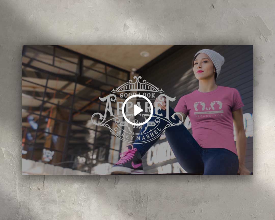
Good Look Apparel Brand Video
Video Production
Brand Video
Brand Campaign · Video Production · Visual Storytelling
Role: Art Director / Video Editing
Client: Good Look Apparel
Brand Overview
Good Look Apparel is a forward-thinking custom boot brand that treats footwear as a form of artistic expression. During the COVID season—when physical retail and traditional fashion marketing were disrupted—the brand needed a compelling visual narrative to maintain presence, connect emotionally with its audience, and reinforce its creative identity.
Strategy Components
1. Campaign Purpose & Context
The brand video was created to promote Good Look Apparel during a period of uncertainty and isolation, using storytelling to keep the brand culturally relevant and emotionally resonant despite limited in-person engagement.
2. Creative Direction & Tone
The video leaned into mood, texture, and atmosphere—positioning the boots not just as products, but as wearable art and self-expression. The tone was introspective and cinematic, reflecting both the moment in time and the brand’s artistic philosophy.
3. Visual Storytelling Approach
Rather than traditional product-forward advertising, the video focused on form, movement, and detail—highlighting craftsmanship, silhouette, and individuality. Close-ups and pacing were used to create intimacy and connection, allowing the audience to feel the brand rather than be sold to.
4. Production & Execution
The piece was edited to balance rhythm and restraint, using visual flow and music to guide the narrative. The final execution was designed to perform across digital channels, including social media and web, where attention and emotional impact mattered most during the pandemic period.
Outcome
The brand video successfully reinforced Good Look Apparel’s identity as a creative, art-driven footwear brand during a challenging cultural moment. By prioritizing emotion and expression over hard selling, the campaign helped maintain brand relevance, deepen audience connection, and showcase the power of storytelling-driven fashion marketing.
Heading 1
Heading 2
Heading 3
Heading 4
Heading 5
Heading 6
Lorem ipsum dolor sit amet, consectetur adipiscing elit, sed do eiusmod tempor incididunt ut labore et dolore magna aliqua. Ut enim ad minim veniam, quis nostrud exercitation ullamco laboris nisi ut aliquip ex ea commodo consequat. Duis aute irure dolor in reprehenderit in voluptate velit esse cillum dolore eu fugiat nulla pariatur.
Block quote
Ordered list
- Item 1
- Item 2
- Item 3
Unordered list
- Item A
- Item B
- Item C
Bold text
Emphasis
Superscript
Subscript
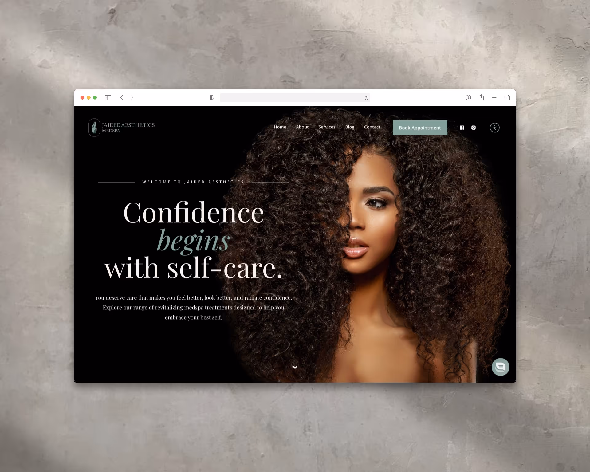
Jaided Aesthetics Website Design
Web Design
MedSpa Website
Website Design · Brand Experience · Conversion-Focused UX
Role: Art Director / Web Designer
Client: Jaided Aesthetics MedSpa (Corona, CA)
Brand Overview
Jaided Aesthetics MedSpa is a modern medical spa offering personalized aesthetic and wellness treatments—including advanced skincare, injectables, weight loss, IV therapy, and hair restoration. The brand is rooted in confidence, self-care, and approachability, aiming to make high-quality aesthetic treatments feel empowering rather than intimidating.
Strategy Components
1. Website Purpose & Positioning
The website was designed to serve as both a brand introduction and a streamlined booking experience. The goal was to communicate medical credibility while maintaining warmth and accessibility—helping potential clients feel confident taking the next step.
2. Visual Identity & Messaging
Clean layouts, calming imagery, and refined typography were used to establish trust and professionalism. Messaging emphasized empowerment and self-confidence, reinforcing the idea that aesthetic care is a personal investment rather than a luxury indulgence.
3. UX / UI Design Strategy
- Clear service segmentation across skincare, injectables, wellness, and hair restoration
- Intuitive navigation to guide users from discovery to decision
- Prominent CTAs to support appointment scheduling and consultations
- Mobile-first responsive design to accommodate on-the-go users
4. Content Structure & Trust Building
Detailed service descriptions explain benefits and process, reducing friction for first-time visitors. Blog content and testimonials support credibility and position the brand as both knowledgeable and client-focused.
5. Performance & Optimization
The site was built with SEO and accessibility in mind, using clear hierarchy, readable typography, and structured content to support organic discovery and conversion.
Outcome
The finished website delivered a polished, confidence-building digital presence that aligned with Jaided Aesthetics’ brand values. By pairing empathetic messaging with conversion-focused UX, the site encourages new clients to engage, explore services, and book appointments with ease—strengthening the medspa’s position in a competitive local market.
Heading 1
Heading 2
Heading 3
Heading 4
Heading 5
Heading 6
Lorem ipsum dolor sit amet, consectetur adipiscing elit, sed do eiusmod tempor incididunt ut labore et dolore magna aliqua. Ut enim ad minim veniam, quis nostrud exercitation ullamco laboris nisi ut aliquip ex ea commodo consequat. Duis aute irure dolor in reprehenderit in voluptate velit esse cillum dolore eu fugiat nulla pariatur.
Block quote
Ordered list
- Item 1
- Item 2
- Item 3
Unordered list
- Item A
- Item B
- Item C
Bold text
Emphasis
Superscript
Subscript
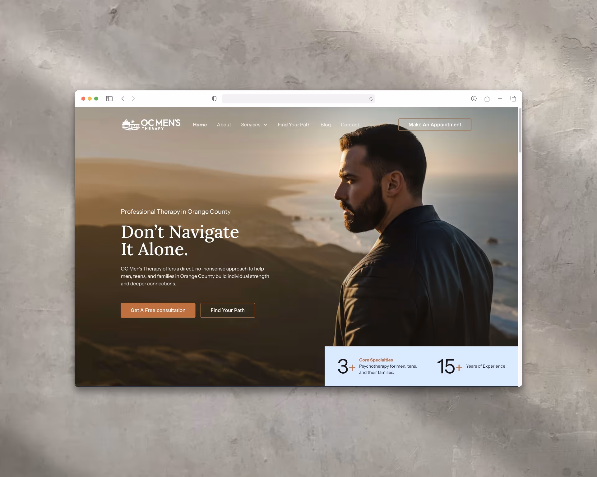
OC Men's Therapy Website Design
Web Design
Website Design
Client: OC Men’s Therapy
Website: oc-mens-therapy.webflow.io
Role: Brand & Web Designer
Scope: UX/UI Design, Visual Design, Content Strategy, SEO
Overview
I designed the website for OC Men’s Therapy to establish a modern, approachable digital presence that speaks directly to men seeking mental health support in Orange County. The site was created to reduce stigma, build trust, and encourage action—balancing emotional accessibility with professionalism, discretion, and clarity.
Website Strategy & Tone
The design emphasizes confidence, openness, and calm assurance. Clean layouts and bold typography establish credibility and strength, while generous spacing and restrained visuals create a supportive, non-clinical environment. Messaging uses direct, empowering language to meet men where they are—reframing therapy as a proactive step toward growth rather than a last resort.
Visual Identity Integration
The website extends the brand’s visual language, drawing on themes of resilience, balance, and forward momentum established in the identity system. Subtle coastal cues and restrained color usage reinforce local context without distraction, keeping the focus on clarity, trust, and connection.
Structure & User Experience
The site architecture was designed to guide users from reassurance to action with minimal friction:
- Home: Clear value proposition centered on understanding, support, and progress
- About: Human-centered introduction to the practice’s philosophy, qualifications, and commitment to confidentiality
- Services: Focus areas including anxiety, stress, relationships, trauma, identity, and career transitions
- Process & FAQs: Straightforward explanation of what to expect, reducing uncertainty and hesitation
- Contact & Booking: Streamlined inquiry flow with clear next steps for scheduling
Performance & Accessibility
The site is fully responsive and mobile-first, recognizing that many users seek support on their phones. Readable typography, intuitive navigation, and thoughtful spacing ensure accessibility and ease of use. SEO best practices were applied to support local discoverability around men’s therapy and counseling services in Orange County.
Outcome
The finished website provides OC Men’s Therapy with a credible, empathetic, and action-oriented digital presence. It creates a safe, modern entry point for men seeking support—helping normalize therapy while positioning the practice as a trusted, professional resource within the local community.
This project highlights my ability to translate brand strategy into a clear, effective digital experience that balances emotional sensitivity with real-world conversion goals.
Heading 1
Heading 2
Heading 3
Heading 4
Heading 5
Heading 6
Lorem ipsum dolor sit amet, consectetur adipiscing elit, sed do eiusmod tempor incididunt ut labore et dolore magna aliqua. Ut enim ad minim veniam, quis nostrud exercitation ullamco laboris nisi ut aliquip ex ea commodo consequat. Duis aute irure dolor in reprehenderit in voluptate velit esse cillum dolore eu fugiat nulla pariatur.
Block quote
Ordered list
- Item 1
- Item 2
- Item 3
Unordered list
- Item A
- Item B
- Item C
Bold text
Emphasis
Superscript
Subscript
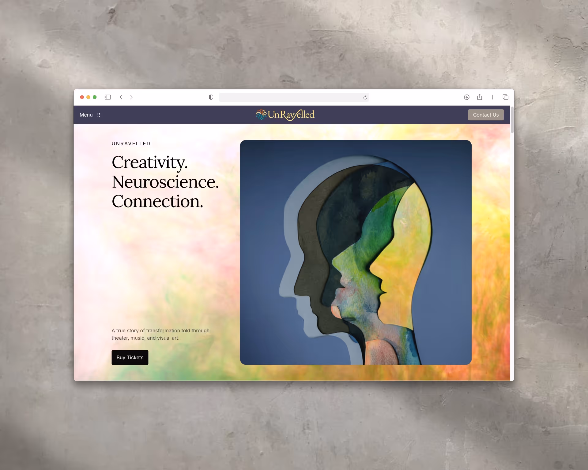
UnRavelled Website Design
Web Design
Stage Play Website
Client: UnRavelled (Original Stage Play)
Creators: Jake Broder & Cath Brittan
Role: Digital Designer
Scope: Website Design, Visual Storytelling, UX/UI
Overview
UnRavelled is an original stage play that explores memory, love, and dementia through the intersection of science and art. Inspired by real stories rooted in neuroscience and human experience, the production required a digital presence that could reflect its emotional depth while remaining accessible to theater audiences, educators, and advocates. The website needed to feel thoughtful, cultural, and human—positioning the play as both a performance and a conversation starter.
Creative Approach
Concept & Narrative Structure
The website was designed as a digital extension of the stage itself. Visual layering, soft fragmentation, and restrained motion were used to echo themes of memory, loss, and emotional unraveling. Story-driven sections guide visitors through the play’s purpose, themes, and impact—mirroring the narrative arc of the production without overwhelming the user.
Typography & Visual Tone
Typography balances cinematic elegance with clarity. Expressive headline type evokes theatrical weight and emotion, while clean, readable body copy ensures accessibility across audiences—from theatergoers to academic and advocacy communities.
Color & Atmosphere
A subdued, cinematic color palette of deep neutrals, soft gradients, and warm highlights was selected to reflect the play’s emotional gravity. Contrast was used intentionally to guide attention toward key actions such as ticketing, performance details, and press engagement, while maintaining sensitivity to accessibility standards.
Audience-Focused Design
The site was structured to serve multiple audiences with ease:
- Theatergoers: Clear access to performance dates, venues, and ticketing
- Educators & Advocates: Contextual content around neuroscience, memory, and dementia
- Press & Media: Centralized access to reviews, interviews, and press materials
The experience was fully responsive, ensuring visual integrity and usability across mobile, tablet, and desktop.
Outcome
The final website provided UnRavelled with a refined digital presence that matched the sophistication and emotional resonance of the production itself. By blending storytelling with intuitive UX, the site became a central platform for audience engagement, ticket sales, and cultural outreach.
This project demonstrates my ability to translate complex, emotionally driven subject matter into a clear, respectful, and visually compelling digital experience—balancing art, narrative, and usability within a single system.
Heading 1
Heading 2
Heading 3
Heading 4
Heading 5
Heading 6
Lorem ipsum dolor sit amet, consectetur adipiscing elit, sed do eiusmod tempor incididunt ut labore et dolore magna aliqua. Ut enim ad minim veniam, quis nostrud exercitation ullamco laboris nisi ut aliquip ex ea commodo consequat. Duis aute irure dolor in reprehenderit in voluptate velit esse cillum dolore eu fugiat nulla pariatur.
Block quote
Ordered list
- Item 1
- Item 2
- Item 3
Unordered list
- Item A
- Item B
- Item C
Bold text
Emphasis
Superscript
Subscript
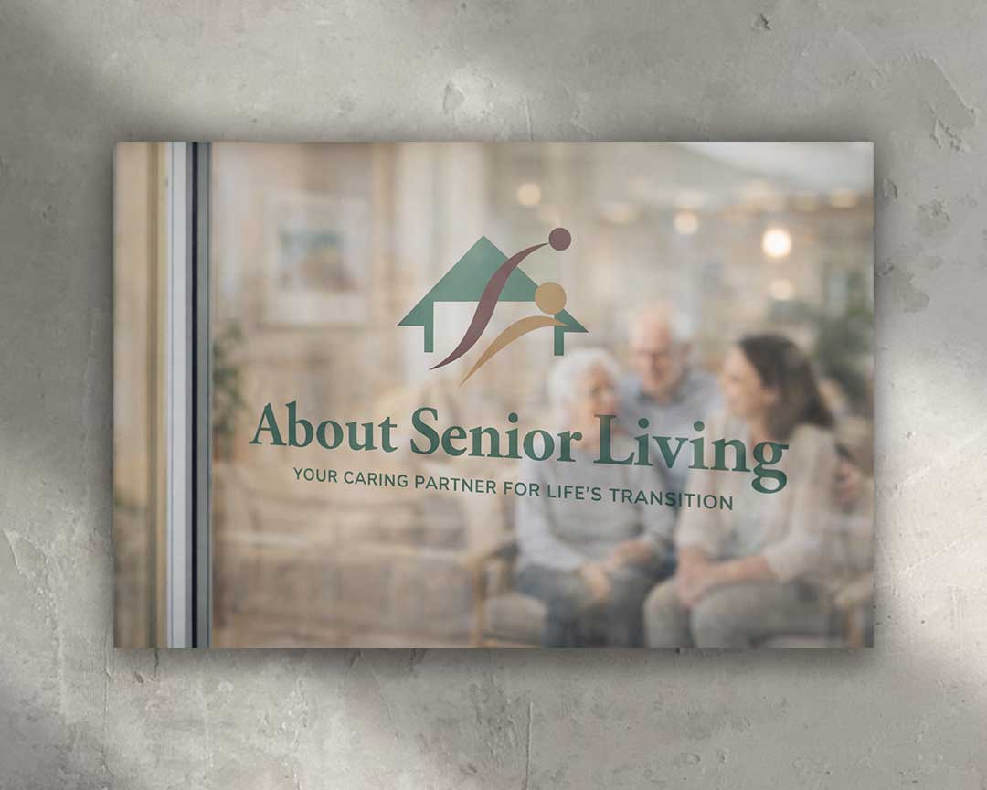
About Senior Living Logo Design
Logo Design
Brand Identity
Client: About Senior Living
Role: Brand Identity Designer
Scope: Logo Design, Visual Identity, Brand Foundations
Overview
About Senior Living is a guidance-focused brand dedicated to supporting individuals and families through one of life’s most important transitions. The identity was designed to communicate trust, compassion, and clarity—balancing professionalism with warmth to reflect both the emotional and practical realities of senior living decisions.
Concept & Symbolism
The mark combines a simplified home form with two abstract human figures in motion, representing connection, care, and partnership. The upward movement suggests progress, reassurance, and forward momentum, while the shared path reinforces the brand’s role as a steady guide rather than a transactional service. Together, the symbol communicates both independence and support—core values within the senior living journey.
Typography & Tone
The wordmark uses a refined serif typeface to convey credibility, stability, and experience. Generous spacing and soft proportions keep the tone calm and approachable, avoiding anything overly clinical. The supporting line, “Your Caring Partner for Life’s Transition,” reinforces the brand’s advisory role and emotional intelligence.
Color Palette
Muted greens and natural earth tones were selected to evoke balance, calm, and trust. The palette feels grounded and reassuring, aligning the brand more closely with care and guidance than institutional healthcare—helping families feel supported rather than overwhelmed.
Versatility & Application
The identity was designed to scale seamlessly across digital, print, and environmental applications. The icon functions independently for signage, wayfinding, and digital use, while the full lockup maintains clarity and presence across marketing materials. Subtle transparency and soft-focus treatments allow the brand to integrate naturally into real-world environments.
Outcome
The final identity positions About Senior Living as a compassionate, credible partner—clear in purpose, human in tone, and visually aligned with the sensitivity of the decisions it supports. The system provides a strong foundation for trust-building, long-term engagement, and brand recognition across touchpoints.
Heading 1
Heading 2
Heading 3
Heading 4
Heading 5
Heading 6
Lorem ipsum dolor sit amet, consectetur adipiscing elit, sed do eiusmod tempor incididunt ut labore et dolore magna aliqua. Ut enim ad minim veniam, quis nostrud exercitation ullamco laboris nisi ut aliquip ex ea commodo consequat. Duis aute irure dolor in reprehenderit in voluptate velit esse cillum dolore eu fugiat nulla pariatur.
Block quote
Ordered list
- Item 1
- Item 2
- Item 3
Unordered list
- Item A
- Item B
- Item C
Bold text
Emphasis
Superscript
Subscript

Jaided Aesthetics Logo Design
Logo Design
Brand Identity
Client: Jaided Aesthetics MedSpa
Role: Art Director / Designer
Scope: Logo Design, Brand Identity, Visual System
Overview
Jaided Aesthetics MedSpa is a modern, client-focused wellness brand dedicated to enhancing natural beauty and confidence through advanced aesthetic treatments. The brand needed an identity that felt elevated yet approachable—luxurious without intimidation—reflecting both the science behind aesthetic care and the emotional transformation clients experience. The name “Jaided” plays on individuality and self-expression, positioning the brand as confident, memorable, and empowering.
Creative Approach
Concept & Symbolism
The logo centers on a stylized flame-like leaf encased within an oval frame. The form symbolizes renewal, vitality, and transformation—core values of aesthetic and wellness treatments. Interwoven vertical lines suggest balance, restoration, and the layered journey of personal care, while the oval enclosure conveys protection, trust, and holistic well-being. The mark balances artistry with clinical precision.
Typography & Brand Voice
A refined, all-caps serif typeface was selected to convey professionalism, credibility, and timeless elegance. Clean spacing and restrained letterforms keep the identity feeling modern and confident. The tagline, “Let’s Get You Jaided,” introduces personality and approachability—softening the luxury tone with a playful, memorable edge.
Color Palette
A muted sage green palette was chosen to communicate calm, healing, and natural balance. The understated color system reinforces luxury without excess, appealing to clients who value subtlety, wellness, and refinement. The monochromatic approach also ensures flexibility across digital and physical environments.
Versatility & Application
The identity system was designed to scale seamlessly across all touchpoints—including signage, packaging, digital platforms, and social media. The emblem functions effectively as a standalone icon for treatments, merchandise, and brand moments, while the full lockup provides a polished, cohesive brand presence.
Outcome
The final brand identity positioned Jaided Aesthetics as both elevated and welcoming—reflecting trust, transformation, and modern wellness. The system supports long-term growth while maintaining clarity and consistency across platforms.
Heading 1
Heading 2
Heading 3
Heading 4
Heading 5
Heading 6
Lorem ipsum dolor sit amet, consectetur adipiscing elit, sed do eiusmod tempor incididunt ut labore et dolore magna aliqua. Ut enim ad minim veniam, quis nostrud exercitation ullamco laboris nisi ut aliquip ex ea commodo consequat. Duis aute irure dolor in reprehenderit in voluptate velit esse cillum dolore eu fugiat nulla pariatur.
Block quote
Ordered list
- Item 1
- Item 2
- Item 3
Unordered list
- Item A
- Item B
- Item C
Bold text
Emphasis
Superscript
Subscript
OC Men's Therapy Logo Design
Logo Design
Brand Identity System
Client: OC Men’s Therapy
Role: Brand Identity Designer
Scope: Logo Design, Visual Identity, Brand Foundations
Overview
OC Men’s Therapy is a specialized counseling practice dedicated to supporting men in Orange County as they navigate personal challenges with strength, balance, and authenticity. The brand identity was designed to feel grounded, confident, and approachable—creating a masculine, stigma-free space that encourages emotional growth and forward progress.
Concept & Symbolism
The logo centers on a pier silhouette paired with flowing ocean waves and a rising sun. Each element carries intentional meaning:
- Pier: Stability, structure, and grounded support—symbolizing a steady foundation during times of uncertainty
- Waves: Emotional depth, movement, and the natural ebb and flow of personal growth
- Rising Sun: Renewal, clarity, and momentum—representing hope and forward motion
Together, these elements communicate resilience and optimism while visually mirroring the therapeutic journey. The pier also anchors the brand locally, referencing Orange County’s coastal identity.
Typography & Style
Bold, modern sans-serif typography conveys confidence, clarity, and directness. Emphasis on “MEN’S” establishes focus and intent, while the softer treatment of “THERAPY” creates balance and approachability. The typographic hierarchy reinforces professionalism while remaining accessible to men seeking results-oriented, straightforward support.
Color Palette
A restrained palette of deep slate gray, clean white, and warm orange was chosen to balance strength and openness:
- Slate Gray: Stability, seriousness, and trust
- White: Clarity, transparency, and calm
- Warm Orange: Energy, encouragement, and renewal
This combination reinforces the brand’s promise of growth through guidance—strong without being intimidating, supportive without feeling clinical.
Versatility & Application
The identity system was designed to scale seamlessly across digital, print, and environmental applications. The pier-and-sun mark functions effectively as both a primary logo and a standalone icon for social media, signage, and mobile contexts. Strong geometry and balanced proportions ensure clarity, recognition, and consistency at any size.
Outcome
The final identity positions OC Men’s Therapy as a modern, trusted counseling practice that speaks directly to its audience. The brand communicates confidence, care, and forward movement—visually and emotionally aligned with the men it serves.
Heading 1
Heading 2
Heading 3
Heading 4
Heading 5
Heading 6
Lorem ipsum dolor sit amet, consectetur adipiscing elit, sed do eiusmod tempor incididunt ut labore et dolore magna aliqua. Ut enim ad minim veniam, quis nostrud exercitation ullamco laboris nisi ut aliquip ex ea commodo consequat. Duis aute irure dolor in reprehenderit in voluptate velit esse cillum dolore eu fugiat nulla pariatur.
Block quote
Ordered list
- Item 1
- Item 2
- Item 3
Unordered list
- Item A
- Item B
- Item C
Bold text
Emphasis
Superscript
Subscript
UnRavelled Logo Design
Logo Design
Brand Overview
Rock, Candy, Scissors is a vibrant and edgy hair salon that blends bold creativity with feminine flair. The brand name playfully twists the classic game "rock, paper, scissors" into a statement of style and empowerment. Catering to a diverse clientele seeking standout hair transformations, the salon embodies confidence, individuality, and a touch of sweetness.
Creative Approach
1. Concept & Symbolism
The logo ingeniously utilizes typography to form the silhouette of a woman's head, capturing the essence of a freshly styled hairdo. The integration of pink lips adds a pop of color and femininity, reinforcing the salon's focus on beauty and self-expression. This design choice not only showcases the salon's artistic approach but also creates an immediate visual connection with its target audience.
2. Typography & Style
The typography is both phenomenal and functional, serving as the primary visual element that shapes the woman's profile. Each letter is thoughtfully crafted to contribute to the overall form, demonstrating the salon's commitment to detail and design excellence. The font choice balances modernity with elegance, appealing to a clientele that values both trendiness and sophistication.
3. Color Palette
A palette of black, white, and vibrant pink is employed to convey professionalism, clarity, and a playful edge. The black and white provide a clean, timeless backdrop, while the pink accents highlight key features like the lips, adding warmth and approachability to the brand identity.
4. Versatility
Designed with adaptability in mind, the logo maintains its impact across various mediums, from signage and business cards to digital platforms and merchandise. Its distinctive silhouette ensures brand recognition, while the typographic elements allow for scalability without loss of detail or clarity.
Heading 1
Heading 2
Heading 3
Heading 4
Heading 5
Heading 6
Lorem ipsum dolor sit amet, consectetur adipiscing elit, sed do eiusmod tempor incididunt ut labore et dolore magna aliqua. Ut enim ad minim veniam, quis nostrud exercitation ullamco laboris nisi ut aliquip ex ea commodo consequat. Duis aute irure dolor in reprehenderit in voluptate velit esse cillum dolore eu fugiat nulla pariatur.
Block quote
Ordered list
- Item 1
- Item 2
- Item 3
Unordered list
- Item A
- Item B
- Item C
Bold text
Emphasis
Superscript
Subscript
Digital Display Banner System
Client: Genesis Motors
Agency: Innocean Worldwide
Role: Senior Graphic Designer
Scope: Digital Display Design, Visual Systems, UX-Informed Layout
Overview
I redesigned a series of digital display banners for Genesis Motors with a focus on elevating brand presence through clarity, restraint, and visual hierarchy. The goal was to move away from cluttered, over-layered banner conventions and instead create a refined, premium system aligned with Genesis’s design-forward brand standards.
Strategic Banner Redesign
Each banner followed a deliberate, top-to-bottom hierarchy designed to guide attention and reinforce brand prestige:
- Genesis Logo: Placed prominently at the top to establish immediate brand recognition and trust
- Hero Vehicle Image: A bold, unobstructed presentation of the G70, given generous negative space to maximize visual impact
- Offer Messaging: Clear, concise copy tailored to campaign context (e.g., Year-End Event, Genesis Cares, Exclusive Offer)
- Call to Action: Reimagined as a full-width horizontal bar rather than a traditional button, creating a confident, modern interaction cue that echoed digital luxury
Consistency Across Campaigns
While messaging shifted by campaign, all banners shared a unified design language that:
- Reinforced Genesis’s premium tone
- Kept the vehicle as the visual centerpiece
- Mirrored layout principles and typography used across Genesis’s broader digital and print ecosystem
The G70 model name was featured consistently, aligning with how Genesis integrates vehicle identity across its branding system.
UX & Platform Considerations
- Designed across multiple IAB standard sizes (leaderboard, MPU, skyscraper, and more)
- Optimized for high-resolution displays with clean compression and fast load times
- Layouts engineered to work seamlessly in both static and animated executions
- Minimalist composition ensured clarity and elegance even in crowded ad environments
Outcome
The banner system delivered a modern, brand-aligned approach to digital advertising that emphasized impact over clutter. The refined hierarchy and restrained design helped Genesis stand out within competitive display placements while reinforcing its positioning as a sophisticated, design-led luxury automotive brand.
This project highlights my ability to translate brand principles into scalable, performance-aware digital assets through strong visual hierarchy and UX-informed design.
Heading 1
Heading 2
Heading 3
Heading 4
Heading 5
Heading 6
Lorem ipsum dolor sit amet, consectetur adipiscing elit, sed do eiusmod tempor incididunt ut labore et dolore magna aliqua. Ut enim ad minim veniam, quis nostrud exercitation ullamco laboris nisi ut aliquip ex ea commodo consequat. Duis aute irure dolor in reprehenderit in voluptate velit esse cillum dolore eu fugiat nulla pariatur.
Block quote
Ordered list
- Item 1
- Item 2
- Item 3
Unordered list
- Item A
- Item B
- Item C
Bold text
Emphasis
Superscript
Subscript
.avif)
Pharrell William's Black Ambition Instagram Videos
Video Production
HBCU Prize & So Ambitious Tour Videos
Founder: Pharrell Williams
Client: Black Ambition
Role: Motion Designer / Video Editor
Scope: Promotional Video, Social Video, Motion Graphics, Editing
Overview
I created two video assets for Black Ambition’s third-year HBCU initiatives—an organization founded by Pharrell Williams to close opportunity and wealth gaps for Black and Latinx entrepreneurs. The videos supported the launch of the Year 3 HBCU Prize competition and captured the energy of the So Ambitious HBCU Tour, a multi-campus event series designed to inspire and mobilize student founders.
HBCU Prize — Year 3 Promotional Video
Objective
Promote the third year of the HBCU Prize by generating awareness, excitement, and participation among HBCU students and alumni—while reinforcing Black Ambition’s mission, leadership, and national visibility.
Creative Execution
The promo video combined bold kinetic typography, brand-forward color palettes, and motion graphics overlays to communicate eligibility, supported industries, and prize opportunities. Visuals emphasized representation, campus life, and entrepreneurial drive, aligning with the cultural impact and credibility associated with Pharrell’s leadership and Black Ambition’s platform. The pacing was energetic and motivational, optimized for social, email, and presentation use.
So Ambitious HBCU Tour — Social Recap Video
Objective
Capture the momentum and community energy of the So Ambitious HBCU Tour and extend its reach beyond physical campus events.
Creative Execution
I edited still photography from HBCU campuses nationwide into a rhythmic, music-driven montage designed for social platforms. Using Premiere Pro, I unified imagery through color correction and grading, then synced transitions tightly to the beat to reflect the excitement, ambition, and presence of the tour. The edit highlighted student engagement, speakers, and shared moments of inspiration tied to Black Ambition’s broader mission.
Outcome
- The HBCU Prize promotional video supported awareness and application growth, serving as a flexible asset across social media, email campaigns, and live presentations.
- The So Ambitious Tour recap video amplified the impact of the campus series, translating in-person energy into a shareable digital story.
By aligning motion, music, and messaging with a mission led by Pharrell Williams, these videos reinforced Black Ambition’s cultural relevance, credibility, and commitment to empowering the next generation of entrepreneurs.
Heading 1
Heading 2
Heading 3
Heading 4
Heading 5
Heading 6
Lorem ipsum dolor sit amet, consectetur adipiscing elit, sed do eiusmod tempor incididunt ut labore et dolore magna aliqua. Ut enim ad minim veniam, quis nostrud exercitation ullamco laboris nisi ut aliquip ex ea commodo consequat. Duis aute irure dolor in reprehenderit in voluptate velit esse cillum dolore eu fugiat nulla pariatur.
Block quote
Ordered list
- Item 1
- Item 2
- Item 3
Unordered list
- Item A
- Item B
- Item C
Bold text
Emphasis
Superscript
Subscript
Luxury Image Retouch for Social Campaign
Client: Genesis Motors
Agency: Innocean Worldwide
Role: Senior Graphic Designer
Scope: High-End Image Retouching, Compositing, Social-First Visual
Overview
Genesis Motors is a luxury automotive brand defined by refined design, progressive engineering, and a minimalist visual language. To support the launch and visual identity of the redesigned Genesis G90—its flagship sedan—the brand required a hero image that embodied sophistication, restraint, and timeless luxury. The final asset was developed for Instagram, aligning with Genesis’s elevated, editorial social presence.
Creative Approach
Complex Retouching & Scene Reconstruction
The original raw image featured a strong foundation but required extensive, detail-driven retouching to meet Genesis’s luxury standards. Key challenges included:
- Removing complex plant reflections across curved metallic surfaces without disrupting natural lighting gradients
- Eliminating background clutter and environmental distractions
- Digitally rebuilding architectural elements, including wall extensions where objects were removed
- Extending secondary elements within the frame to rebalance composition and strengthen visual harmony
The image was meticulously reconstructed using advanced masking, clone and healing techniques, digital painting, and gradient refinement—ensuring a flawless, distraction-free presentation of the vehicle.
Black & White Conversion for Brand Alignment
After technical cleanup, the image was converted to black and white to align with Genesis’s timeless, design-forward brand language. Removing color allowed form, light, and materiality to take center stage—highlighting the sculpted body lines and signature Crest Grille. Contrast, tonal range, and highlight control were carefully tuned to preserve depth, elegance, and visual authority.
Outcome
The finished image was published on Genesis’s official Instagram channel, reinforcing the G90’s positioning as a benchmark of modern luxury. The asset blended seamlessly into Genesis’s social feed—clean, bold, and editorial—while demonstrating exceptional attention to detail.
Heading 1
Heading 2
Heading 3
Heading 4
Heading 5
Heading 6
Lorem ipsum dolor sit amet, consectetur adipiscing elit, sed do eiusmod tempor incididunt ut labore et dolore magna aliqua. Ut enim ad minim veniam, quis nostrud exercitation ullamco laboris nisi ut aliquip ex ea commodo consequat. Duis aute irure dolor in reprehenderit in voluptate velit esse cillum dolore eu fugiat nulla pariatur.
Block quote
Ordered list
- Item 1
- Item 2
- Item 3
Unordered list
- Item A
- Item B
- Item C
Bold text
Emphasis
Superscript
Subscript
PGN Agency Harley-Davidson Marketing Brochure
Print Design
Outreach Brochure
Client: PGN Agency
Audience: Harley-Davidson Dealers
Role: Senior Graphic Designer
Scope: Print Design, Brand Storytelling, B2B Marketing Collateral
Overview
I designed a quad-fold outreach brochure for PGN Agency to support new and prospective Harley-Davidson dealer relationships. The piece needed to resonate immediately with dealers by reflecting the culture, values, and mindset of the Harley brand—while clearly communicating PGN’s long-standing expertise and performance-driven success within the dealer network.
Design Tone & Format
The brochure was intentionally bold, aggressive, and unapologetically Harley in tone. The quad-fold format unfolds as a narrative, building momentum panel by panel. A color palette inspired by Harley’s iconic orange and black—without replicating trademarked assets—established instant familiarity and credibility.
Angular layouts, confident typography, and dynamic spacing reinforced a sense of motion and power, aligning the visual experience with the energy of the open road and the Harley lifestyle.
Illustration & Craft Detail
Custom, hand-drawn line illustrations of Harley-Davidson motorcycles were incorporated as footer elements throughout the brochure. These fine-line sketches added a layer of authenticity and craftsmanship—echoing the mechanical artistry of the bikes themselves and reinforcing PGN’s respect for the brand’s heritage.
Messaging & Dealer Positioning
The content was written to speak directly to Harley dealers, beginning with shared values and culminating in proof of performance.
- Opening Panel: A direct declaration—“Now… Let’s Talk Harley.”—to establish immediate alignment
- Interior Panels: Highlighted PGN’s 15+ year track record with Harley dealers, including a long-term client whose strongest sales year began in 2005
- Messaging emphasized PGN’s deep understanding of the dealer process, rider mentality, and the cultural weight of the Harley brand
A featured quote captured the emotional core of the audience:
“A Harley isn’t just a motorcycle. It’s a brotherhood, an escape, a declaration of independence.”
Call to Action
The final panel featured a message from PGN’s president—a lifelong Harley rider—paired with a confident, results-driven CTA inviting dealers to partner on programs designed to increase sales. Contact details and a strong closing statement reinforced PGN’s direct-response mindset.
Outcome
The brochure became a powerful dealer outreach tool that went beyond service promotion. It reflected a shared passion for the Harley-Davidson lifestyle while grounding that passion in strategy, experience, and measurable results.
Heading 1
Heading 2
Heading 3
Heading 4
Heading 5
Heading 6
Lorem ipsum dolor sit amet, consectetur adipiscing elit, sed do eiusmod tempor incididunt ut labore et dolore magna aliqua. Ut enim ad minim veniam, quis nostrud exercitation ullamco laboris nisi ut aliquip ex ea commodo consequat. Duis aute irure dolor in reprehenderit in voluptate velit esse cillum dolore eu fugiat nulla pariatur.
Block quote
Ordered list
- Item 1
- Item 2
- Item 3
Unordered list
- Item A
- Item B
- Item C
Bold text
Emphasis
Superscript
Subscript
Harley-Davidson Blast Magazine
Branded Content · Editorial Design · Campaign Storytelling
Role: Graphic Designer
Client: Calumet Harley-Davidson
Brand Overview
Calumet Harley-Davidson is more than a dealership—it’s a cultural hub for riders and enthusiasts across the region. Known for its bold personality, rider-first mentality, and deep community ties, the dealership wanted a branded content piece that felt authentic to Harley culture while supporting sales, events, and customer loyalty. That vision became Blast, a monthly magazine designed to sound, look, and feel like it came straight from the road.
Strategy Components
1. Cover Design & Feature Focus
The February issue of Blast centered on two key drivers:
- The return of the Softail Custom to the 2007 Harley-Davidson lineup
- Promotion of the After Inventory Sale
The cover was built for immediate impact, combining a bold Softail Custom hero image with gritty textures, Harley-inspired typography, and clear callouts for sale dates and dealership events. The visual tone was tough, energetic, and unapologetic—designed to resonate with riders and drive in-store traffic.
2. Editorial Layout & Content Design
Inside, the magazine balanced lifestyle storytelling with sales performance:
- Modular layouts allowed monthly flexibility for featured bikes, gear, service specials, and events
- Lifestyle photography and custom graphics reinforced authenticity and rider culture
- Sales-driven content was integrated seamlessly into editorial-style spreads to avoid feeling promotional
The structure supported both storytelling and inventory movement, helping the magazine feel like a rider’s insider publication rather than a traditional dealership flyer.
3. Voice, Tone & Community Connection
Copywriting reflected Calumet’s rebellious, rider-first voice—casual, confident, and community-driven. Editorial intros and feature copy leaned into Harley’s independence-driven mindset, reinforcing the emotional connection between the brand, the dealership, and its riders.
4. Campaign Utility & Longevity
Blast was designed as a repeatable branded system, allowing Calumet to publish monthly issues that adapted to new inventory, promotions, and seasonal campaigns while maintaining a consistent visual and tonal identity.
Outcome
Blast became a signature branded asset for Calumet Harley-Davidson—part magazine, part cultural touchpoint. It helped drive post-inventory sales during slower periods, strengthened customer loyalty, and reinforced the dealership’s position as a genuine extension of Harley culture.
This project demonstrates my ability to design multi-page branded editorial campaigns, capture the voice of a distinct subculture, and align visual storytelling with real-world business objectives in a retail and lifestyle-driven environment.
Heading 1
Heading 2
Heading 3
Heading 4
Heading 5
Heading 6
Lorem ipsum dolor sit amet, consectetur adipiscing elit, sed do eiusmod tempor incididunt ut labore et dolore magna aliqua. Ut enim ad minim veniam, quis nostrud exercitation ullamco laboris nisi ut aliquip ex ea commodo consequat. Duis aute irure dolor in reprehenderit in voluptate velit esse cillum dolore eu fugiat nulla pariatur.
Block quote
Ordered list
- Item 1
- Item 2
- Item 3
Unordered list
- Item A
- Item B
- Item C
Bold text
Emphasis
Superscript
Subscript
Frenchcrete Brochure
Print Design
Textured Concrete Brochure
Agency: PGN Agency
Client: Frenchcrete Concrete Specialists
Role: Graphic Designer
Scope: Print Design, Marketing Collateral, Visual Storytelling
Overview
I designed a four-page marketing brochure for Frenchcrete, a legacy concrete and home improvement company established in 1968. The piece was created to introduce and promote their Textured Concrete Services through a refined, image-driven format that communicated both durability and design sophistication.
Creative Direction
The brochure elevates textured concrete from a purely functional service to a customizable design solution. The visual approach balances lifestyle inspiration with practical clarity—helping homeowners envision how concrete can enhance both aesthetics and long-term value.
Format & Structure
- Cover: A stamped concrete patio set within a landscaped environment, framed by ornamental accents and a clean, editorial layout.
- Interior Spread:
- A pattern showcase highlighting seven popular textured concrete styles using labeled swatches for easy comparison.
- A service application section featuring four core uses—driveways, patios, walkways, and poolside—supported by real project photography.
- Back Cover: Reinforced Frenchcrete’s credibility and longevity, with contact information and a soft introduction to additional services including roofing, windows, additions, and decks.
Visual Design & Color Strategy
Frenchcrete’s signature deep red was used strategically to anchor headlines, section dividers, and calls to action. Imagery was curated to complement the palette—featuring warm brick, stone, and earth tones that reinforced craftsmanship and visual cohesion.
Typography & Hierarchy
A combination of modern serif and clean sans-serif type balanced heritage with accessibility. Content was structured into clear, scannable sections, allowing homeowners to quickly browse options, understand benefits, and visualize outcomes without feeling overwhelmed.
Outcome
The final brochure delivered a polished, versatile sales and marketing tool that clearly communicated Frenchcrete’s expertise, design range, and customer-first approach. The pattern swatch section supported confident decision-making, while lifestyle photography created emotional connection—strengthening brand credibility and supporting in-person sales conversations.
Heading 1
Heading 2
Heading 3
Heading 4
Heading 5
Heading 6
Lorem ipsum dolor sit amet, consectetur adipiscing elit, sed do eiusmod tempor incididunt ut labore et dolore magna aliqua. Ut enim ad minim veniam, quis nostrud exercitation ullamco laboris nisi ut aliquip ex ea commodo consequat. Duis aute irure dolor in reprehenderit in voluptate velit esse cillum dolore eu fugiat nulla pariatur.
Block quote
Ordered list
- Item 1
- Item 2
- Item 3
Unordered list
- Item A
- Item B
- Item C
Bold text
Emphasis
Superscript
Subscript
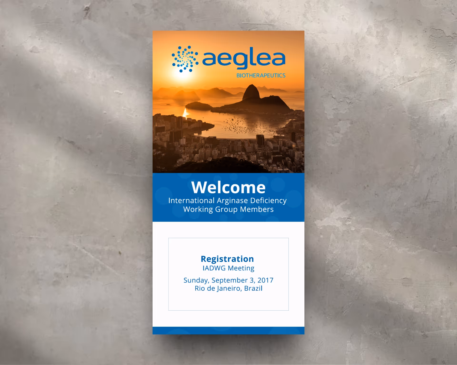
Aeglea Biotherapeutics Banner Design
Print Design
IADWG Meeting Banner
Client: Aeglea Biotherapeutics
Audience: International Arginase Deficiency Working Group (IADWG)
Role: Graphic Designer
Scope: Large-Format Environmental Design, Event Branding
Overview
I designed a large-format welcome banner for Aeglea Biotherapeutics to greet attendees of the International Arginase Deficiency Working Group (IADWG) Meeting in Rio de Janeiro. Positioned at the event venue entrance, the banner served as a first point of contact for international researchers and clinicians—setting a tone of warmth, professionalism, and global collaboration.
Purpose & Messaging
The primary objective was to create a clear, welcoming message that immediately oriented attendees while reinforcing Aeglea’s role as a convener and supporter of the rare disease research community.
The headline directly addressed IADWG members, with supporting information clearly presenting the meeting location and registration date to ensure consistency and ease of navigation for arriving guests.
Visual Direction
The design centered on a sunset landscape of Rio de Janeiro, selected to evoke a sense of arrival, optimism, and place. The imagery grounded the event in its host city while symbolizing global connection and forward momentum in rare disease research.
Color balance and contrast were carefully adjusted to maintain text legibility and visual impact at large scale.
Brand Alignment
Aeglea’s logo, typography, and color accents were integrated seamlessly to maintain brand integrity across a prominent environmental application. The layout emphasized hierarchy and distance readability, ensuring the banner performed effectively in a high-traffic conference environment.
Outcome
The final banner created an inviting and cohesive welcome experience for international attendees, reinforcing the collaborative and mission-driven nature of the meeting. It reflected Aeglea Biotherapeutics’ commitment to global research partnerships and demonstrated my ability to deliver brand-aligned, large-format design for scientific and medical environments.
Heading 1
Heading 2
Heading 3
Heading 4
Heading 5
Heading 6
Lorem ipsum dolor sit amet, consectetur adipiscing elit, sed do eiusmod tempor incididunt ut labore et dolore magna aliqua. Ut enim ad minim veniam, quis nostrud exercitation ullamco laboris nisi ut aliquip ex ea commodo consequat. Duis aute irure dolor in reprehenderit in voluptate velit esse cillum dolore eu fugiat nulla pariatur.
Block quote
Ordered list
- Item 1
- Item 2
- Item 3
Unordered list
- Item A
- Item B
- Item C
Bold text
Emphasis
Superscript
Subscript
Holiday Service & Performance Mailer
Branded Content · Print Campaign · Promotional Storytelling
Role: Graphic Designer
Client: Boswell’s Harley-Davidson
Brand Overview
Boswell’s Harley-Davidson is a high-volume, performance-driven dealership with deep credibility in the riding community. Known for its bold, no-nonsense personality and focus on power, upgrades, and service, Boswell’s needed a magazine-style direct mail piece that would hit with maximum impact—promoting Holiday Service and Performance Specials while staying true to Harley culture.
Strategy Components
1. Concept & Layout Strategy
The piece was designed as a mini-magazine experience—something that felt substantial and impossible to ignore when it landed in the mailbox. The layout embraced an intentionally aggressive visual system, using bold overlaps, dense imagery, and a controlled chaos grid to mirror the raw energy of the Harley lifestyle.
Typography played a central role, with heavy, sharp-edged, all-caps headlines that projected confidence and urgency. The overall tone was loud, direct, and rider-focused—built to demand attention rather than politely request it.
2. Campaign Messaging & Value Stack
At the core of the mailer was a high-impact headline that set the tone immediately:
“Feast on the Savings during Boswell’s Holiday Service and Performance Specials!”
Supporting callouts reinforced value and performance, including:
- Save BIG on Genuine Harley-Davidson Upgrades
- Add Torque and Horsepower to Your Ride—Let Boswell’s Pros Do the Work
A stacked offer structure clearly communicated incentives such as MSRP pricing, zero-interest financing, deferred payments, and no money down—paired with a strong CTA and a one-year unlimited mileage service warranty to build trust and urgency.
3. Visual Treatment & Brand Consistency
The design leaned fully into Boswell’s fearless brand identity:
- Full-bleed photography of Harley models and performance components
- Gritty textures, overlays, and shadows to create depth and attitude
- Angled layouts and layered elements to simulate motion and horsepower
While visually aggressive, the system remained brand-consistent—balancing intensity with clarity so offers were immediately understandable.
4. Print Execution & Campaign Utility
The mailer was engineered for real-world performance, with clear hierarchy, readable offers, and layouts optimized for fast scanning. The magazine-style format supported extended engagement while still driving immediate action.
Outcome
The mailer delivered exactly as intended—bold, high-energy, and impossible to overlook. It energized riders during the holiday season, drove in-store visits and service bookings, and reinforced Boswell’s position as a performance-first Harley dealership that speaks directly to its community.
This project demonstrates my ability to combine aggressive promotional strategy, editorial-style layout, and culturally authentic design into a cohesive, high-performance print campaign that delivers both brand impact and measurable results.
Heading 1
Heading 2
Heading 3
Heading 4
Heading 5
Heading 6
Lorem ipsum dolor sit amet, consectetur adipiscing elit, sed do eiusmod tempor incididunt ut labore et dolore magna aliqua. Ut enim ad minim veniam, quis nostrud exercitation ullamco laboris nisi ut aliquip ex ea commodo consequat. Duis aute irure dolor in reprehenderit in voluptate velit esse cillum dolore eu fugiat nulla pariatur.
Block quote
Ordered list
- Item 1
- Item 2
- Item 3
Unordered list
- Item A
- Item B
- Item C
Bold text
Emphasis
Superscript
Subscript

Kim Price Realty Website Design
Web Design
Commercial Real Estate Website
Client: Kim Price Realty
Role: Art Director / Web Designer
Scope: Website Design, UX/UI, Lead Generation
Overview
Kim Price Realty is a commercial real estate brokerage based in Orange County, California, with over 20 years of experience across retail, industrial, office, and specialty-use leasing. As a solo broker operating in a competitive market, Kim needed a professional, credible website that clearly communicated her expertise, showcased active listings, and made it easy for potential clients to engage.
Creative Approach
Website Strategy & Design
The site was designed to function as both a digital brand presence and a practical business tool. I created a clean, modern layout that reflects Kim’s experience and professionalism while remaining approachable and easy to navigate. Careful attention was paid to typography, spacing, and hierarchy to ensure clarity and trust at every touchpoint. See style guide
Structure & User Experience
The site architecture was built for speed, clarity, and conversion across desktop and mobile:
- Home: Strong headline and introductory copy positioning Kim as a trusted commercial real estate partner
- About: Highlights 20+ years of experience and core focus areas to quickly establish credibility
- Property Listings: A clean, scannable layout for featured properties, emphasizing square footage, use type, location, and availability
- Contact: Simple, user-friendly contact form, clickable details, and embedded map for context
Performance & Usability
The website was built with SEO best practices, semantic structure, and optimized assets for fast load times. A mobile-first responsive layout ensures consistent usability across devices. A QR code—used on business cards and printed materials—links directly to the site, reinforcing cross-channel consistency and ease of access.
Outcome
The finished website provided Kim Price Realty with a polished, professional online presence that aligns with her real-world reputation. It supports day-to-day business by helping prospects quickly evaluate listings, understand services, and initiate contact with confidence.
Heading 1
Heading 2
Heading 3
Heading 4
Heading 5
Heading 6
Lorem ipsum dolor sit amet, consectetur adipiscing elit, sed do eiusmod tempor incididunt ut labore et dolore magna aliqua. Ut enim ad minim veniam, quis nostrud exercitation ullamco laboris nisi ut aliquip ex ea commodo consequat. Duis aute irure dolor in reprehenderit in voluptate velit esse cillum dolore eu fugiat nulla pariatur.
Block quote
Ordered list
- Item 1
- Item 2
- Item 3
Unordered list
- Item A
- Item B
- Item C
Bold text
Emphasis
Superscript
Subscript
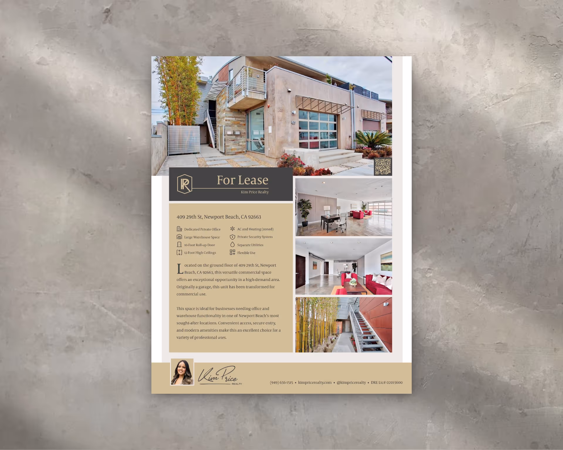
Kim Price Realty Flyer and Business Card
Print Design
Business Card & Promotional Flyer
Client: Kim Price Realty
Role: Senior Graphic Designer
Scope: Print Design, Brand Collateral, Premium Production
Overview
Kim Price Realty is a seasoned commercial real estate brokerage based in Orange County, California, with over 20 years of experience operating in one of the most competitive markets in the country. To reflect Kim’s credibility, personal approach, and high level of service, I designed a business card and promotional flyer that balanced sophistication with accessibility—elevated further through premium print materials and finishes.
Creative Approach
Business Card Design
The business card was designed as both a personal introduction and a polished brand statement. A double-sided layout features a full photo of Kim Price on one side to reinforce trust and recognition, with contact details and a QR code on the reverse for quick digital access to her website.
The card uses a matte black background with clean, restrained typography to convey professionalism without excess. Printed on thick, soft-touch stock, the tactile finish adds a subtle sense of luxury, ensuring the card stands out both visually and physically.
Promotional Flyer — Lease Listing
The flyer was created to promote an active commercial lease while reinforcing Kim’s broader brand story and market expertise.
- The top section introduces Kim’s role with the headline: “Your Commercial Real Estate Partner in Orange County”
- Supporting copy highlights her two decades of experience and range of commercial property specialties
- The main body presents property details in a clear, scannable layout ideal for quick decision-making
- A strong call to action encourages inquiries via form submission or QR code scan
Visually, the flyer mirrors the business card’s aesthetic—matte black foundation with refined gold and white accents—ensuring consistency across touchpoints. Like the card, it was printed on heavy, soft-touch matte stock to maintain a premium feel.
Outcome
The business card and flyer worked together to elevate Kim Price Realty’s brand presence, combining professionalism, personal connection, and market authority. The premium print finishes reinforced the caliber of her services, while the QR integration created a seamless bridge between print and digital engagement.
Heading 1
Heading 2
Heading 3
Heading 4
Heading 5
Heading 6
Lorem ipsum dolor sit amet, consectetur adipiscing elit, sed do eiusmod tempor incididunt ut labore et dolore magna aliqua. Ut enim ad minim veniam, quis nostrud exercitation ullamco laboris nisi ut aliquip ex ea commodo consequat. Duis aute irure dolor in reprehenderit in voluptate velit esse cillum dolore eu fugiat nulla pariatur.
Block quote
Ordered list
- Item 1
- Item 2
- Item 3
Unordered list
- Item A
- Item B
- Item C
Bold text
Emphasis
Superscript
Subscript
Series M Theaters Door Hanger and Yard Sign
Print Design
Luxury Home Theater Campaign
Client: Series M Theaters by VFX
Role: Graphic Designer / Art Director
Scope: Print Campaign, Door Hangers, Yard Sign, Visual Direction
Overview
I designed a suite of printed marketing materials for Series M Theaters by VFX, a premium in-home cinema brand specializing in high-end, custom theater installations. The campaign was created to immediately communicate cinematic quality, lifestyle aspiration, and exclusivity—positioning Series M as a prestige home upgrade rather than a standard AV service.
Visual Concept & Art Direction
The creative direction drew directly from the emotional cues of a traditional movie theater. A rich red curtain served as the foundational visual motif across all pieces, instantly evoking anticipation, drama, and the ritual of cinema. Gold accents—used in graphic elements such as film reels and ticket passes—reinforced luxury, craftsmanship, and exclusivity.
The visual system was designed to feel cinematic and aspirational, selling the emotional experience of movie night at home rather than focusing on technical specifications.
Door Hanger Designs
Two distinct door hanger variations were developed to highlight different facets of the cinematic experience:
- Film Reel Version: Featured a gold film reel as the hero element, symbolizing classic movie magic and high production value
- Movie Pass Version: Used a gold ticket motif to convey exclusivity and the idea of a private, invitation-only theater experience
Both versions incorporated lifestyle photography of a family enjoying a home movie night—balancing aspiration with relatability. Typography was bold yet refined, ensuring clarity while maintaining a premium tone. Clear calls-to-action encouraged homeowners to imagine and explore bringing a luxury theater experience into their own space.
Yard Sign Design
The yard sign extended the same visual language for campaign cohesion. The headline “Your Cinematic Experience Awaits” was designed for immediate readability at a distance, supported by strong contrast, restrained copy, and the consistent red-and-gold palette. The composition emphasized emotion and lifestyle over technical detail.
Production & Print Considerations
All materials were designed with real-world print execution in mind, including:
- CMYK-safe gold tones that retained richness without metallic inks
- High-contrast layering for legibility
- Proper bleed, trim, and safe zones for production-ready delivery
This ensured the system translated cleanly from concept to physical distribution.
Outcome
The final print campaign successfully positioned Series M Theaters by VFX as a luxury lifestyle brand—selling not just technology, but the emotional experience of cinema at home. The cohesive visual system reinforced exclusivity, comfort, and cinematic immersion, making the materials effective tools for neighborhood-level awareness and high-end lead generation.
Heading 1
Heading 2
Heading 3
Heading 4
Heading 5
Heading 6
Lorem ipsum dolor sit amet, consectetur adipiscing elit, sed do eiusmod tempor incididunt ut labore et dolore magna aliqua. Ut enim ad minim veniam, quis nostrud exercitation ullamco laboris nisi ut aliquip ex ea commodo consequat. Duis aute irure dolor in reprehenderit in voluptate velit esse cillum dolore eu fugiat nulla pariatur.
Block quote
Ordered list
- Item 1
- Item 2
- Item 3
Unordered list
- Item A
- Item B
- Item C
Bold text
Emphasis
Superscript
Subscript
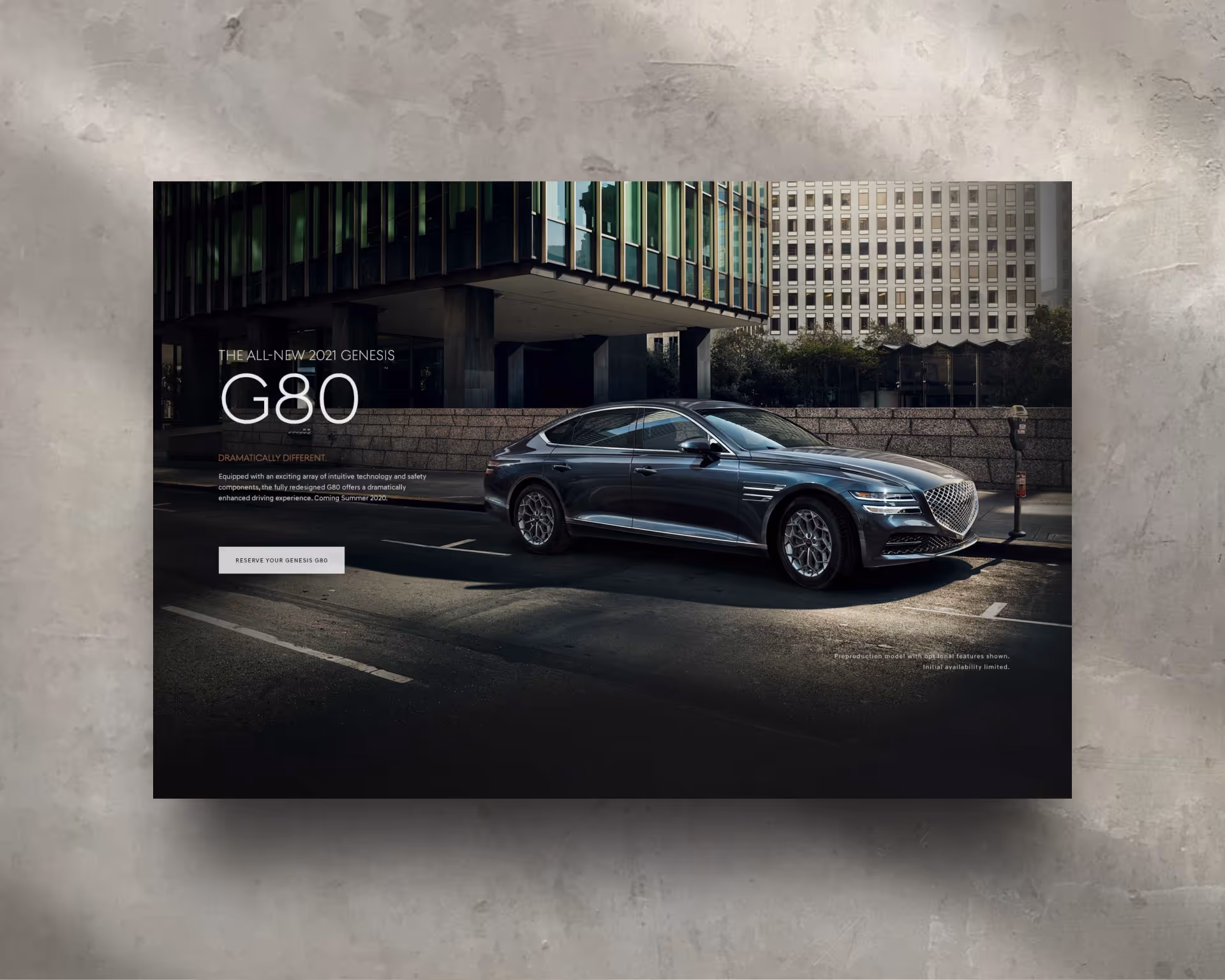
Genesis Motors — Dealer Website Hero Campaigns
Client: Genesis Motors
Agency: Innocean Worldwide
Role: Senior Graphic Designer
Scope: Brand Campaign Assets, Dealer-Level Growth Marketing, Hero Image Design, Copywriting
Overview
Genesis Motors, the luxury automotive division of Hyundai, required a series of high-impact hero images to support U.S. dealer websites—including Genesis of West Houston and other regional dealerships. These assets translated national brand campaigns into localized, performance-driven experiences while maintaining Genesis’s elevated luxury identity.
The hero units played a critical role in promoting new model launches, generating early interest for upcoming arrivals, and guiding prospective buyers toward inventory and reservations.
Objective
Bridge national Genesis brand storytelling with dealer-level conversion goals by creating visually striking, model-specific hero assets that drive engagement, inventory exploration, and early reservations.
Creative Approach
1. Hero Image Production & Model-Specific Messaging
I designed a suite of website hero images positioned at the top of dealer homepages and model landing pages. Each hero focused on a specific vehicle or seasonal initiative, pairing luxury imagery with concise, conversion-focused messaging.
Featured Vehicles Included:
- The All-New Genesis G80
- Genesis G90
- Genesis GV70
- Genesis GV80 (Genesis’s first-ever SUV)
- Full seasonal lineup featuring sedans and SUVs together
Each hero asset incorporated:
- A bold, premium headline (e.g., “The All-New Genesis GV80”)
- A supporting subheadline highlighting key features or value (AWD, display technology, performance)
- Clear CTAs such as “Reserve Yours Before It Arrives” or “View Inventory”
2. Visual Composition & Image Curation
Working within Genesis brand guidelines, I curated and refined official brand photography to best support hero layouts and responsive web requirements.
For the GV80 launch in particular, I emphasized:
- Clean, dramatic compositions to mirror the vehicle’s sculpted design
- Cinematic lighting to convey presence and arrival
- Strategic negative space for legible copy overlays without compromising visual impact
For full-lineup seasonal imagery, I carefully arranged sedans and SUVs to showcase the breadth of the Genesis lineup while maintaining consistent lighting, scale, and depth.
3. Copywriting & Brand Voice Adaptation
I wrote and refined short-form promotional copy aligned with Genesis’s voice—confident, refined, and aspirational without excess.
- Messaging balanced luxury storytelling with performance-driven clarity
- CTAs were designed to convert intent into action while maintaining brand dignity
- Copy placement was optimized for both desktop and mobile layouts
4. Dealer Customization & Scalability
While rooted in national Genesis branding, each hero asset was designed for dealer-level flexibility, allowing for:
- Localized availability messaging
- Dealer-specific promotions
- Dynamic CTAs tied to real-time inventory or arrivals
This modular approach ensured scalability across multiple dealer sites without sacrificing brand consistency.
Outcome
These hero images successfully bridged brand and performance marketing, helping dealerships:
- Build momentum around new model launches, especially the GV80
- Drive early reservations and inventory engagement
- Present Genesis as a forward-thinking luxury brand at the local dealer level
This work demonstrates my ability to execute brand-safe, high-impact campaign assets that support growth marketing objectives—balancing creative direction, copywriting, and UX-aware layout within strict automotive brand standards.
Heading 1
Heading 2
Heading 3
Heading 4
Heading 5
Heading 6
Lorem ipsum dolor sit amet, consectetur adipiscing elit, sed do eiusmod tempor incididunt ut labore et dolore magna aliqua. Ut enim ad minim veniam, quis nostrud exercitation ullamco laboris nisi ut aliquip ex ea commodo consequat. Duis aute irure dolor in reprehenderit in voluptate velit esse cillum dolore eu fugiat nulla pariatur.
Block quote
Ordered list
- Item 1
- Item 2
- Item 3
Unordered list
- Item A
- Item B
- Item C
Bold text
Emphasis
Superscript
Subscript
Good Look Apparel Boot Designs
Product Design
Custom Footwear Collection
Client: Good Look Apparel
Role: Art Director / Product Designer
Scope: Product Development, Surface Design, Visual Compositing, Packaging Design
Overview
Good Look Apparel is a custom footwear brand that designs one-of-a-kind boots for men and women—turning everyday fashion staples into bold statements of personal expression. Each product is conceived as both wearable design and collectible object, blending original surface artwork with quality materials to create footwear rooted in art, culture, and story.
Creative Approach
Product Sourcing & Surface Design
This project began at the product level. I sourced and evaluated base boot silhouettes, focusing on construction quality, material compatibility, and suitability for digital surface printing. Each design originated from a creative concept, which I translated into original surface artwork engineered specifically for curved, wearable forms.
Patterns and illustrations were developed to flow intentionally across seams, heels, and shafts—ensuring visual continuity and balance. The process required careful alignment between artistic expression and manufacturing constraints, treating each boot as a fully custom product rather than a graphic overlay.
Product Visualization & Storytelling
To bring each design to life prior to production, I created high-impact digital composites that placed the boots into contextual environments reflecting their artistic influences—urban, abstract, historical, or cultural. Using advanced Photoshop compositing and retouching techniques, I matched lighting, texture, and material realism to present the footwear as both tangible and aspirational.
These visuals allowed the brand to tell a story around each product, positioning the boots as part of a larger creative world rather than standalone items.
Packaging System Design
The packaging was designed as a continuation of the product experience. I developed a cohesive system where boxes, tissue paper, and inserts were customized using elements derived directly from each boot’s surface artwork. The goal was to make the unboxing experience feel intentional and immersive—reinforcing the artistic value of the product and elevating the brand beyond standard fashion packaging.
Outcome
The final collection unified product sourcing, surface design, visual storytelling, and packaging into a single, cohesive creative system. The boots stood out for their originality, craftsmanship, and art-first aesthetic, while the supporting visuals and packaging deepened customer connection to the brand’s identity and values.
Heading 1
Heading 2
Heading 3
Heading 4
Heading 5
Heading 6
Lorem ipsum dolor sit amet, consectetur adipiscing elit, sed do eiusmod tempor incididunt ut labore et dolore magna aliqua. Ut enim ad minim veniam, quis nostrud exercitation ullamco laboris nisi ut aliquip ex ea commodo consequat. Duis aute irure dolor in reprehenderit in voluptate velit esse cillum dolore eu fugiat nulla pariatur.
Block quote
Ordered list
- Item 1
- Item 2
- Item 3
Unordered list
- Item A
- Item B
- Item C
Bold text
Emphasis
Superscript
Subscript
Little Wedding Box Promo Video
Video Production
Whiteboard Animation Promo Video
Client: Little Wedding Box
Role: Senior Graphic Designer / Motion Designer
Scope: Brand Storytelling, Whiteboard Animation, Video Explainers
Brand Overview
Little Wedding Box creates beautifully designed, custom wedding websites that remove the stress and technical burden from wedding planning. Built around simplicity, elegance, and peace of mind, the brand offers couples a turnkey solution for managing RSVPs, schedules, and event details—allowing them to focus on celebrating rather than troubleshooting.
Creative Approach
1. Project Scope — Whiteboard Animation Promo
To introduce the brand and its value proposition to newly engaged couples, I created a whiteboard-style promotional video that clearly, warmly, and efficiently explains what Little Wedding Box does and why it’s an essential planning tool for modern weddings.
2. Visual Style & Tone
The animation was designed to feel:
- Hand-drawn and human, reinforcing approachability and trust
- Clean and uncluttered, with white backgrounds, fluid black line work, and subtle accent colors
- Calm, friendly, and reassuring—speaking directly to couples who may feel overwhelmed
The overall tone balanced elegance with simplicity, aligning with the brand’s promise of stress-free planning.
3. Narrative Flow & Storytelling
The video follows a clear, empathetic storyline:
- Opens by acknowledging the frustration of traditional wedding website setup (hosting, design tools, tech issues)
- Introduces Little Wedding Box as the solution that handles everything—from setup and customization to guest management
- Concludes with a message centered on saving time, reducing stress, and focusing on meaningful moments
The structure was intentionally concise, making the video ideal for first-time viewers and short attention spans.
4. Branding Integration
The video concludes with a branded end card featuring:
- The Little Wedding Box logo
- Supporting tagline
- A clear call-to-action encouraging couples to get started
Branding was integrated gently but confidently, reinforcing trust without overwhelming the viewer.
Outcome
The final whiteboard animation transformed a potentially complex service into a warm, engaging explainer that was easy to understand and emotionally resonant. The video served as a versatile asset for the brand—ideal for homepage placement, social media sharing, and digital advertising.
Heading 1
Heading 2
Heading 3
Heading 4
Heading 5
Heading 6
Lorem ipsum dolor sit amet, consectetur adipiscing elit, sed do eiusmod tempor incididunt ut labore et dolore magna aliqua. Ut enim ad minim veniam, quis nostrud exercitation ullamco laboris nisi ut aliquip ex ea commodo consequat. Duis aute irure dolor in reprehenderit in voluptate velit esse cillum dolore eu fugiat nulla pariatur.
Block quote
Ordered list
- Item 1
- Item 2
- Item 3
Unordered list
- Item A
- Item B
- Item C
Bold text
Emphasis
Superscript
Subscript
Graybug Vision Poster Design
Print Design
Graybug Vision — Scientific Event Posters
Client: Graybug Vision
Role: Senior Graphic Designer
Scope: Event Poster Design, Visual Hierarchy, Brand Alignment
Overview
Graybug Vision is a clinical-stage biopharmaceutical company developing targeted therapies for diseases of the retina and optic nerve. Known for precision in ocular drug delivery and scientific rigor, the brand required professional event posters that clearly communicated essential information while reinforcing its position as a leader in eye-health innovation. Two distinct posters were created for internal and professional audiences, each aligned with Graybug Vision’s established brand system.
Creative Approach
Project Scope & Brand Alignment
The objective was to design two clean, visually compelling posters that balanced scientific credibility with strong visual focus:
- CRA Training Poster
- Clinical Investigator Meeting Poster
Both pieces followed brand guidelines while adapting visual tone and structure to suit their specific audiences and event contexts.
Poster 1 — CRA Training
This poster centered on a high-resolution close-up image of a human eye, chosen for both symbolic relevance and visual impact. The detailed iris imagery reflected Graybug Vision’s commitment to precision, targeted therapies, and retinal expertise.
The image was color-graded to align with the brand palette and used as a strong visual anchor. Event details—date, location, and registration information—were organized beneath the image in a clean, corporate layout to ensure clarity and professionalism.
Poster 2 — Clinical Investigator Meeting
The second poster adopted a more abstract, modern approach to reflect the technical and research-driven nature of the meeting. Geometric elements and structured forms were used to suggest scientific systems and retinal pathways, while remaining subtle and brand-appropriate.
The Graybug Vision logo was given clear prominence, supported by a restrained color palette of deep blue, light gray, and clinical green tones. Typography emphasized hierarchy and legibility, allowing key information to be absorbed quickly in professional settings.
Outcome
Both posters successfully balanced visual storytelling with corporate clarity, strengthening Graybug Vision’s presence at professional and clinical events. The designs were prepared for both print and digital distribution and reflected the brand’s scientific rigor, innovation, and attention to detail.
This project highlights my ability to design for highly regulated, science-driven environments—combining visual refinement, typographic discipline, and strict brand adherence to produce polished, professional communication assets.
Heading 1
Heading 2
Heading 3
Heading 4
Heading 5
Heading 6
Lorem ipsum dolor sit amet, consectetur adipiscing elit, sed do eiusmod tempor incididunt ut labore et dolore magna aliqua. Ut enim ad minim veniam, quis nostrud exercitation ullamco laboris nisi ut aliquip ex ea commodo consequat. Duis aute irure dolor in reprehenderit in voluptate velit esse cillum dolore eu fugiat nulla pariatur.
Block quote
Ordered list
- Item 1
- Item 2
- Item 3
Unordered list
- Item A
- Item B
- Item C
Bold text
Emphasis
Superscript
Subscript
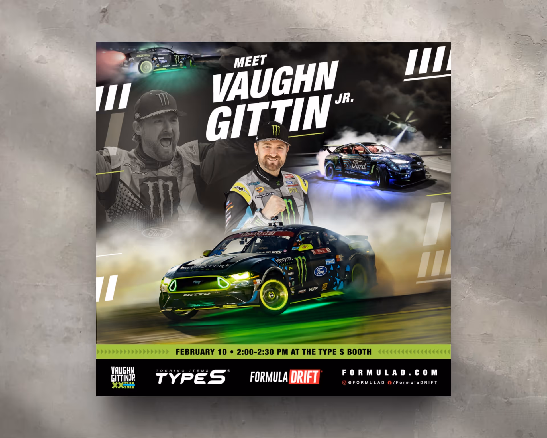
Horizon Brands Poster Design
Print Design
TYPE S × Formula Drift Poster Campaign
Client: Horizon Brands
Partner: Vaughn Gittin Jr.
Product: TYPE S
Role: Senior Graphic Designer
Scope: Event Marketing, Poster Design, Photo Retouching, Brand Integration
Overview
Horizon Brands builds and scales innovative consumer product companies across lifestyle and automotive categories. In partnership with Formula Drift champion Vaughn Gittin Jr., Horizon launched a live-event poster campaign to promote TYPE S Underglow LED Lighting—designed to merge motorsports culture with high-impact product visibility. The poster was created for national Formula Drift events, serving as both a fan collectible and a bold brand statement.
Creative Approach
Concept & Purpose
The objective was to capture the raw energy of Formula Drift while clearly showcasing TYPE S underglow technology in an authentic, performance-driven environment. The poster needed to resonate with motorsports fans while maintaining strong brand clarity and product focus in a fast-paced live-event setting.
Visual Execution
The composition features Vaughn Gittin Jr. in a dynamic, high-contrast environment, with dramatic lighting designed to highlight the TYPE S LED underglow on his vehicle. Careful retouching and tonal control ensured the lighting emphasized the product without overpowering the athlete or the brand. The overall treatment leaned cinematic and aggressive—consistent with drifting culture and performance branding.
Typography & Composition
Bold, condensed typography was used to echo speed, control, and mechanical precision. A clear hierarchy guided the viewer from athlete to brand to product, ensuring immediate recognition at distance. Layout balance was carefully managed to maintain visual flow while accommodating required logos and messaging.
Brand Integration & Asset Handling
Working within Horizon Brands’ style guidelines, I curated and retouched existing photography, adjusted color and contrast to align with brand standards, and integrated all approved TYPE S and partner logos. Attention was given to spacing, margins, and color accuracy to ensure consistency across the broader campaign ecosystem.
Outcome
The final poster delivered a high-impact, brand-compliant asset that successfully captured the excitement of Formula Drift while elevating the TYPE S product line. It was well received by both fans and stakeholders at the event and demonstrated strong execution across photo retouching, layout design, and brand integration.
This project highlights experience in motorsports marketing, live-event design, and translating performance culture into visually powerful brand assets—while maintaining clarity, hierarchy, and commercial intent.
Heading 1
Heading 2
Heading 3
Heading 4
Heading 5
Heading 6
Lorem ipsum dolor sit amet, consectetur adipiscing elit, sed do eiusmod tempor incididunt ut labore et dolore magna aliqua. Ut enim ad minim veniam, quis nostrud exercitation ullamco laboris nisi ut aliquip ex ea commodo consequat. Duis aute irure dolor in reprehenderit in voluptate velit esse cillum dolore eu fugiat nulla pariatur.
Block quote
Ordered list
- Item 1
- Item 2
- Item 3
Unordered list
- Item A
- Item B
- Item C
Bold text
Emphasis
Superscript
Subscript
Hyundai Summer Clearance Event Banner Ad
Animation
Spanish-Language Animated Banner Campaign
Client: Hyundai
Agency: Innocean Worldwide
Role: Senior Graphic Designer / Animator
Scope: Multicultural Advertising, HTML5 Banners, Paid Media, Motion Design
Brand Overview
Hyundai is a global automotive brand recognized for innovation, reliability, and approachable design. This campaign supported the Hyundai Tucson 2017 clearance event, with a focus on reaching Spanish-speaking audiences through culturally relevant messaging and energetic digital creative.
Strategy Components
1. Objective
To design a vibrant, animated Spanish-language banner ad that captured the feeling of summer while promoting the Hyundai Tucson 2017 during a key sales window—driving awareness and engagement across digital display placements.
2. Creative Execution
I designed and animated a dynamic HTML5 banner that paired bold typography with bright, seasonal color palettes and fluid motion. The headline—
“Más divertido que un día de playa” (“More fun than a day at the beach”)—
set a playful, aspirational tone, emotionally connecting with viewers while reinforcing the Tucson’s versatility, lifestyle appeal, and value.
3. Animation Approach
The animation featured:
- Smooth, eye-catching transitions designed to grab attention quickly
- Summery visual cues that reinforced the seasonal messaging
- A clearly defined CTA that stood out without interrupting visual flow
Pacing and motion were carefully calibrated to perform effectively across high-traffic digital placements, with special consideration for mobile environments.
4. Cultural Relevance & Market Fit
Spanish-language copy and visual cues were crafted to resonate authentically with Hispanic audiences, while still adhering to Hyundai’s broader brand standards. The result balanced cultural specificity with brand consistency—ensuring the creative felt both relevant and on-brand.
5. Outcome
The animated banner successfully supported Hyundai’s seasonal clearance campaign by delivering engaging, culturally targeted creative optimized for paid digital media. The execution helped increase visibility and engagement among Spanish-speaking consumers during a critical promotional period.
Heading 1
Heading 2
Heading 3
Heading 4
Heading 5
Heading 6
Lorem ipsum dolor sit amet, consectetur adipiscing elit, sed do eiusmod tempor incididunt ut labore et dolore magna aliqua. Ut enim ad minim veniam, quis nostrud exercitation ullamco laboris nisi ut aliquip ex ea commodo consequat. Duis aute irure dolor in reprehenderit in voluptate velit esse cillum dolore eu fugiat nulla pariatur.
Block quote
Ordered list
- Item 1
- Item 2
- Item 3
Unordered list
- Item A
- Item B
- Item C
Bold text
Emphasis
Superscript
Subscript
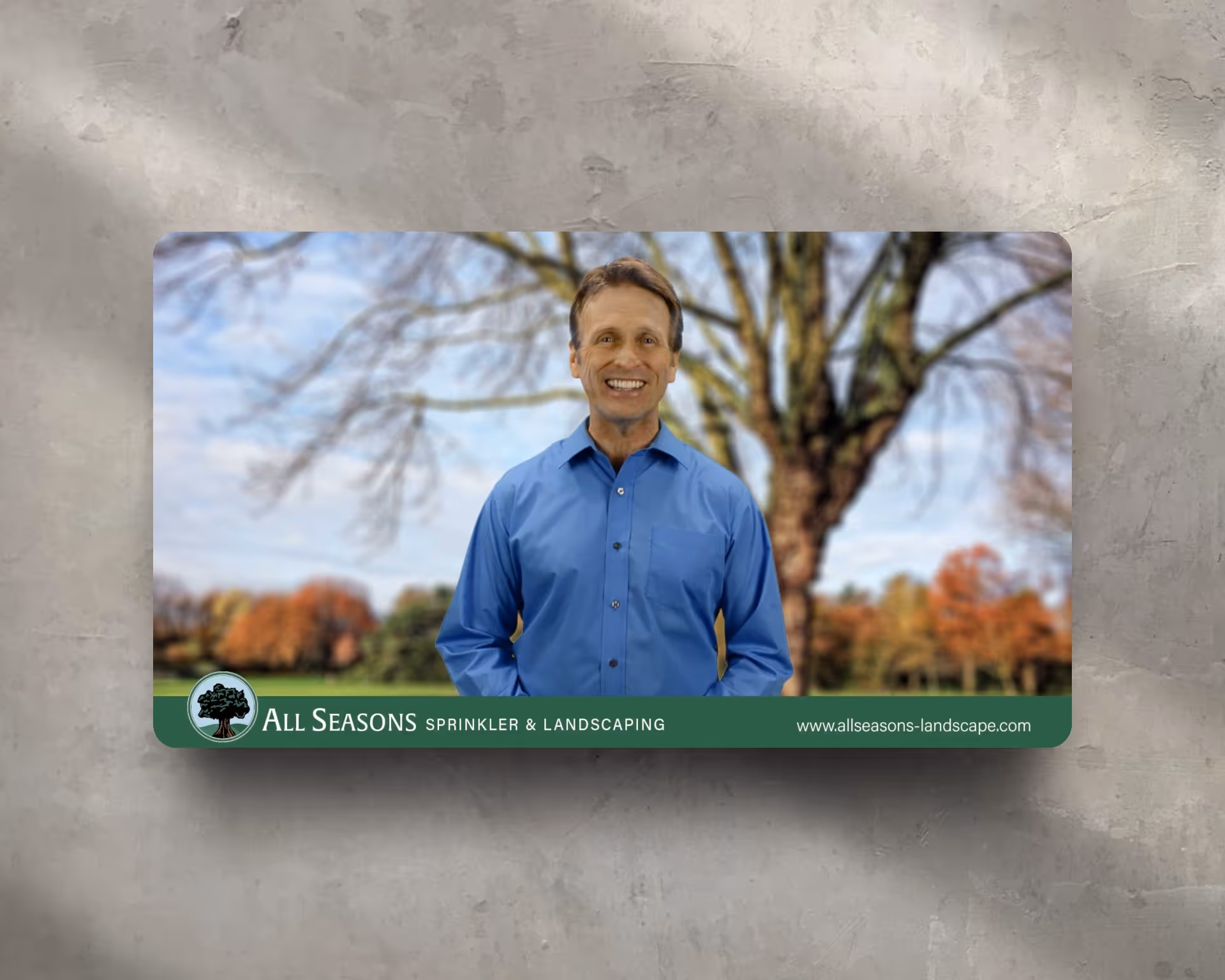
All Seasons Promo Video
Video Production
Brand Promo Video
Client: All Seasons Sprinkler & Landscaping
Role: Brand & Motion Designer
Scope: Video Concept, Direction, Editing, Motion Graphics
Overview
I created a brand promotional video for All Seasons Sprinkler & Landscaping to introduce their services to new homeowners and local residents. The video was designed to build trust quickly by combining a personable spokesperson with visual proof of the company’s landscaping, irrigation, and outdoor design work.
Objective
Increase awareness of All Seasons’ full-service offerings while positioning the company as a friendly, reliable neighborhood expert. The video needed to feel approachable and professional—clear enough for first-time viewers while reinforcing credibility and experience.
Creative Direction
A professional spokesperson was cast and directed to serve as the face of the brand, delivering messaging in a calm, conversational tone that reflected All Seasons’ customer-first approach. The on-camera presence helped humanize the business and establish immediate trust.
Production & Motion Design
- After Effects: Green screen keying, compositing, branded lower-thirds, and motion elements
- Premiere Pro: Full narrative edit combining spokesperson footage with real project visuals
- Transitions & Graphics: Custom motion transitions designed to keep pacing smooth and welcoming
- Music: Friendly, upbeat track selected to reinforce the brand’s neighborhood-focused personality
Messaging & Structure
The edit was structured to balance clarity and momentum—introducing services, showing real-world results, and reinforcing reliability without overwhelming the viewer. Visuals highlighted the breadth of work while keeping the tone grounded and accessible.
Outcome
The final video positioned All Seasons as a personable, trustworthy service provider with proven expertise. It became a flexible marketing asset used across the website, social media, and local advertising—supporting brand awareness and lead generation through a human-centered, polished presentation.
Heading 1
Heading 2
Heading 3
Heading 4
Heading 5
Heading 6
Lorem ipsum dolor sit amet, consectetur adipiscing elit, sed do eiusmod tempor incididunt ut labore et dolore magna aliqua. Ut enim ad minim veniam, quis nostrud exercitation ullamco laboris nisi ut aliquip ex ea commodo consequat. Duis aute irure dolor in reprehenderit in voluptate velit esse cillum dolore eu fugiat nulla pariatur.
Block quote
Ordered list
- Item 1
- Item 2
- Item 3
Unordered list
- Item A
- Item B
- Item C
Bold text
Emphasis
Superscript
Subscript
Marvel Avengers "Game with Intel"
Animation
Intel Gaming × Marvel’s Avengers Campaign
Agency: Damage Creative
Client: Intel
Partners: Crystal Dynamics, Square Enix
Franchise: Marvel’s Avengers
Role: Senior Graphic Designer / Motion & Web Design
Scope: Brand Campaign, Web Experience Design, Motion Design, Hero Animation
Overview
To support the launch of Marvel’s Avengers, Intel Gaming partnered with Crystal Dynamics and Square Enix on a premium digital campaign that positioned Intel hardware as the engine behind a more powerful PC gaming experience. I designed and developed the campaign website, including a cinematic animated hero that anchored the entire experience.
Campaign Objective
Create a high-impact digital entry point that captured the epic scale of the Avengers universe while reinforcing Intel’s core brand values—performance, innovation, and precision. The hero needed to energize fans immediately and establish Intel as essential to next-level gameplay.
Creative Execution & Storytelling
I concepted and executed a masthead animation featuring the Avengers team emerging from swirling smoke in a dramatic reveal. Designed as a cinematic moment rather than a decorative flourish, the animation functioned as the narrative opening—introducing the campaign’s central idea:
“Game with Intel for a Mightier PC Experience.”
Motion Design & Tools
Built in Adobe After Effects, the hero animation combined layered smoke simulations, lighting effects, depth-of-field, and controlled character motion. Pacing and composition were carefully tuned to deliver intensity while preserving usability—ensuring motion elevated the experience without distracting from content or navigation.
Web Experience & Brand Integration
Beyond the hero animation, I designed and developed the full campaign website to seamlessly integrate motion, messaging, and interaction. Typography, transitions, and layout were calibrated to respect both Intel’s brand system and Marvel’s cinematic tone—creating a cohesive experience across technology and entertainment brands.
Outcome
The animated hero became the visual centerpiece of the Intel × Marvel’s Avengers campaign landing page—delivering a powerful first impression, reinforcing the campaign narrative, and positioning Intel as a key player in high-performance, immersive PC gaming.
Heading 1
Heading 2
Heading 3
Heading 4
Heading 5
Heading 6
Lorem ipsum dolor sit amet, consectetur adipiscing elit, sed do eiusmod tempor incididunt ut labore et dolore magna aliqua. Ut enim ad minim veniam, quis nostrud exercitation ullamco laboris nisi ut aliquip ex ea commodo consequat. Duis aute irure dolor in reprehenderit in voluptate velit esse cillum dolore eu fugiat nulla pariatur.
Block quote
Ordered list
- Item 1
- Item 2
- Item 3
Unordered list
- Item A
- Item B
- Item C
Bold text
Emphasis
Superscript
Subscript
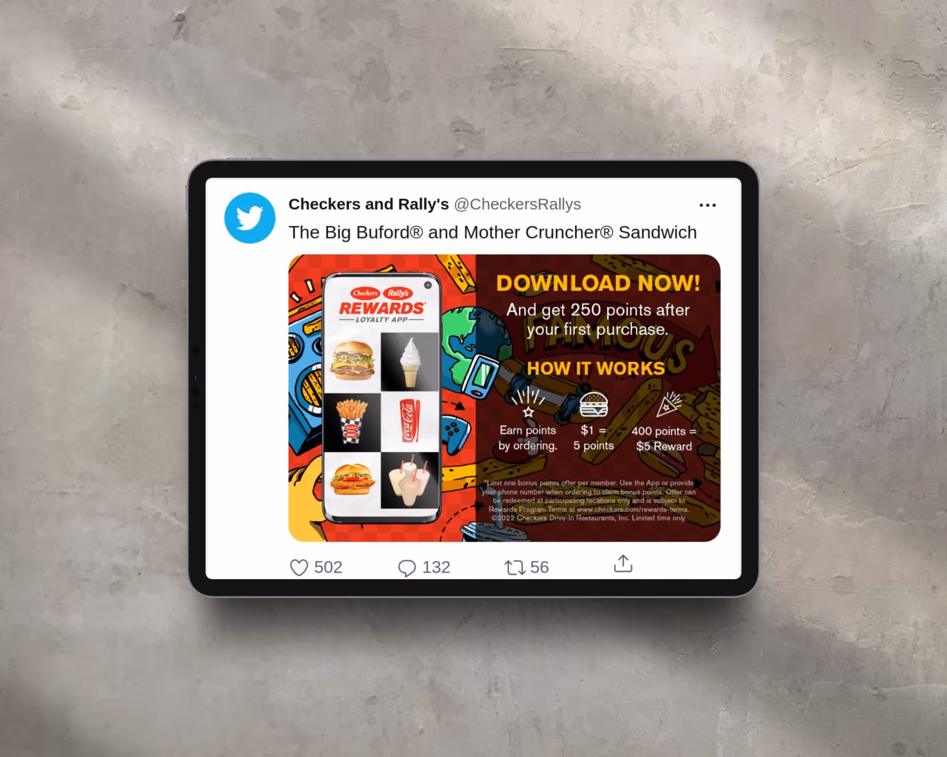
Checkers Banner Ads for Rewards Loyalty App
Animation
Rewards App Paid Media Campaign
Agency: Forestadt Agency
Client: Checkers & Rally’s
Role: Senior Graphic Designer / Motion, Digital & Development
Platforms: Display, Mobile, App Install Placements
Overview
As part of a digital acquisition campaign for the Checkers & Rally’s Rewards App, I led the concept, design, animation, and development of a system of animated banner ads focused on driving app downloads. The work extended a larger campaign anchored by video, translating high-level brand messaging into conversion-focused paid media creative.
Campaign Objective
Increase awareness and drive installs of the Checkers & Rally’s Rewards App by clearly communicating value—exclusive offers, free food, and member-only rewards—within the tight constraints of paid display environments.
Creative Concept & Execution
I designed a modular banner system using Checkers & Rally’s branded illustration assets, bold typography, and high-energy motion. The creative leaned into the brand’s flavor-forward, no-nonsense personality—delivering fast, attention-grabbing visuals that cut through crowded feeds while staying message-driven and performance-oriented.
Motion Design & Messaging Strategy
Motion was used strategically to surface key app benefits in short, rhythmic sequences optimized for quick consumption. Strong visual hierarchy ensured each banner delivered:
- Immediate brand recognition
- A clear value proposition
- A decisive call-to-action
All within the first few seconds—supporting performance goals in scroll-heavy, high-competition placements.
Development & Optimization
Banners were built across multiple standard ad sizes and optimized for fast load times and platform requirements. Clear CTAs such as “Download the App” and “Get Your Rewards” were consistently reinforced to guide users directly toward conversion. Layouts were designed to scale cleanly across sizes without sacrificing clarity or impact.
Outcome
The final banner system delivered a cohesive, high-impact paid media presence that reinforced brand recognition while supporting user acquisition goals. The campaign demonstrated how expressive brand creative can be translated into disciplined, conversion-driven digital assets—balancing personality with performance.
Heading 1
Heading 2
Heading 3
Heading 4
Heading 5
Heading 6
Lorem ipsum dolor sit amet, consectetur adipiscing elit, sed do eiusmod tempor incididunt ut labore et dolore magna aliqua. Ut enim ad minim veniam, quis nostrud exercitation ullamco laboris nisi ut aliquip ex ea commodo consequat. Duis aute irure dolor in reprehenderit in voluptate velit esse cillum dolore eu fugiat nulla pariatur.
Block quote
Ordered list
- Item 1
- Item 2
- Item 3
Unordered list
- Item A
- Item B
- Item C
Bold text
Emphasis
Superscript
Subscript
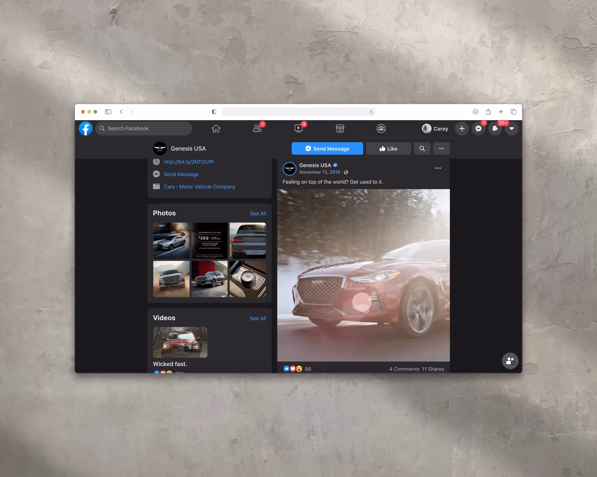
Genesis Facebook Campaign
Video Production
Genesis Motors — Social Video Campaign
Agency: Innocean Worldwide
Client: Genesis Motors
Role: Senior Graphic Designer / Motion & Video Art Direction
Platforms: Facebook, Instagram
Overview
As part of a social-first brand campaign for Genesis Motors, I created short-form video content designed to highlight the craftsmanship, design precision, and emotional presence of select Genesis vehicles. The work translated Genesis’ cinematic brand language into high-impact paid social placements optimized for mobile feeds.
Creative & Storytelling
Working from raw footage, I led video editing and visual direction to craft a dramatic, detail-driven narrative. Each edit focused on elevating signature vehicle features—headlight design, grille texture, wheel movement, and interior finishes—using pacing, light, and composition to convey refinement and control. The storytelling was intentionally minimal, allowing the product’s design to drive the emotional arc.
Sound & Motion Design
The visual rhythm was tightly synchronized with orchestral music to create a cinematic, almost choreographed experience. Cuts and transitions were timed to musical cues, giving the vehicle movement a sense of precision and elegance—reinforcing Genesis’ luxury positioning through sound and motion working in unison.
Paid Social Optimization
Assets were designed specifically for Facebook and Instagram feeds, with versions optimized for vertical and square formats. The opening seconds were engineered to capture attention immediately, using bold motion and close-up detail shots to stop the scroll and sustain engagement in a crowded social environment.
Outcome
The campaign delivered a polished, elevated brand presence across social platforms. Through disciplined pacing, sound design, and product-focused storytelling, the videos reinforced Genesis’ identity as a design-led luxury brand while performing effectively within paid social placements.
Heading 1
Heading 2
Heading 3
Heading 4
Heading 5
Heading 6
Lorem ipsum dolor sit amet, consectetur adipiscing elit, sed do eiusmod tempor incididunt ut labore et dolore magna aliqua. Ut enim ad minim veniam, quis nostrud exercitation ullamco laboris nisi ut aliquip ex ea commodo consequat. Duis aute irure dolor in reprehenderit in voluptate velit esse cillum dolore eu fugiat nulla pariatur.
Block quote
Ordered list
- Item 1
- Item 2
- Item 3
Unordered list
- Item A
- Item B
- Item C
Bold text
Emphasis
Superscript
Subscript
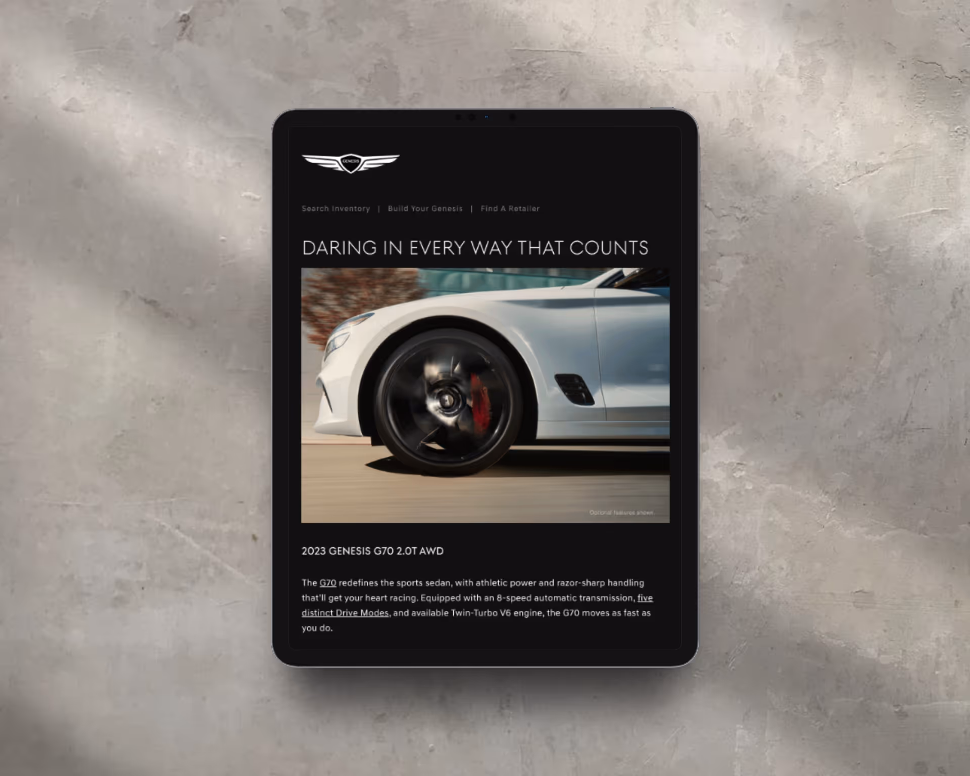
“Daring in Every Way That Counts” Campaign
Client: Genesis
Agency: Innocean Worldwide
Role: Senior Digital Designer & Developer
Scope: Brand Campaign, Motion Design, Email Marketing, Cinemagraph Animation
Overview
Genesis is a luxury automotive brand redefining modern elegance through bold design, advanced technology, and confident performance. The “Daring in Every Way That Counts” campaign reinforced Genesis’s challenger mindset—positioning the brand as a refined yet fearless alternative in the luxury automotive space. The work focused on expressing confidence through restraint, motion, and premium visual craft.
Strategy & Brand Positioning
Genesis positions itself as bold without being loud—innovative without excess. This campaign translated that philosophy into visual storytelling, emphasizing composure, precision, and intent. “Daring” was framed not as flash, but as confidence expressed through design decisions that matter.
Visual Identity & Messaging
Creative execution leaned into minimalism with power:
- Clean compositions and controlled negative space
- High-contrast imagery to emphasize form and material
- Confident, declarative messaging anchored by the campaign line
The visual language supported Genesis’s premium tone while subtly communicating motion and performance.
Motion Design Execution
To elevate the campaign email’s hero section, I created a cinemagraph-style animation in Adobe After Effects. The vehicle’s wheel remained in motion while the rest of the scene stayed static—introducing movement with restraint and sophistication.
Key considerations included:
- Optimizing for inbox environments across major email clients
- Maintaining visual clarity while meeting strict file-size constraints
- Ensuring seamless looping without distracting from the message
The result was a refined moment of motion that drew attention without overwhelming the layout.
Outcome
The animated hero became a focal point of the email experience, immediately engaging viewers while reinforcing Genesis’s daring yet composed brand identity. The execution balanced creativity with technical precision—mirroring the values of the Genesis brand itself—and contributed to stronger engagement while elevating overall campaign perception.
Heading 1
Heading 2
Heading 3
Heading 4
Heading 5
Heading 6
Lorem ipsum dolor sit amet, consectetur adipiscing elit, sed do eiusmod tempor incididunt ut labore et dolore magna aliqua. Ut enim ad minim veniam, quis nostrud exercitation ullamco laboris nisi ut aliquip ex ea commodo consequat. Duis aute irure dolor in reprehenderit in voluptate velit esse cillum dolore eu fugiat nulla pariatur.
Block quote
Ordered list
- Item 1
- Item 2
- Item 3
Unordered list
- Item A
- Item B
- Item C
Bold text
Emphasis
Superscript
Subscript
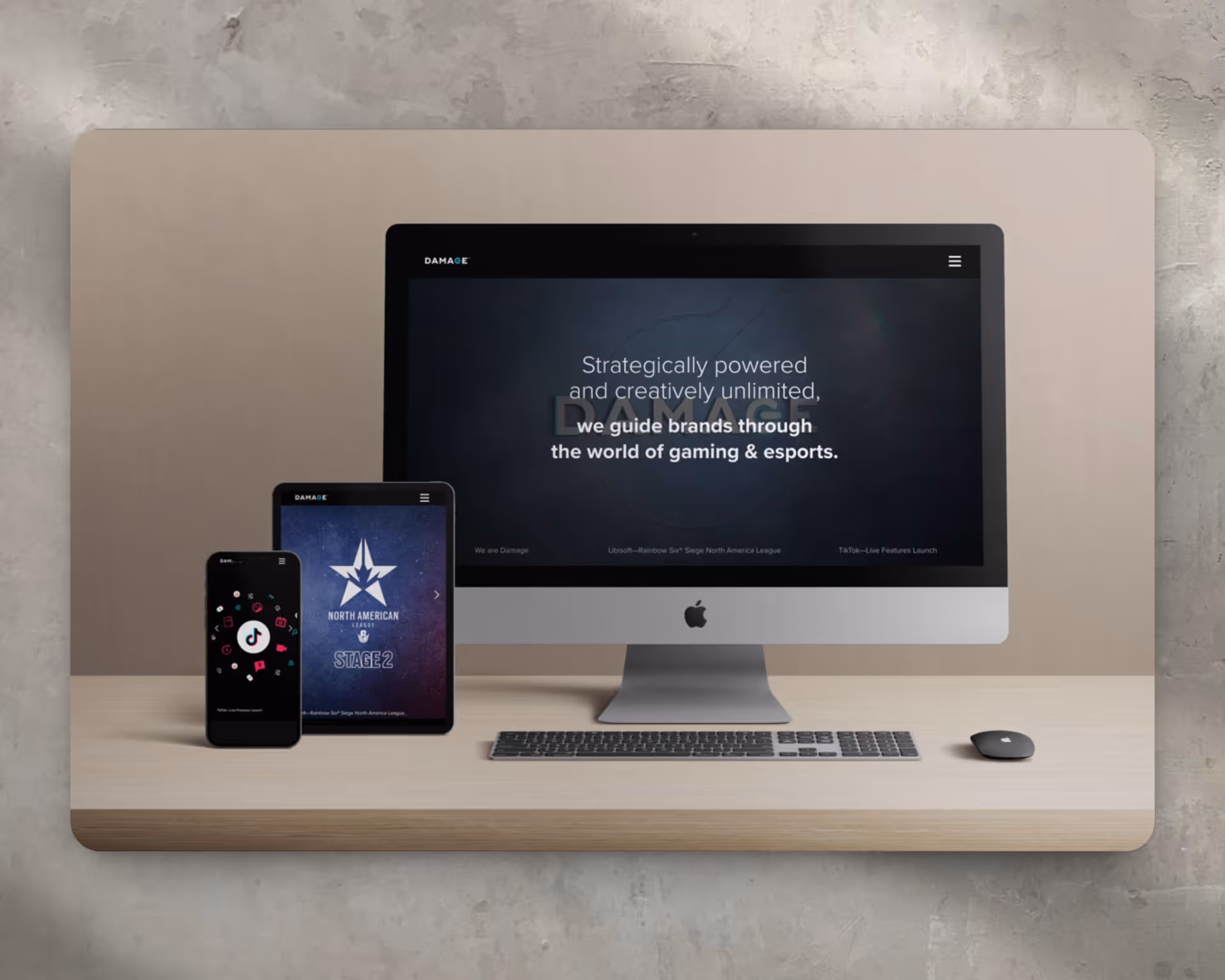
Damage Creative Website
Web Design
Website Design
Client: Damage Creative
Role: Senior Graphic Designer / Web Designer
Scope: Website Design, UX/UI, Visual System, Responsive Design
Overview
I designed the website for Damage Creative, a Los Angeles–based creative agency operating at the intersection of gaming culture, streaming, and brand storytelling. The site positions Damage as a bold, credible partner for brands seeking authentic engagement with gaming audiences—while reflecting the speed, edge, and intensity of the space.
Brand Positioning
The website reinforces Damage Creative’s role as a cultural translator between brands and gamers. Messaging emphasizes deep community knowledge, authenticity, and creative ambition—clearly differentiating Damage from traditional agencies attempting to enter gaming from the outside.
UX & Information Architecture
The experience was designed to feel immersive without sacrificing clarity. Content is structured to quickly communicate who Damage is, what they do, and why they’re credible, while still allowing deeper exploration into campaigns, partnerships, and thinking. Navigation supports both fast scanning and engaged browsing.
Visual Design & Tone
The visual system leans dark, cinematic, and high-contrast—borrowing from gaming and esports aesthetics without becoming gimmicky. Bold typography, motion-forward layouts, and dynamic imagery create energy and momentum while maintaining hierarchy and readability.
Responsive & Multi-Device Design
The site was designed responsively across desktop, tablet, and mobile. Layouts, typography, and imagery scale fluidly to preserve legibility, performance, and visual impact across all screen sizes.
Content & Community Focus
Campaign work, partnerships, and cultural moments are showcased to demonstrate Damage’s proximity to the gaming ecosystem. The content highlights participation in the community—not just marketing to it—reinforcing credibility with both endemic and non-endemic brands.
Outcome
The final website delivered a confident, future-forward digital presence aligned with Damage Creative’s positioning as a leader in gaming and streaming culture. It functions as both a brand statement and a business development tool—communicating authority, authenticity, and creative ambition from the first interaction.
Heading 1
Heading 2
Heading 3
Heading 4
Heading 5
Heading 6
Lorem ipsum dolor sit amet, consectetur adipiscing elit, sed do eiusmod tempor incididunt ut labore et dolore magna aliqua. Ut enim ad minim veniam, quis nostrud exercitation ullamco laboris nisi ut aliquip ex ea commodo consequat. Duis aute irure dolor in reprehenderit in voluptate velit esse cillum dolore eu fugiat nulla pariatur.
Block quote
Ordered list
- Item 1
- Item 2
- Item 3
Unordered list
- Item A
- Item B
- Item C
Bold text
Emphasis
Superscript
Subscript
.avif)
Genesis Signature Event Hero and Banner Ads
Banner Ads
Signature Event Digital Banner Campaign
Client: Genesis Motors
Agency: Innocean Worldwide
Role: Senior Graphic Designer
Scope: Brand Campaigns, Paid Media, Digital Advertising, Scalable Banner Systems
Branding Overview
The Genesis Signature Event is a high-impact promotional moment designed to pair the brand’s premium positioning with compelling, limited-time incentives. The goal of this campaign was to deliver visually refined, performance-driven banner ads that upheld Genesis’s luxury standards while driving engagement, click-throughs, and inventory exploration across digital media channels.
Strategy Components
1. Brand Positioning
Genesis positions itself as a modern luxury alternative—offering world-class design, advanced technology, and concierge-level service without compromise. The Signature Event reinforced this positioning by blending elevated visuals with persuasive offers, targeting discerning buyers who value both performance and prestige.
2. Visual Identity & Messaging
The banner system emphasized elegance, restraint, and clarity—avoiding overt sales language while still communicating urgency.
Each execution featured:
- High-resolution imagery of flagship models (including G80 and GV70)
- Polished typography aligned with Genesis brand guidelines
- Clean layouts with generous spacing to preserve a premium feel
- CTAs such as “Explore Offers” and “Limited-Time Event”, crafted to feel aspirational rather than promotional
Messaging balanced urgency with sophistication, ensuring consistency with Genesis’s luxury-forward voice.
3. UX & Digital Design Strategy
- Responsive & Scalable Layouts: Designed across multiple IAB sizes to perform seamlessly in programmatic display, paid social, and dealership placements
- Subtle Motion & Animation: Where applicable, restrained animation was used to draw attention without distracting from the vehicle or compromising load performance
- Brand Integrity: Every detail—type scale, spacing, color usage—was carefully aligned to Genesis’s visual system, ensuring a cohesive experience across platforms
4. Performance Optimization & Production
- A large volume of banner variations were produced and optimized for multiple formats (HTML5, JPG, GIF)
- Assets were built using a modular design system, enabling rapid localization and offer swaps while maintaining visual consistency
- File sizes, animation timing, and CTA placement were optimized for performance and conversion efficiency
- A streamlined automation workflow supported scalable asset production across markets and media buys
Result
The Signature Event banner campaign successfully reinforced Genesis’s premium brand perception while supporting measurable performance goals across paid media and dealership channels. The system-driven approach allowed for speed, consistency, and flexibility—ensuring the campaign could scale nationally while remaining visually refined.
Heading 1
Heading 2
Heading 3
Heading 4
Heading 5
Heading 6
Lorem ipsum dolor sit amet, consectetur adipiscing elit, sed do eiusmod tempor incididunt ut labore et dolore magna aliqua. Ut enim ad minim veniam, quis nostrud exercitation ullamco laboris nisi ut aliquip ex ea commodo consequat. Duis aute irure dolor in reprehenderit in voluptate velit esse cillum dolore eu fugiat nulla pariatur.
Block quote
Ordered list
- Item 1
- Item 2
- Item 3
Unordered list
- Item A
- Item B
- Item C
Bold text
Emphasis
Superscript
Subscript
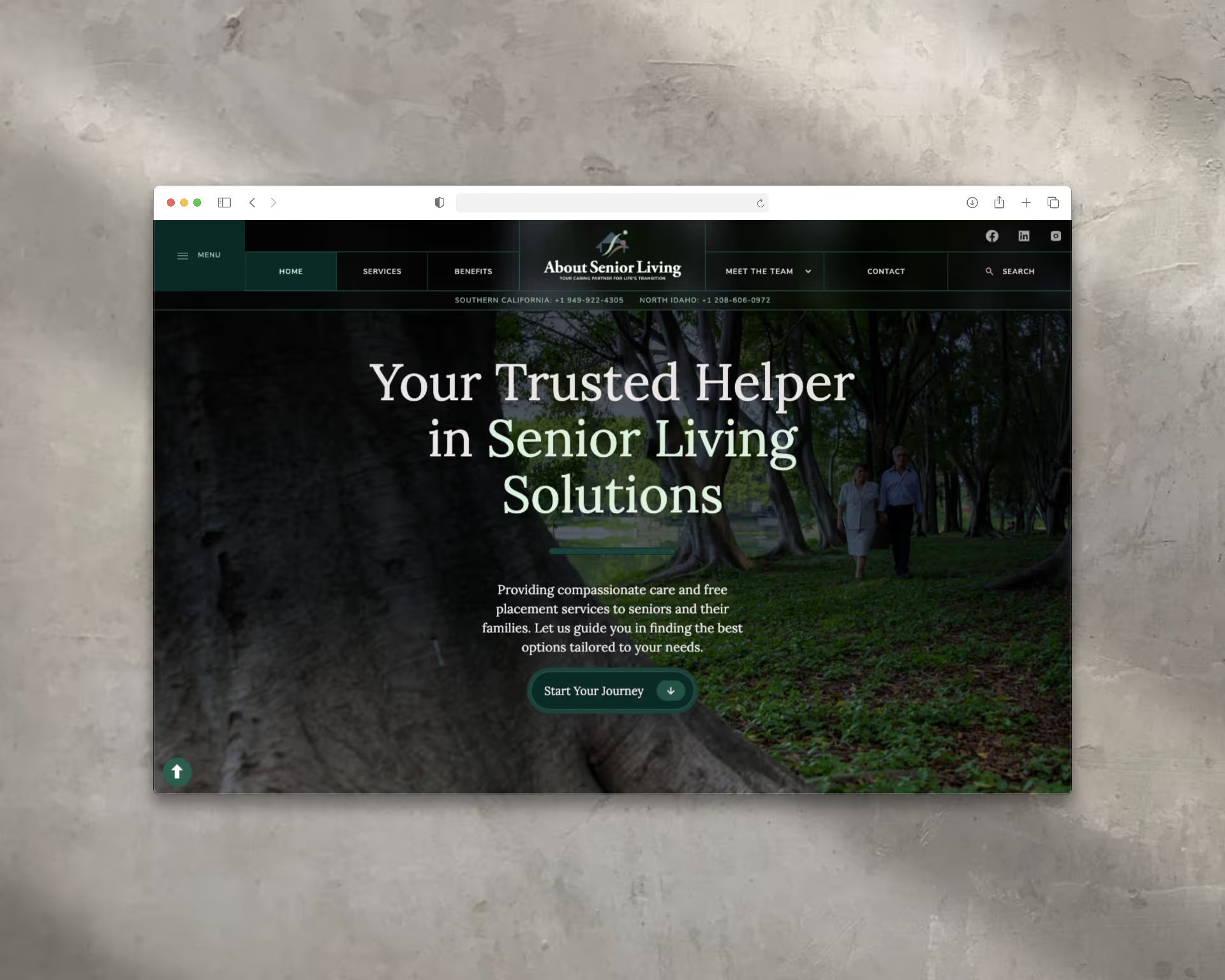
About Senior Living Website
Web Design
Website Design
Client: About Senior Living
Website: aboutseniorliving.com
Role: Brand & Web Designer
Scope: UX/UI Design, Visual Design, Content Structure, Lead Generation
Overview
I designed the AboutSeniorLiving.com website to support families navigating senior care decisions across Southern California and Northern Idaho. The site was built to feel calm, supportive, and trustworthy—prioritizing clarity and empathy while guiding users toward personalized, no-cost placement support.
Brand Positioning
The website positions About Senior Living as a compassionate partner rather than a transactional referral service. Messaging emphasizes guidance, expertise, and emotional reassurance, reinforcing the brand’s role in helping families make confident, informed decisions during complex life transitions.
UX & Information Architecture
The user experience was designed for accessibility across a wide range of comfort levels with technology—particularly for families under stress or time pressure.
Services are clearly organized by care type—assisted living, memory care, board and care homes, and in-home support—allowing visitors to quickly understand options without feeling overwhelmed. Navigation is intuitive and linear, supporting both exploration and fast decision-making.
Visual Design & Tone
A warm, understated color palette paired with refined typography establishes credibility while maintaining approachability. Generous spacing, soft imagery, and a calm visual rhythm reduce cognitive load and create an environment that feels reassuring rather than clinical.
Content Strategy
Content was structured to answer the real questions families face when seeking senior care. Clear service descriptions, testimonials, and a transparent explanation of the placement process build trust and set expectations. Language is direct, empathetic, and supportive—reinforcing that families are not navigating the process alone.
Calls to Action & Conversion
Primary calls to action such as “Start Your Journey” and consultation prompts are integrated throughout the site in a non-intrusive way. Contact forms and consultation requests are designed to feel like an invitation for help, not a sales funnel—encouraging outreach without pressure.
SEO & Lead Generation
The site was structured using SEO best practices, including keyword-focused page architecture, search-friendly content, and optimized metadata. Lead capture is supported through integrated forms and consultation requests, ensuring the site functions as both an informational resource and a conversion tool.
Outcome
The final website provides About Senior Living with a cohesive digital presence that reflects its values of trust, empathy, and expertise. It supports lead generation while creating a calm, confidence-building experience for families navigating senior care decisions—bridging emotional reassurance with practical next steps.
Heading 1
Heading 2
Heading 3
Heading 4
Heading 5
Heading 6
Lorem ipsum dolor sit amet, consectetur adipiscing elit, sed do eiusmod tempor incididunt ut labore et dolore magna aliqua. Ut enim ad minim veniam, quis nostrud exercitation ullamco laboris nisi ut aliquip ex ea commodo consequat. Duis aute irure dolor in reprehenderit in voluptate velit esse cillum dolore eu fugiat nulla pariatur.
Block quote
Ordered list
- Item 1
- Item 2
- Item 3
Unordered list
- Item A
- Item B
- Item C
Bold text
Emphasis
Superscript
Subscript

VJP Tax Services Website
Web Design
Branding Overview
VjP Tax & Financial Services is a Long Beach–based firm offering comprehensive financial solutions, including tax preparation, bookkeeping, business formation, and digital mailbox services. Founded by Vonya McCoy, the company emphasizes personalized service, financial education, and community empowerment. Their mission is to simplify financial processes, enabling clients to "stress less, live more."
Strategy Components
1. Brand Positioning
Positioned as a trusted financial partner for individuals and small businesses in Southern California, VjP combines professional expertise with a personal touch. The brand emphasizes accessibility, education, and long-term client relationships.
2. Visual Identity & Messaging
The website design reflects clarity and professionalism, using a clean layout and approachable language. Key messages focus on trust, expertise, and the firm's commitment to client success.
3. UX/UI Design Strategy
- Intuitive Navigation: Services are categorized clearly, allowing users to find information effortlessly.
- Responsive Design: Ensures optimal viewing across devices.
- Call-to-Action (CTA): Prominent CTAs like "Book A Consultation" guide users toward engagement.vjptaxservices.com+1vjptaxservices.com+1
4. Content Strategy
Content is tailored to address client needs, with detailed service descriptions, informative blog posts, and FAQs that build trust and demonstrate expertise.
5. SEO & Lead Generation
The website is optimized for search engines with relevant keywords, meta descriptions, and structured data. Integrated contact forms and consultation booking features facilitate lead capture and conversion.
Heading 1
Heading 2
Heading 3
Heading 4
Heading 5
Heading 6
Lorem ipsum dolor sit amet, consectetur adipiscing elit, sed do eiusmod tempor incididunt ut labore et dolore magna aliqua. Ut enim ad minim veniam, quis nostrud exercitation ullamco laboris nisi ut aliquip ex ea commodo consequat. Duis aute irure dolor in reprehenderit in voluptate velit esse cillum dolore eu fugiat nulla pariatur.
Block quote
Ordered list
- Item 1
- Item 2
- Item 3
Unordered list
- Item A
- Item B
- Item C
Bold text
Emphasis
Superscript
Subscript
Skye Construction Website
Web Design
Website Design
Client: Skye Construction
Role: Brand & Web Designer
Scope: UX/UI Design, Visual Design, Content Strategy, Lead Generation
Overview
I designed the website for Skye Construction, an Orange County–based ADU contractor specializing in garage conversions, attached and detached ADUs, and interior remodels. The site was built to clearly explain a complex, regulation-heavy service while positioning Skye as a modern, reliable partner homeowners can trust.
Brand Positioning
The website positions Skye Construction as more than a builder—it presents the company as an experienced guide through zoning, permitting, and construction. Messaging emphasizes clarity, confidence, and ROI, helping homeowners understand both the lifestyle and income potential of ADUs without feeling overwhelmed.
Visual Identity & Tone
The visual system uses clean lines, contemporary typography, and aspirational California-inspired imagery to reflect modern craftsmanship. The design balances professionalism with approachability, reinforcing Skye’s reputation for quality work, transparency, and regulatory expertise.
UX & Information Architecture
The site was structured to educate while driving action:
- Clear Value Proposition: The homepage explains what ADUs are, why they matter, and how Skye simplifies the process
- Segmented Services: Dedicated pages for garage conversions, detached ADUs, attached ADUs, and remodels—each highlighting benefits, visuals, and CTAs
- Mobile-First Navigation: Intuitive layouts ensure homeowners can quickly find answers on any device
- Trust Builders: Process breakdowns, FAQs, and testimonial sections reduce friction and hesitation
Lead Generation & Conversion
Calls to action such as “Get Started” and “Request a Consultation” are integrated throughout the site, paired with streamlined, low-friction forms. Content hierarchy supports informed decision-making while guiding users naturally toward consultation.
SEO & Performance
The site architecture supports organic discovery through service-specific and location-based keyword targeting. Page structure, content flow, and technical considerations were designed to improve visibility for homeowners searching for ADU solutions in Southern California.
Outcome
The final website provides Skye Construction with a clear, modern digital presence that educates, builds trust, and drives qualified leads. It translates a highly technical construction offering into an accessible, confidence-building experience—supporting Skye’s growth as a go-to ADU partner in Orange County.
Heading 1
Heading 2
Heading 3
Heading 4
Heading 5
Heading 6
Lorem ipsum dolor sit amet, consectetur adipiscing elit, sed do eiusmod tempor incididunt ut labore et dolore magna aliqua. Ut enim ad minim veniam, quis nostrud exercitation ullamco laboris nisi ut aliquip ex ea commodo consequat. Duis aute irure dolor in reprehenderit in voluptate velit esse cillum dolore eu fugiat nulla pariatur.
Block quote
Ordered list
- Item 1
- Item 2
- Item 3
Unordered list
- Item A
- Item B
- Item C
Bold text
Emphasis
Superscript
Subscript
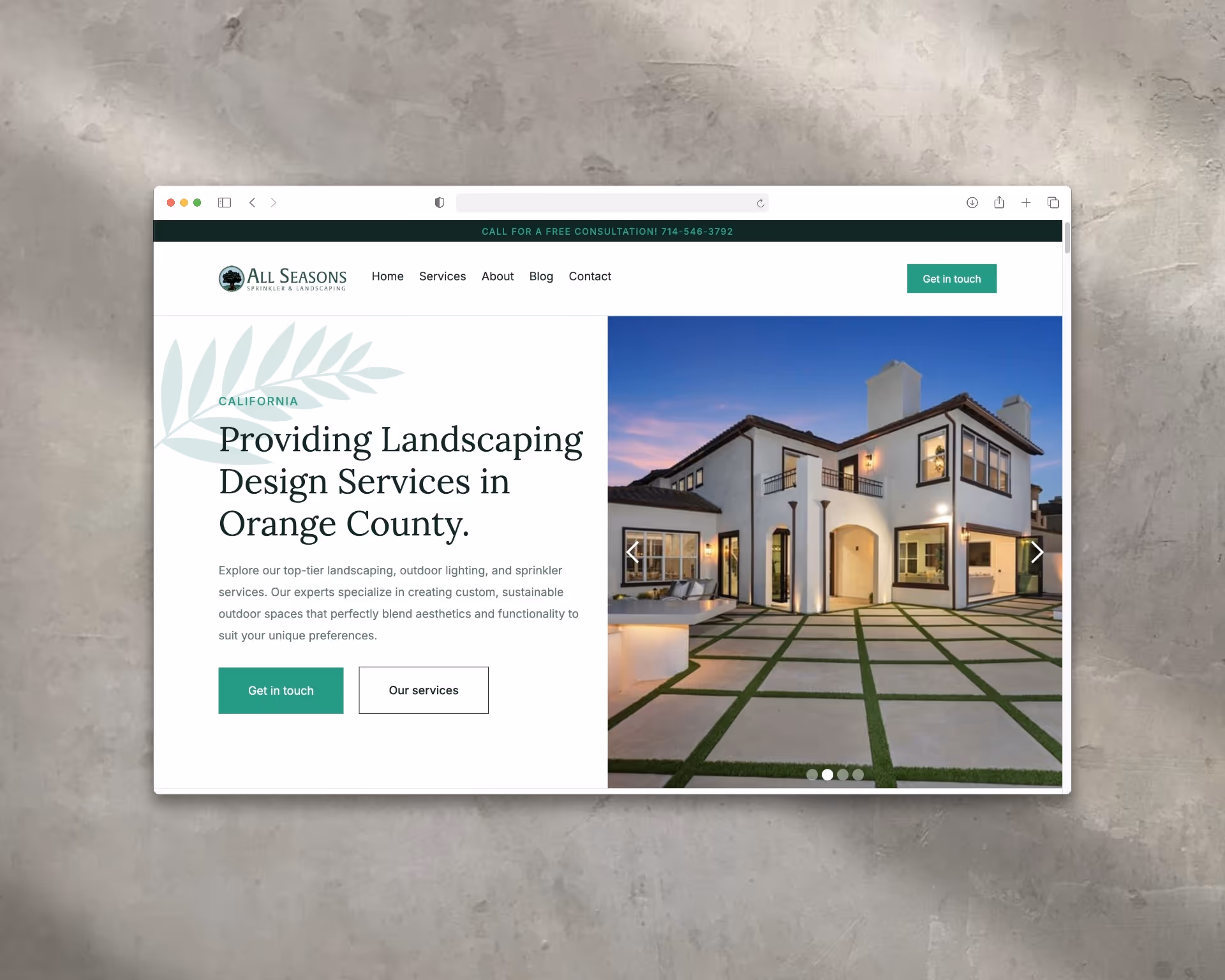
All Seasons Sprinkler and Landscaping Website
Web Design
Website Design
Client: All Seasons Sprinkler & Landscaping
Role: Brand & Web Designer
Scope: UX/UI Design, Visual Design, Content Structure, SEO & Lead Generation
Overview
I designed the All Seasons Sprinkler & Landscaping website to position the company as a trusted, full-service landscaping partner in Orange County. The site balances visual polish with clarity—showcasing craftsmanship and services while making it easy for homeowners to request consultations.
Brand Positioning
The website presents All Seasons as a reliable, high-quality provider focused on long-term outdoor solutions. Messaging emphasizes personalized service, sustainability, and attention to detail—reinforcing the brand’s commitment to enhancing curb appeal and outdoor living experiences.
UX & Information Architecture
Services are clearly organized and easy to navigate, allowing users to quickly explore offerings such as residential landscaping, sprinkler systems, outdoor lighting, synthetic turf, and garden design. The structure supports both quick scanning and deeper exploration without overwhelming the user.
Visual Design & Tone
Clean layouts, high-resolution photography, and a cohesive green-forward color palette communicate professionalism and environmental care. Typography and spacing were chosen to prioritize readability while keeping the experience modern, approachable, and service-oriented.
Content Strategy
Content was developed to address common homeowner questions and clearly communicate expertise. Dedicated service pages, a visual project portfolio, and educational messaging work together to build trust and demonstrate the range and quality of All Seasons’ work.
Calls to Action & Conversion
Clear CTAs such as “Get in Touch” and consultation prompts are integrated throughout the site. Contact forms are simple and accessible, encouraging low-friction inquiries and supporting consistent lead generation.
SEO & Lead Generation
The site was structured with SEO best practices in mind, including keyword-optimized service pages, metadata, and search-friendly content architecture. Integrated forms and consultation requests ensure the site functions as both an informational resource and a conversion tool.
Outcome
The final website delivers a cohesive digital presence that reflects All Seasons’ expertise and approachability. It supports brand awareness, improves service clarity, and functions as an effective lead-generation platform for residential and commercial landscaping inquiries.
Heading 1
Heading 2
Heading 3
Heading 4
Heading 5
Heading 6
Lorem ipsum dolor sit amet, consectetur adipiscing elit, sed do eiusmod tempor incididunt ut labore et dolore magna aliqua. Ut enim ad minim veniam, quis nostrud exercitation ullamco laboris nisi ut aliquip ex ea commodo consequat. Duis aute irure dolor in reprehenderit in voluptate velit esse cillum dolore eu fugiat nulla pariatur.
Block quote
Ordered list
- Item 1
- Item 2
- Item 3
Unordered list
- Item A
- Item B
- Item C
Bold text
Emphasis
Superscript
Subscript