Someone lands on your site, their thumb hovers, and you’ve got a tiny window to look legitimate. Not after they read your About page. Not after they scroll your portfolio. In the first few seconds.
That snap judgment is professional website credibility in action. It’s the online version of a clean storefront, a confident greeting, and a clear sign that says exactly what you sell.
Below are the exact cues people notice first, why they signal “established,” and quick fixes you can apply even if you’re a small team.
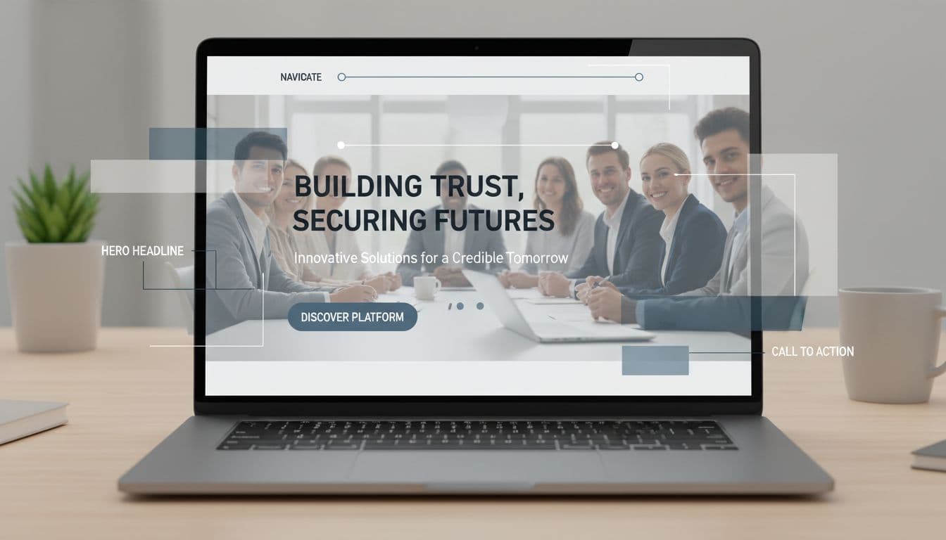
Above-the-fold layout cues that communicate clarity and confidence, created with AI.
In the first moments, visitors don’t “read” your website. They pattern-match. They look for signals that tell them they’re in the right place and that you’re real.
Research is consistent on this point. The Stanford Persuasive Technology Lab found that people heavily judge credibility based on design presentation (see the report, How Do People Evaluate a Web Site’s Credibility?). That doesn’t mean you need flashy visuals. It means messy design reads like messy service.
In that first scan, most visitors check:
If they can’t answer “What is this and can they help me?” quickly, they bounce. The Wix summary of first-impression behavior is a good reminder: clarity beats clever when time is short.
A strong hero headline is the fastest credibility win because it reduces doubt. Visitors want a straight answer, not a puzzle.
Do (clear and specific):
Don’t (vague or hypey):
Quick fix for small businesses: rewrite your hero in this simple format:
Service + audience + location (or outcome). Add one line underneath with a proof point (years in business, turnaround time, warranty, rating).
Also, make your main button obvious and singular. Two competing calls to action can feel like a lack of focus.
Mini checklist (above the fold):
Visitors judge legitimacy by how quickly they can predict where things are. If your navigation looks like a junk drawer, your business feels the same.
A professional, established site usually has 5 to 7 top-level links, written in plain language:
Home, Services, Pricing, Work (or Case Studies), About, Reviews, Contact
Do: Put “Services” and “Contact” where people expect them.
Don’t: Hide key pages under cute labels like “The Goods” or “Let’s Chat.”
Quick fix: if you offer multiple services, create a simple Services overview page, then individual service pages. That structure signals scale and stability, even if you’re a team of one.
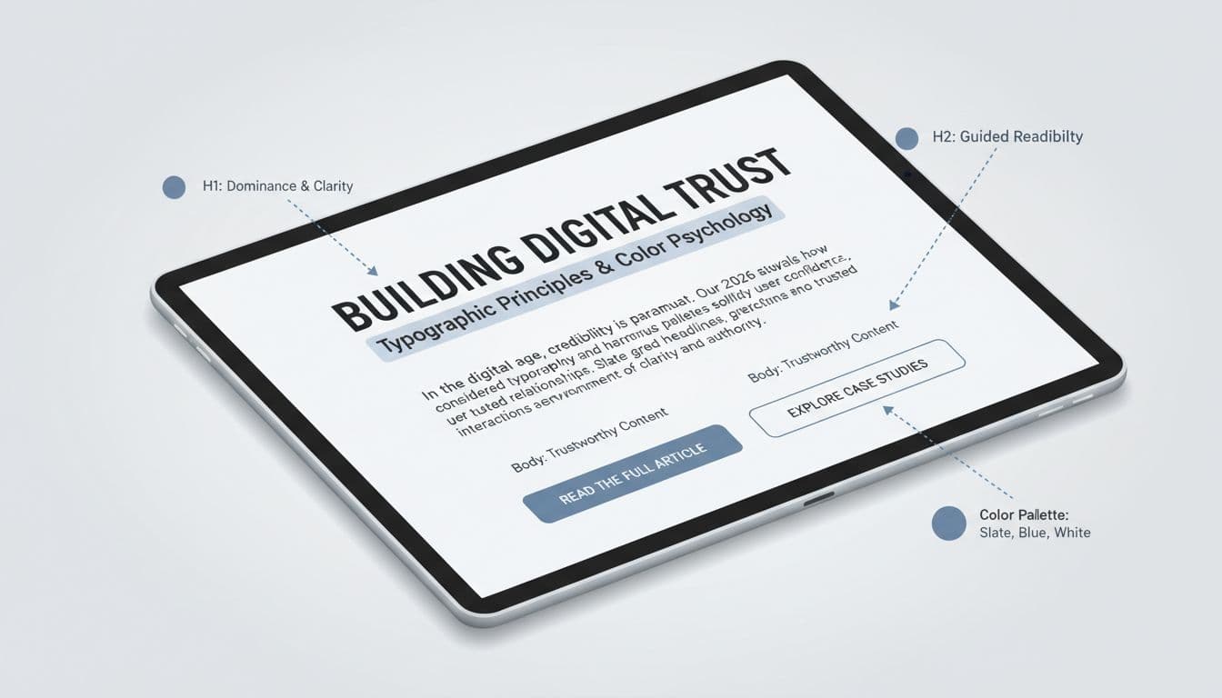
Typography hierarchy and consistent color use that reduce “DIY” vibes, created with AI.
People notice type and color faster than they realize. When fonts clash, spacing is tight, or contrast is weak, the site feels unfinished.
What visitors subconsciously look for:
Do/don’t examples:
Quick fix: choose one modern sans-serif for body text and one for headings, or use one family with multiple weights. If you need a simple gut-check on usability basics, Business.com’s small business web design tips covers common layout and readability issues that quietly hurt trust.
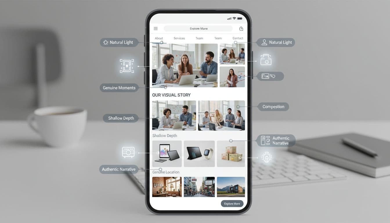
Authentic photos that confirm a real team, real work, and a real place, created with AI.
Stock photos aren’t automatically “bad,” but generic stock photos are. Visitors can smell them in one second, and the site starts to feel like a template business.
Highest-trust images for local services, consultants, and startups:
Quick fix: schedule one short photo session and build a reusable library. Update at least once a year. Stale visuals can make an active business look abandoned.
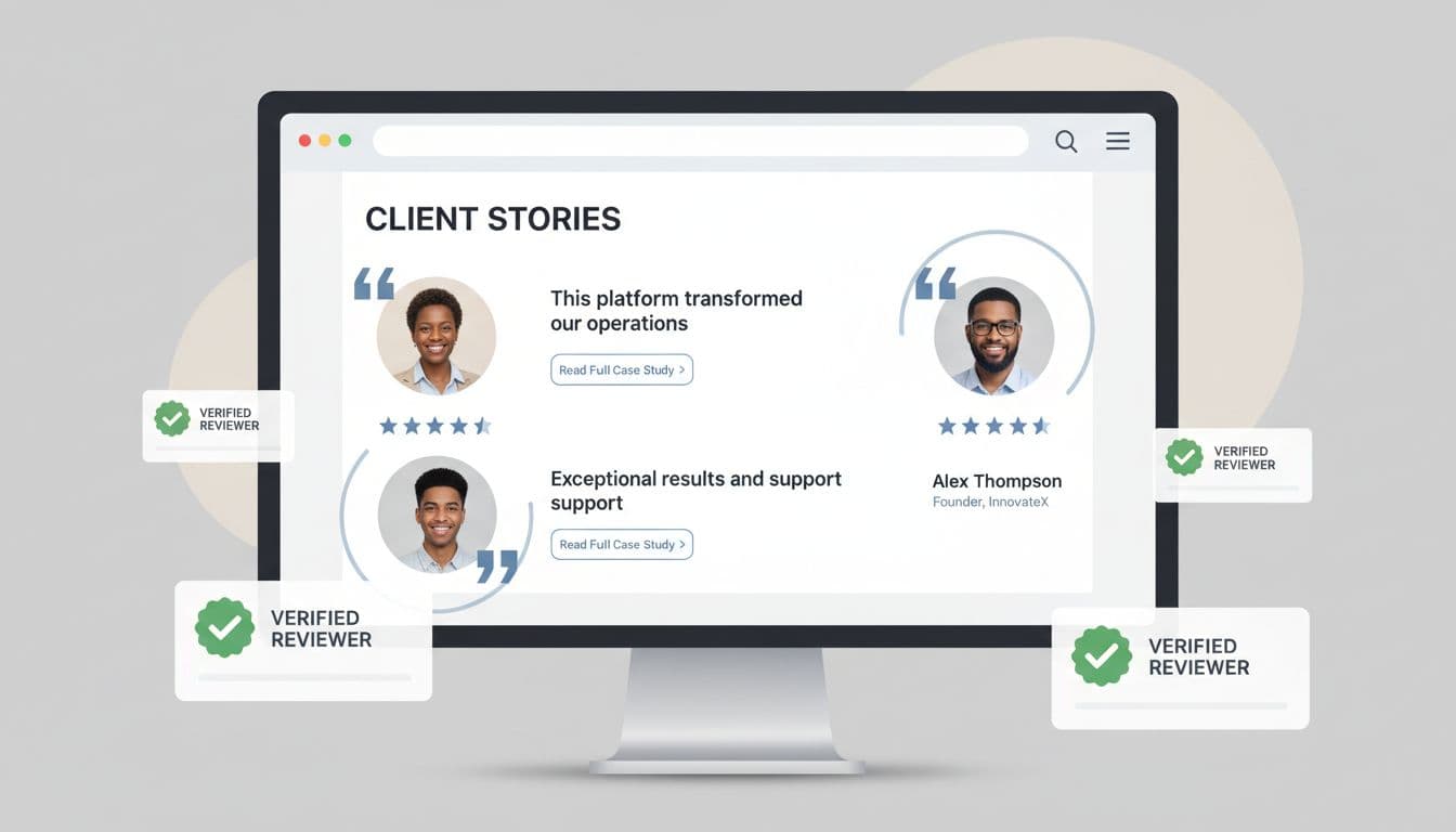
Testimonials and case studies presented in a clean, scannable format, created with AI.
In the first 5 seconds, visitors aren’t looking for “nice words.” They’re looking for proof that someone like them got a result.
A strong testimonial includes:
A case study is even stronger because it shows process and results. Even one case study can make your business feel established.
Do: “We cut their lead response time from 2 days to 2 hours.”
Don’t: “Amazing service, highly recommend!”
For a practical overview of trust elements beyond testimonials, DeType’s breakdown of trust signals is a solid reference.
Quick fix: turn your three best testimonials into a “Results” strip on the homepage, then link to a full Reviews page and 1 to 3 case studies.

Clear contact details and footer signals that make a business feel legitimate, created with AI.
Visitors look for “real-world anchors.” If they can’t find a way to reach you, they assume you don’t want to be reached.
High-credibility contact cues:
Footer quick win list:
Do: Make the Contact page one tap away on mobile.
Don’t: Use only a generic form with no other options.
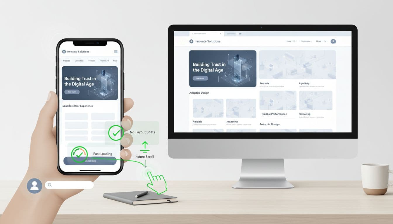
Mobile responsiveness and stability cues that make a site feel dependable, created with AI.
A site can look beautiful and still lose trust if it feels clunky on a phone. In 2026, “professional” means thumb-friendly and steady.
Visitors notice these performance cues fast:
Those map to Core Web Vitals concepts (load speed, interaction responsiveness, layout stability) without you needing to talk like an engineer.
Quick fixes that pay off fast:
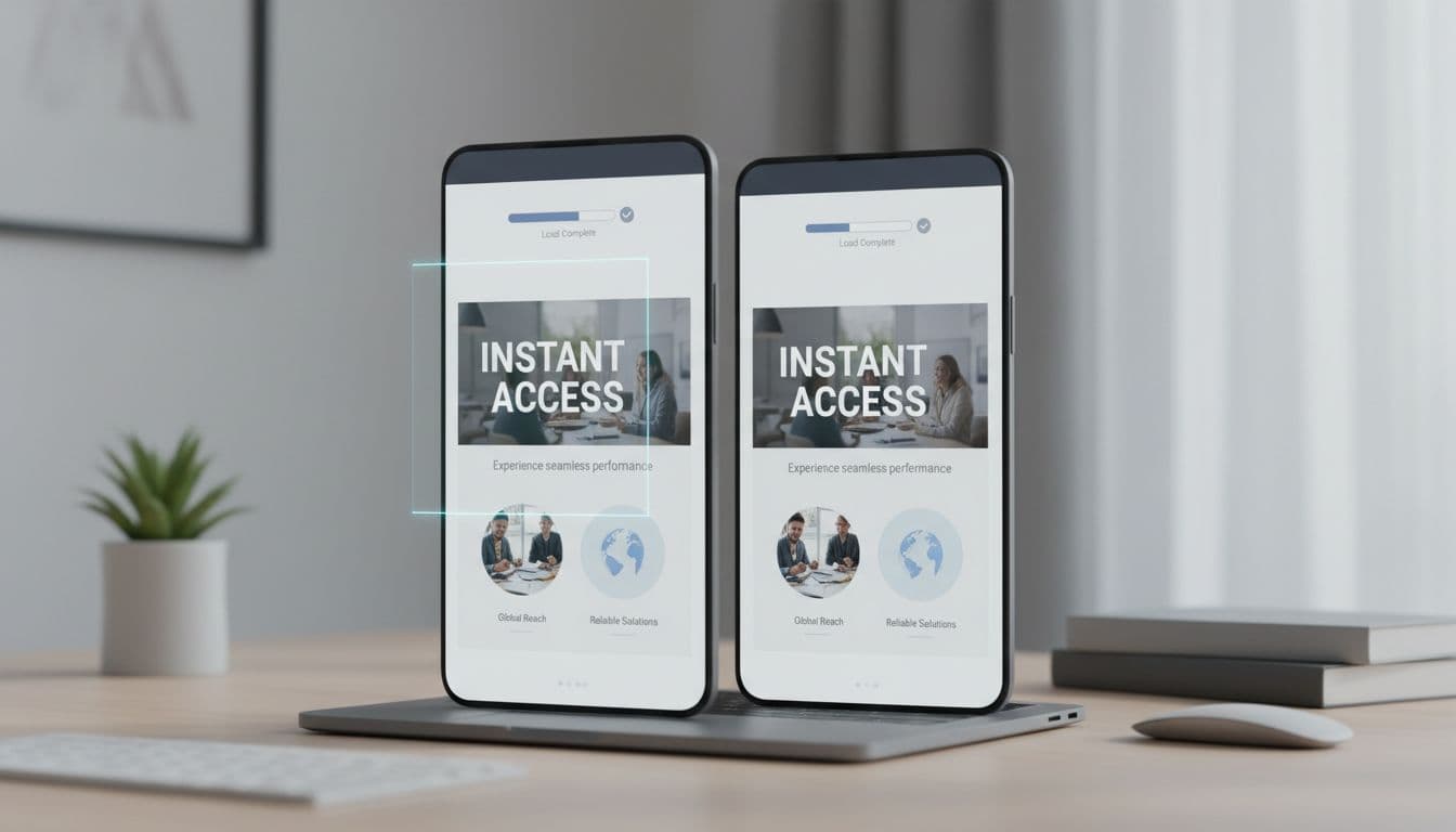
Fast loading and responsive behavior that support trust on any device, created with AI.
A professional site feels established because it removes friction and doubt right away. Clear headline, clean layout, readable type, real photos, specific proof, easy contact, and solid mobile performance all build professional website credibility in under 5 seconds.
Pick one page (usually your homepage) and tighten the cues above before you redesign everything. Small changes add up fast.
If you want a second set of eyes on your credibility cues, this is the kind of work Graphic ReDesign focuses on: websites that look trustworthy quickly, load fast on mobile, and turn visits into leads.
.svg)
Heart health is crucial for overall well-being. Learn how to keep your heart healthy with these simple lifestyle changes, expert tips, and the latest medical advancements.
Around 50% of internet users say that website design is a crucial factor in formulating an opinion about a brand. (PR Newswire)

2160 Barranca Parkway #1047
Irvine, CA 92606
Service Area: United States