Strong brands rarely start with huge budgets. They start with clear choices and steady polish. That's a fact!
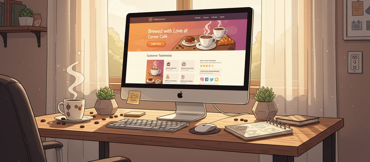
Your website is the first place people judge your brand. With a few focused moves, you can look like a large, established company, even if you are still small.

Pick a clean, high-contrast color palette. You can even be creative in naming your colors.
It's that simple! Here is a good resource for picking a main color. And then, once you have that, you can use it when establishing your supporting colors.
Choose 1 headline font and 1 body font. Google fonts is a good place to choose a font. After you download and install it, you can use them everywhere without any copyright issues. Skip fancy script fonts. Clean fonts look more confident and modern.
Now, create a basic brand kit. This is basically just pulling all of these things together and maybe a few instructions in case someone else has to use it. Here's an overview of what is in the kit:
Keep it short and clear, then share it with anyone who works on your site or marketing. Again, this is called a "Brand Kit." Throw that word around a bit, it will make you sound professional! If you aren't experienced with creating this type of stuff or feel like its over your head, hire a professional. In fact, most of the time, this is the best option.

A strong homepage layout has more power than a large ad budget. Focus on these core parts:
This structure creates a sense of scale, even on a lean budget. So if you have reached this point, you might think this is starting to look like a single-page website (or a landing page). And it can be! If you are a new business or just starting, start small and simple. With these tips, it can still be impactful.
Low-quality images make brands look small. You still have options without a big spend.
If you use stock images, pick ones that:
Keep the style consistent across your site and social media.
Clear, confident copy feels premium.
Use this simple structure for each page:
Avoid long blocks of text. Use short paragraphs, headings, and bullet points. Use everyday words. Complex language doesn’t impress busy visitors.
Now, we have to talk about something… we both know you are going to use ChatGPT. Don't lie. If you haven't already started using it—you will. But that's not a problem, just make sure your content is original and useful. If you are worried about it being too AI-like, here is a tool that can humanized your text for you. And guess what? It's an AI tool too! Lol.
Big brands lean on trust. You can do the same on a smaller scale.
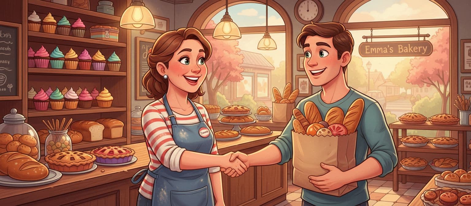
Even five strong testimonials can change how your brand feels online.

People trust brands that feel stable and consistent.
Check that your:
Consistency costs nothing. It instantly raises your perceived size and reliability.
You don’t need to spend everywhere, adding all of these "helpful" subscriptions to your credit card. Focus your budget on:
A well-structured site with a strong first impression often beats a large but messy one.
Start with what you have today: a focused message, a clean look, and proof that your work delivers results. Then polish your website step by step.
If you want a site that feels like a big brand without a big-brand budget, invest in expert help for design, structure, and copy—maybe consider us? A focused project can give you a site that:
Your brand can look as strong as the service you provide, even on a small budget. Now, is that all there is? Almost—there is one more thing you have to consider—accessibility. Its all about making your website open to those with disabilities. But that is for another topic, find out more on that here.
.svg)
Heart health is crucial for overall well-being. Learn how to keep your heart healthy with these simple lifestyle changes, expert tips, and the latest medical advancements.
Around 50% of internet users say that website design is a crucial factor in formulating an opinion about a brand. (PR Newswire)

2160 Barranca Parkway #1047
Irvine, CA 92606
Service Area: United States