February 3, 2026

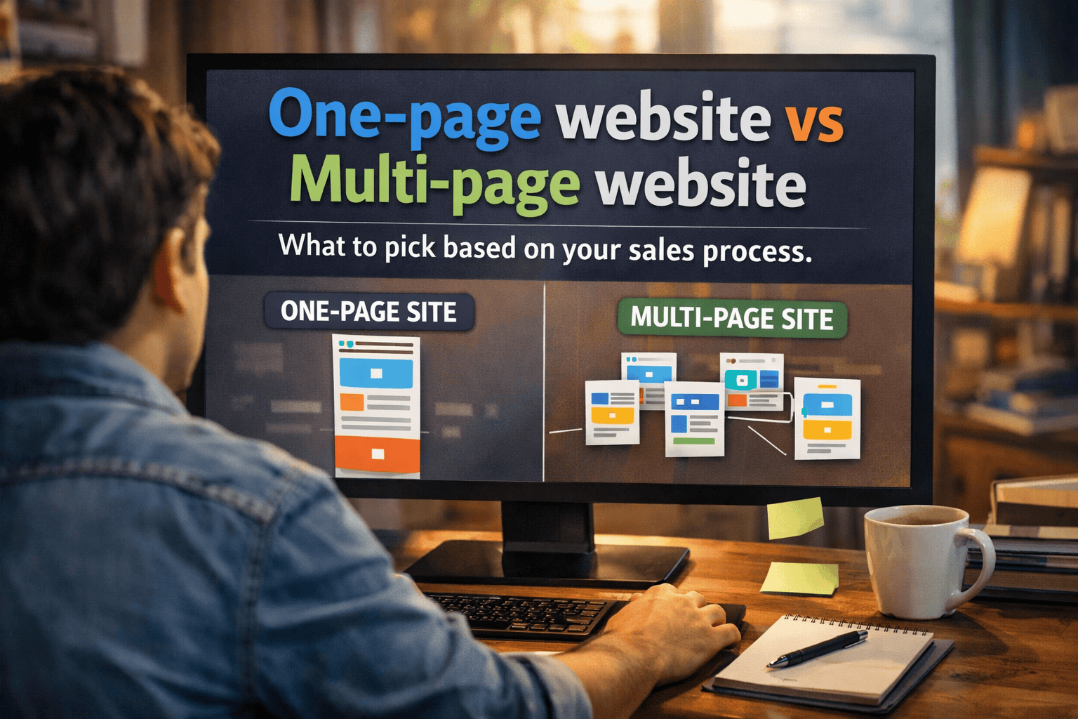
Picking between a one-page vs multi-page website isn’t a design preference, it’s a sales process decision. Your site should match how prospects find you, how they build trust, and how they take the next step.

Think of it like a storefront. If you sell one item with one clear price, you can run a tight, focused counter. If you offer a menu, you need signs, categories, and paths that help people self-select. Your website works the same way.

Start by mapping your sales process (traffic → trust → action)

Clean, modern vector-style infographic comparing one-page and multi-page websites, highlighting pros like fast load times and SEO depth, with a central decision flowchart based on offer complexity, traffic sources, SEO importance, and conversion paths, ending in tailored recommendations.

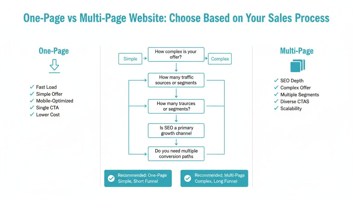
Infographic comparing the two site types and the decisions that usually drive the right choice (created with AI).

Before you choose a layout, write down three things:

  • Where traffic comes from (Google search, paid ads, referrals, LinkedIn outreach, partnerships).
  • What prospects need to believe before they contact you (proof, pricing clarity, expertise, fit).
  • What “conversion” means for you (purchase, book a call, request a quote, start a trial).

A one-page site works best when the journey is short and the offer is easy to grasp. A multi-page site shines when buyers need options, proof, and answers in layers.

One-page vs multi-page website: a practical comparison

FactorOne-page websiteMulti-page websiteUsually best when…Offer complexityOne main offerMultiple offers or tiersYou sell more than one service or segmentBuyer journeyShortMedium to longBuyers research before contacting youTraffic patternOne main entry pointMany entry pointsYou rely on Google and long-tail searchesSEO coverageLimitedStrongYou want to rank for several topics and intentsConversion goalOne primary actionSeveral actionsYou need different CTAs for different visitorsMaintenanceSimpleMore to manageYou’ll publish content, case studies, or updates

If your leads mostly land on one page and decide fast, one-page can convert well. If your leads land on different pages based on what they searched, multi-page usually wins.

When a one-page website fits a short, focused funnel

A one-page website is a strong match when you want visitors to take one main action and you can explain the value fast. It’s common for:

Sales processes that fit one-page

  • Paid ads → one offer → checkout or book a call (short decision window).
  • Referral traffic → “confirm credibility” → contact (they already trust the referrer).
  • Webinar or event traffic → register → follow-up sequence.
  • Single-product SaaS waitlist → join list → email nurture.

A good one-page site feels like a guided conversation. Each section answers the next question before it’s asked.

One-page website checklist (good fit if most are true):

  • You have one primary offer (or one “best” package you want to sell).
  • Most visitors arrive from one campaign or one link.
  • Your pitch can be understood in under two minutes.
  • You’re optimizing for one conversion (book, buy, join).

Recommended one-page site outline (sections that sell)

Clean, modern vector infographic on white background comparing page structures for one-page (stacked sections: Hero, Problem-Solution, Social Proof, Pricing, FAQ, CTA) and multi-page websites (core pages: Home, About, Services, Case Studies, Contact with navigation). Features blue teal accents, simple line icons, and user flow arrows.

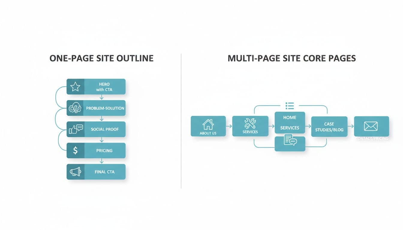
Simple outlines showing how one-page sections differ from multi-page navigation (created with AI).

Use this structure as a starting point:

  • Hero + single CTA: Say who it’s for, what you do, and the next step (book a call, get a quote).
  • Problem → outcome: Show you understand the pain, then name the result you deliver.
  • How it works: 3 to 5 steps, plain language, no fluff.
  • Social proof: Testimonials, logos (if allowed), short wins, before/after.
  • Pricing or “starting at”: Reduce back-and-forth. If pricing varies, explain what drives it.
  • FAQ: Handle objections (timeline, process, what’s included, who it’s for).
  • Final CTA: Repeat the action with a tight reminder of the benefit.

One warning: one-page sites can get heavy if you cram in videos, sliders, and giant images. That matters for speed and conversions.

When a multi-page website matches a longer sales cycle

Multi-page is often the right call for B2B services, agencies, consultants, and SaaS with multiple use cases. It supports how people actually buy: they compare, skim, come back later, then share links internally.

Sales processes that fit multi-page

  • Inbound SEO → service page → case studies → contact (common for agencies and consultants).
  • LinkedIn outreach → credibility check → about + proof → book a call.
  • Partner referrals → “what exactly do you do?” → services + process → contact.
  • SaaS with multiple personas → use case pages → pricing → trial or demo.

Multi-page website checklist (good fit if most are true):

  • You serve different industries or roles (each needs different messaging).
  • You have more than one service or package.
  • You want to rank for multiple search intents (service, pricing, comparisons, FAQs).
  • Your prospects need proof (case studies, detailed process, team, approach).

Recommended multi-page website core pages (and what each should do)

Keep it lean at first, then expand based on real questions prospects ask:

  • Home: Quick positioning, key services, proof, and clear paths.
  • Services (one page per service): One problem, one buyer, one offer per page.
  • About: Trust builders (who you are, how you work, why it’s different).
  • Case Studies or Portfolio: The strongest conversion helper for high-ticket services.
  • Pricing or Packages: Even ranges help qualify leads.
  • Contact: Short form, clear expectations, and next steps.

Multi-page sites also let you create pages that match search intent. Someone searching “website redesign pricing” needs different content than someone searching “B2B web design agency Orange County” or “website maintenance plan.”

2025 considerations that should influence your choice

Core Web Vitals and mobile-first UX affect both rankings and conversions in 2025. Here’s how the choice changes the work:

  • Core Web Vitals: One-page sites risk slower load times because everything loads at once. Multi-page sites can be faster per visit if each page is lighter. Either way, watch LCP (load speed), INP (tap and click responsiveness), and CLS (layout shifting).
  • Mobile-first behavior: On phones, long one-page sites can cause scroll fatigue. Multi-page helps people jump straight to what they need, but only if navigation is thumb-friendly and simple.
  • Search intent coverage: Multi-page makes it easier to answer specific questions with dedicated pages. That often means better qualified leads, not just more traffic.
  • Measurement: Multi-page gives clearer signals in analytics (which service page drives leads, which case study closes deals). One-page needs more careful event tracking to avoid guesswork.

A simple decision tree you can use today

Clean vector infographic showing a decision tree to choose between one-page and multi-page websites based on sales process length and buyer journey.

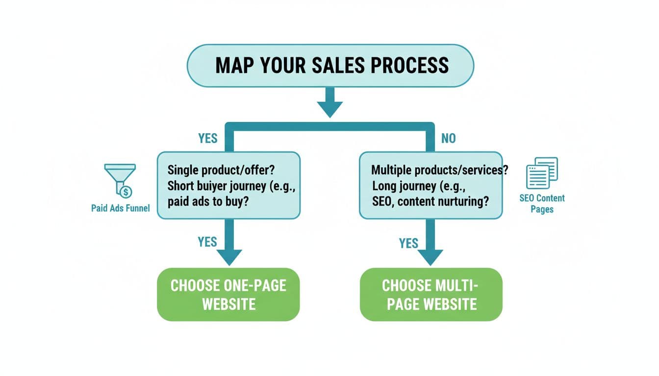
Decision tree that maps common sales paths to the right site type (created with AI).

  1. Do you have one primary offer you want most people to choose?
    If yes, go to step 2. If no, pick multi-page.
  2. Is most of your traffic going to one campaign or one link?
    If yes, go to step 3. If no, pick multi-page.
  3. Do buyers usually decide fast (same day or same week)?
    If yes, pick one-page. If no, pick multi-page.

Common misconceptions that cause costly picks

“One-page is always better for conversions.”
It can be, when the offer is simple and the CTA is singular. For complex services, a one-page site often becomes a cluttered wall that people skim and leave.

“Multi-page means slower and harder to use.”
Not if it’s built with clear menus, fast templates, and focused pages. In many cases, a multi-page site is faster because users only load what they need.

“SEO doesn’t matter for service businesses.”
If your sales process includes trust-building before a call, search usually plays a role. Multi-page content helps you show up for more “ready-to-buy” searches.

If you’re stuck, pick the hybrid that matches real life

Many businesses do best with a multi-page website plus one or two dedicated landing pages for paid ads or specific offers. That way, you get SEO depth and a focused conversion path when you need it.

If you’re early-stage, you can also start with a tight one-page site, then expand into a multi-page structure as soon as you see repeating questions from leads.

Conclusion: let your funnel choose the layout

The best one-page vs multi-page website choice is the one that matches how prospects move from first click to signed contract. One-page works when you sell one clear offer with one clear next step. Multi-page works when trust takes time and buyers need answers from different angles. Pick the structure that makes the next step feel obvious, then improve it with real data from calls, forms, and wins.

Related Blogs

Related Health Tips

Heart health is crucial for overall well-being. Learn how to keep your heart healthy with these simple lifestyle changes, expert tips, and the latest medical advancements.