
20+
Years Experience

.svg)
Designer | Developer
Carey Davis
I'm a multidisciplinary designer and developer with over 20 years of experience spanning print, digital, web, and interactive media. My background includes roles as a graphic designer, art director, and senior digital creative, with deep expertise in UX, high-end photo retouching, animation, and email development.
I've led client projects, managed teams, trained agencies, and taught design and animation at the college level. With a BFA in Graphic Design and a strong foundation in both design and code, I bring strategic, hands-on leadership across the entire creative and development process.
Multidisciplinary
Portfolio

Damage Creative Website
Delivers thought-provoking, category-shattering campaigns and content that resonates with the gaming community.
Branding Overview
Damage Creative is a Los Angeles-based full-service creative agency specializing in gaming and streaming culture. Founded by gaming industry experts and powered by award-winning ad agency leaders, Damage delivers thought-provoking, category-shattering campaigns and content that resonates with the gaming community. Their mission is to engage consumers through the virtual frontier of gaming and streaming, consistently delivering provocative and authentic ideation to ingrain brands with gamers.
Strategy Components
1. Brand Positioning
Damage Creative positions itself at the intersection of gaming culture and brand storytelling. By leveraging deep-rooted connections within the gaming community and a strong understanding of brand dynamics, they bridge the gap between gamers and brands, ensuring authentic and impactful engagements.
2. Visual Identity & Messaging
The agency's visual identity reflects a bold and modern aesthetic, resonating with the dynamic nature of gaming culture. Messaging emphasizes authenticity, innovation, and a deep understanding of the gaming landscape, appealing to both endemic and non-endemic brands seeking to connect with gaming audiences.
3. UX & Digital Design Strategy
Damage Creative's digital presence is designed to be immersive and user-centric. Their website and digital campaigns prioritize intuitive navigation, engaging content, and responsive design, ensuring optimal user experiences across devices.
4. Content & Community Engagement
The agency emphasizes the importance of community engagement, creating content that not only promotes brands but also adds value to the gaming community. Through strategic partnerships with influencers, streamers, and esports teams, Damage Creative ensures that brand messages are delivered authentically and resonate with target audiences.
.jpeg)
Genesis Signature Event Hero and Banner Ads
The Genesis Signature Event is a seasonal promotional campaign designed to highlight exclusive offers on Genesis vehicles.
Branding Overview
To create visually striking, on-brand banner ads that align with the premium positioning of the Genesis brand while driving engagement and click-throughs during a high-impact promotional period.
Strategy Components
1. Brand Positioning
Genesis positions itself as a modern luxury alternative—offering world-class design, technology, and service without compromise. The Signature Event supports this positioning by pairing premium aesthetics with compelling purchase incentives, designed to appeal to discerning buyers seeking performance and prestige.
2. Visual Identity & Messaging
The campaign’s visual language emphasized elegance, minimalism, and clarity. Banner ads featured:
- High-resolution imagery of flagship models (e.g., G80, GV70)
- Polished typography consistent with Genesis brand guidelines
- Strong CTAs such as “Explore Offers” or “Limited-Time Event”
Messaging balanced urgency with luxury, ensuring the tone stayed aspirational rather than overly promotional.
3. UX & Digital Design Strategy
- Responsive and Scalable Layouts: Banners were designed in multiple sizes to perform across programmatic, social, and dealership ad placements.
- Subtle Animation: Where applicable, motion was used to draw attention without compromising load speed or visual integrity.
- Brand Integrity: Every element—from type to spacing—was crafted to mirror the Genesis brand’s design standards and create a seamless cross-platform experience.
4. Performance Optimization
- A large number of asset versions were optimized for file size and platform requirements (HTML5, JPG, GIF) through a sophisticated automation workflow (see video below).
- A modular design system allowed rapid creation of localized variations while maintaining consistency.
- CTAs and focal points were placed strategically for high visibility and conversion.
Result
The banners reinforced Genesis’s premium image while supporting traffic and conversion goals across digital media buys, dealership sites, and remarketing channels.
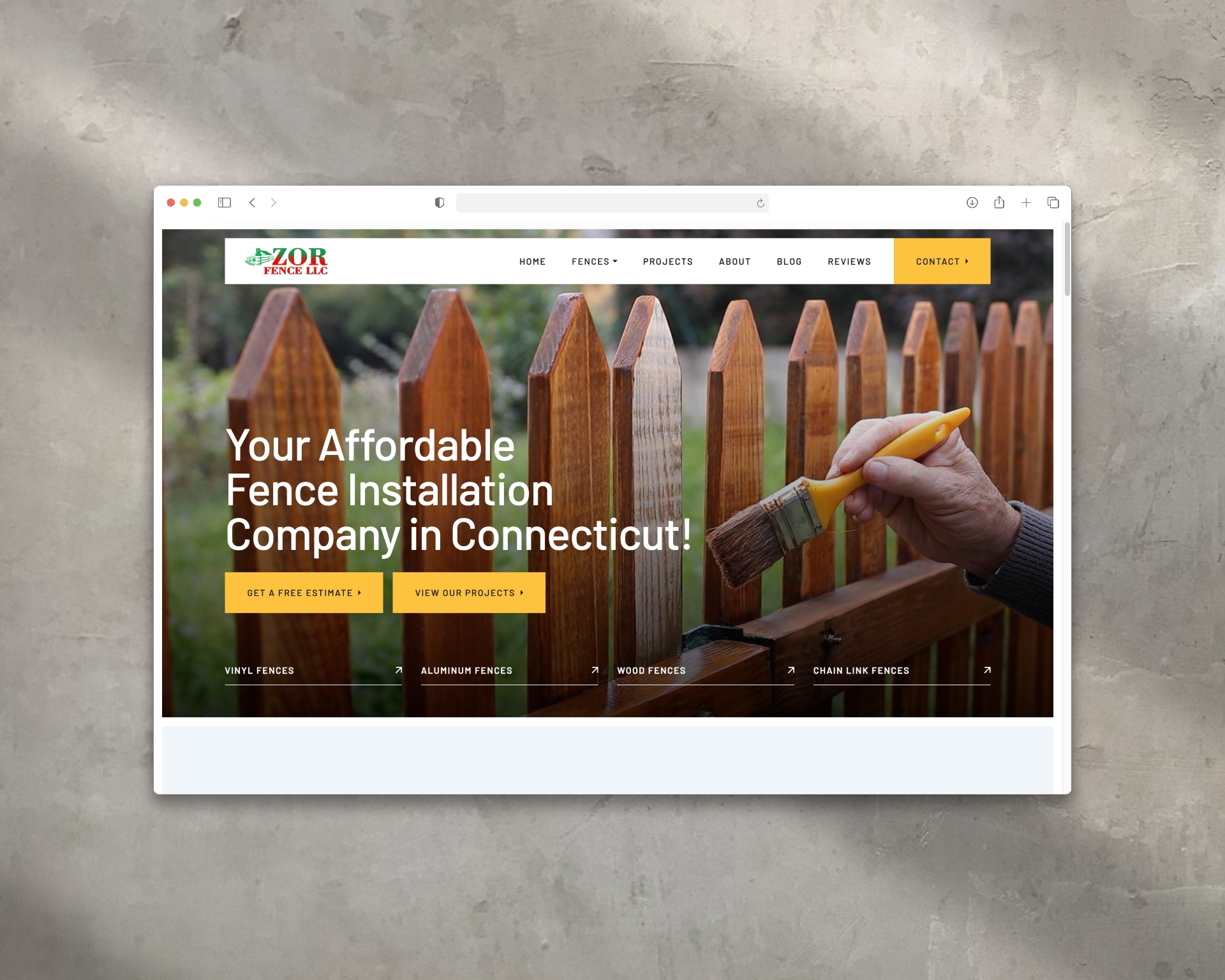
ZOR Fence Website
Offers a range of fencing solutions—including vinyl, wood, aluminum, and chain link.
Branding Overview
AboutSeniorLiving.com is a compassionate, no-cost senior care referral service operating in Southern California and Northern Idaho. Their mission is to guide families through the complex journey of finding the right senior living solution—whether it’s assisted living, memory care, board and care homes, or in-home support—by offering personalized, expert-driven placement services. Their approach is rooted in empathy, clarity, and trust, helping families make informed decisions during emotionally challenging times.
Strategy Components
1. Brand Positioning
ZOR Fence positions itself as an accessible and reliable fencing solution provider in Connecticut. By highlighting their affordability and quality workmanship, they appeal to homeowners and businesses seeking dependable fencing services without compromising on quality.
2. Visual Identity & Messaging
The website design reflects a professional and approachable brand image, utilizing clean layouts and straightforward navigation. Messaging focuses on key selling points such as "Affordable Prices and Quality Workmen," reinforcing their value proposition.
3. UX/UI Design Strategy
- Service Clarity: Dedicated pages for each fencing type (vinyl, wood, aluminum, chain link) provide detailed information, helping users make informed decisions.
- Project Showcase: A comprehensive gallery displays before-and-after images, demonstrating the company's craftsmanship and range of services .
- User Engagement: Clear calls-to-action, such as "Get A Free Estimate," encourage user interaction and facilitate lead generation.
4. Content Strategy
Content is tailored to address common customer concerns and questions, providing insights into the benefits of different fencing materials and styles. The inclusion of customer testimonials and detailed service descriptions builds trust and credibility.
5. SEO & Lead Generation
The website is optimized for search engines with relevant keywords related to fencing services in Connecticut. Integrated contact forms and clear contact information make it easy for potential clients to reach out, enhancing lead generation efforts.

About Senior Living Website
A free senior care referral service that helps families find the best living and care options for their loved ones.
Branding Overview
AboutSeniorLiving.com is a compassionate, no-cost senior care referral service operating in Southern California and Northern Idaho. Their mission is to guide families through the complex journey of finding the right senior living solution—whether it’s assisted living, memory care, board and care homes, or in-home support—by offering personalized, expert-driven placement services. Their approach is rooted in empathy, clarity, and trust, helping families make informed decisions during emotionally challenging times.
Strategy Components
1. Brand Positioning
Positioned as a trusted partner in senior living transitions, AboutSeniorLiving.com emphasizes personalized guidance and compassionate support. The brand communicates a commitment to easing the stress of finding appropriate care, ensuring families feel supported every step of the way.
2. Visual Identity & Messaging
The website's design employs a warm and approachable aesthetic, using soothing colors and clear typography to create a sense of comfort and reliability. Messaging focuses on empathy and expertise, with headlines like "Your Trusted Helper in Senior Living Solutions" reinforcing the brand's supportive role.
3. UX/UI Design Strategy
- Intuitive Navigation: Services are clearly categorized, allowing users to easily explore options such as assisted living, memory care, and in-home support.
- Responsive Design: Ensures optimal viewing across devices, catering to both tech-savvy users and those less familiar with digital platforms.
- Call-to-Action (CTA): Prominent CTAs like "Start Your Journey" guide users toward initiating the placement process.
4. Content Strategy
Content is tailored to address the concerns and questions of families seeking senior care solutions. Detailed service descriptions, testimonials, and a clear outline of the placement process build trust and demonstrate the organization's commitment to personalized support.
5. SEO & Lead Generation
The website is optimized for search engines with relevant keywords, meta descriptions, and structured data. Integrated contact forms and consultation booking features facilitate lead capture and conversion.

Graybug Vision Poster Design
Graybug Vision is a clinical-stage biopharmaceutical company focused on developing transformative therapies for diseases of the retina and optic nerve.
Brand Overview
Graybug Vision is a clinical-stage biopharmaceutical company focused on developing transformative therapies for diseases of the retina and optic nerve. Known for its precision in ocular drug delivery and targeted treatment innovation, Graybug Vision bridges science and patient care through advanced research and technology. For two major professional events, the company needed clean, visually compelling posters that reflected their scientific expertise and brand sophistication.
Creative Approach
1. Project Scope
Design two professional event posters that communicate critical details while visually reinforcing Graybug Vision’s mission in eye health innovation.
- Poster 1: CRA Training
- Poster 2: Clinical Investigator Meeting
Both pieces were created to align with brand guidelines while addressing distinct event audiences.
2. Poster 1 – CRA Training
This design centered around a high-resolution close-up image of a human eye, selected for its symbolic and visual depth.
- The intricate iris detail communicates Graybug’s commitment to precision and targeted therapies for complex retinal conditions.
- The photo was color-graded to align with Graybug’s brand palette, and served as a striking visual anchor.
- Event information—including date, location, and registration details—was presented in a clean, corporate format beneath the imagery, reinforcing clarity and professionalism.
3. Poster 2 – Clinical Investigator Meeting
The second poster employed a modern, abstract design to complement the technical nature of the event while remaining brand-aligned.
- The layout featured the Graybug Vision logo prominently, supported by geometric design elements in brand colors (deep blue, light gray, and clinical green hues).
- Abstract forms created a sense of structure and depth, subtly referencing retinal pathways and scientific systems.
- The typographic structure emphasized hierarchy and readability, helping attendees quickly identify key information about the meeting.
4. Outcome
Both posters successfully balanced visual storytelling and corporate clarity, adhering to Graybug Vision’s brand while elevating the presence of their events.
These designs demonstrate expertise in:
- Photo retouching and enhancement
- Professional event layout composition
- Typographic balance and brand integration
The result was a cohesive set of materials ready for both print and digital distribution, strengthening Graybug Vision’s position as a leader in ocular innovation.

Horizon Brands Poster Design
Horizon Brands builds and scales innovative consumer product companies that enhance everyday life.
Brand Overview
Horizon Brands builds and scales innovative consumer product companies that enhance everyday life. Their portfolio includes high-performance lifestyle and automotive products designed with precision, innovation, and modern aesthetics. As part of their partnership with Formula Drift racer Vaughn Gittin Jr., Horizon Brands launched a poster campaign to promote their TYPE S Underglow LED Lighting at a national motorsport event—blending high-octane excitement with product visibility.
Creative Approach
1. Concept & Purpose
The goal of this poster was to capture the bold energy of Formula Drift culture while showcasing the TYPE S product in a real-world, high-performance setting. The poster was designed for live event distribution, serving both as a collectible for fans and a visually striking brand showcase for TYPE S underglow LED technology.
2. Visual Execution
The layout features Formula Drift champion Vaughn Gittin Jr., dramatically lit and staged to highlight the vibrant TYPE S LED underglow on his vehicle.
- The pose, lighting, and composition were carefully selected and retouched to draw focus to the product without overpowering the athlete.
- A high-contrast treatment gives the poster a cinematic, aggressive feel, consistent with motorsports branding.
3. Typography & Composition
The poster showcases strong typographic hierarchy, emphasizing Vaughn’s name, the TYPE S logo, and key messaging.
- Bold, condensed fonts were used to mimic the raw speed and control of drifting.
- Text placement and balance were managed to maintain clear visual flow from brand to product to athlete.
4. Asset Integration & Branding
After reviewing the Horizon Brands style guide, I curated and retouched existing photography, adjusted lighting and color to align with brand standards, and seamlessly integrated all required logos and brand elements.
- Care was taken to preserve consistency across visual tone, layout margins, and brand-approved color applications.
5. Outcome
The final poster delivered a visually bold, brand-compliant piece that captured the energy of Formula Drift and celebrated the TYPE S product line. The piece highlighted my skills in Photoshop retouching, layout design, and typographic composition, and was well received both by fans and brand stakeholders at the event.

Genesis Dealer Website Hero Designs
Genesis Motors is the luxury automotive division of Hyundai, known for combining premium craftsmanship, bold design, and next-generation technology.
Brand Overview
Genesis Motors is the luxury automotive division of Hyundai, known for combining premium craftsmanship, bold design, and next-generation technology. As the brand expanded its lineup and presence in the U.S., dealer websites such as Genesis of West Houston and others needed high-impact hero images to promote new models, build excitement around upcoming arrivals, and guide prospective buyers toward inventory and reservations.
These assets played a key role in translating national brand messaging into local, sales-driven experiences that still felt elevated and on-brand.
Creative Approach
1. Hero Image Production & Model-Specific Messaging
I created a series of hero images designed to feature prominently at the top of Genesis dealer websites. Each hero focused on a specific model or seasonal initiative, combining luxury visuals with concise, conversion-focused messaging.
Featured Vehicles Included:
- The All-New Genesis G80 / G90 / GV70
- Genesis GV80 (the brand’s first-ever SUV)
- Full seasonal lineup featuring sedans and SUVs side by side
Each asset was carefully composed to include:
- A bold headline such as “The All-New [Year] Genesis G80”
- A subheadline that highlighted a key feature or value proposition (e.g. “Now with Available AWD and a 14.5” Display”)
- A clear call to action, such as “Reserve Yours Before It Arrives” or “View Inventory”
2. Visual Composition & Image Curation
The design process began with reviewing official Genesis brand photography, selecting imagery that best showcased each model’s design language and complemented the hero’s layout requirements. For the GV80 launch in particular, I emphasized:
- A clean, dramatic layout to mirror the vehicle’s sculpted design
- Cinematic lighting that evoked a sense of arrival and presence
- Positioning that allowed for clear copy overlays without compromising visual balance
For the full-lineup seasonal image, I arranged a progression of Genesis vehicles from sedan to SUV, showcasing the breadth of the brand while maintaining uniform lighting and consistency in visual depth.
3. Copywriting & Brand Voice Adaptation
I wrote and refined short-form promotional copy that stayed true to the Genesis voice—refined, aspirational, yet accessible.
- The tone balanced product excitement with luxury restraint
- Every word was designed to convert interest into action while still maintaining brand dignity
Each CTA was strategically placed to align with user reading flow, and optimized for visibility across both desktop and mobile layouts.
4. Dealer Customization
While the assets aligned with Genesis’ national branding, each hero was adapted to the individual dealer’s needs, with flexible overlays that allowed for:
- Localized vehicle availability
- Dealer-specific promotions
- Real-time inventory CTAs like “Now Arriving at Genesis of West Houston”
Outcome
These hero images played a key role in bridging brand storytelling with dealer-level performance marketing. They helped:
- Build momentum for new model releases, especially the GV80
- Drive early reservations and inventory exploration for dealerships
- Position Genesis as a forward-thinking luxury brand, even at the dealership website level
This project showcases my strength in creative direction, layout design, automotive brand alignment, and high-impact promotional messaging—all while working within strict visual guidelines and performance goals.
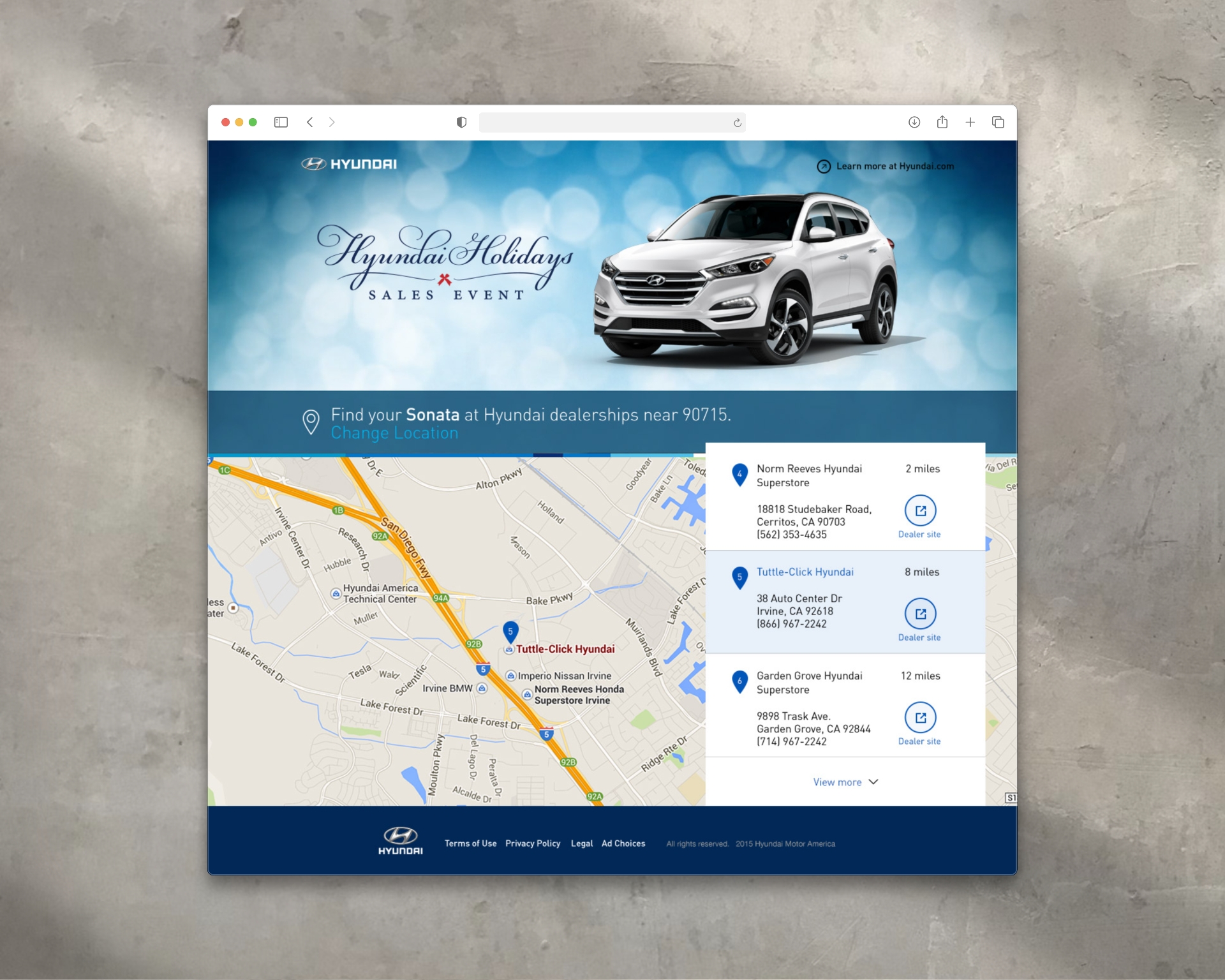
Hyundai Holidays Sales Event Hero Design
Hyundai is a global automotive brand known for its sleek design, innovative technology, and refined approach to value.
Brand Overview
Hyundai is a global automotive brand known for its sleek design, innovative technology, and refined approach to value. Each year, Hyundai launches a high-visibility holiday campaign—formerly the Hyundai Holidays Sales Event, now known as the Hyundai Getaway Sales Event—to promote special seasonal offers across its vehicle lineup. For this campaign, Hyundai aimed to highlight the Hyundai Sonata through a website experience that felt festive, premium, and on-brand.
Creative Approach
1. Animated Header Design
To support the campaign, I designed and animated a hero section for the Hyundai website, balancing brand visibility with seasonal ambiance.
- The layout featured the Hyundai Holidays logo on the left and the Hyundai Sonata on the right, establishing a clear visual hierarchy and product focus.
- The composition was optimized for clarity and elegance, keeping the layout responsive and adaptable across screen sizes and resolutions.
2. Motion Design & Atmosphere
The animation centered around a soft, subtle bokeh effect—a seasonal nod without overwhelming the interface.
- The background featured gently animated bokeh lights in soft whites and cool blues, creating a sense of winter lightness and holiday calm.
- The motion was designed to be minimal and fluid, contributing to a polished experience while staying light on performance.
- The animation helped set an elevated seasonal tone that stood apart from typical retail-style holiday graphics.
3. Brand Alignment
Every visual and motion element was built to adhere closely to Hyundai’s brand and campaign guidelines, focusing on:
- A refined, modern aesthetic
- Clean layout structure that integrated seamlessly with Hyundai’s broader website system
- Subtlety and precision—keeping the focus on the Sonata and the campaign message
Outcome
The animated header contributed a visually immersive and brand-consistent experience to one of Hyundai’s key seasonal campaigns. It brought motion, balance, and atmosphere to the Hyundai Holidays event while reinforcing the vehicle’s appeal. This project reflects my ability to blend motion design, layout composition, and brand sensitivity into a cohesive digital asset for large-scale promotional use.

Hyundai Social Media Card Designs
Hyundai is a global automotive brand known for its innovation, advanced safety features, and sleek modern design.
Brand Overview
Hyundai is a global automotive brand known for its innovation, advanced safety features, and sleek modern design. For a social media campaign centered on the Hyundai Elantra, the goal was to create a set of engaging, visually striking social cards tailored for Instagram and other platforms, each spotlighting a key vehicle feature. These cards were crafted to align with Hyundai’s bold visual identity while delivering bite-sized, tech-focused content that educates and excites potential drivers.
Creative Approach
1. Clari-Fi™ Music Restoration Technology Card
This card highlighted the Clari-Fi™ audio system, which restores depth and clarity to compressed digital music files.
- The visual concept featured a soundwave motif expanding outward from the Elantra’s interior speaker system, symbolizing immersive, high-fidelity sound.
- The layout paired clean typography with a layered, tech-inspired background, reinforcing the advanced audio engineering behind the feature.
- Subtle gradients and motion-inspired design elements conveyed energy, aligning with the emotional impact of music behind the wheel.
2. Blind Spot Detection + Rear Cross-Traffic Alert Cards (Two Variations)
These two cards each focused on Hyundai’s driver-assist technologies, with different graphic treatments to appeal across varied scroll behaviors and content formats:
Card A – Top-Down Illustration Style
- A bird’s-eye view of the Elantra on a multilane road illustrated blind spot zones and the detection system in action.
- Animated-style motion lines and directional arrows showed where and how alerts are triggered, making the feature visually intuitive.
- The Elantra was highlighted in a vivid color to draw focus amidst a minimal environment.
Card B – Close-Up Rear Perspective
- A dynamic rear-quarter view of the vehicle emphasized the rear cross-traffic alert system.
- Nearby approaching vehicles were shown with glowing alert zones, visually communicating the vehicle’s situational awareness.
- Crisp UI-inspired overlays and icons reinforced Hyundai’s smart tech capabilities in a clean, digestible format.
3. Lane Change Assist Card
This card focused on Lane Change Assist, a feature that extends blind spot detection when merging or changing lanes.
- The visual used stylized lane lines and motion blur effects to convey speed, precision, and safety in one glance.
- Directional indicators and a highlighted side mirror subtly emphasized where the technology is active.
- The tone was confident and composed, mirroring Hyundai’s brand voice.
Outcome
These social cards successfully translated technical vehicle features into compelling, user-friendly visuals.
- Each card adhered to Hyundai’s brand guidelines while introducing creative variation in layout, illustration style, and motion cues.
- Designed for high performance on Instagram, Facebook, and other mobile-first platforms, the cards contributed to increased feature awareness and engagement among Hyundai’s digital audience.

Good Look Apparel Boot Designs
Good Look Apparel is a forward-thinking custom boot company redefining footwear as a form of artistic expression.
Brand Overview
Good Look Apparel is a custom footwear brand that designs one-of-a-kind boots for men and women—transforming fashion staples into bold statements of personal style. The brand brings an artistic lens to product development, merging original surface design with high-quality materials to create boots that are both wearable and collectible. Each design draws from a unique visual world, allowing customers to express individuality through form, pattern, and story.
Creative Approach
1. Product Sourcing & Surface Design
At the core of this project was the creation of custom-printed boot designs, developed from the ground up to reflect artistic themes and cultural influences.
- I was responsible for sourcing the base boots, evaluating style, construction, and material compatibility with digital printing processes.
- Each boot design began with a creative concept, which I translated into original surface artwork tailored for precise application to curved, wearable forms.
- Designs ranged from bold graphic patterns to more textured, illustrative motifs—each intended to stand out in both everyday wear and editorial settings.
- Special care was taken to adapt each design to the boot’s structure, ensuring visual flow across seams, heels, and shafts.
This wasn’t just art placement—it was a custom product creation process that balanced creative expression with material constraints and manufacturing feasibility.
2. Product Visualization
To bring the designs to life pre-production, I created a series of high-impact digital composites showing the boots in contextual environments that echoed their artistic roots—urban, abstract, historical, or cultural.
- These composites allowed the brand to showcase each design with a narrative lens, turning each product into part of a larger story.
- I used advanced retouching and compositing techniques in Photoshop to match lighting, texture, and material realism, presenting the boots as both tangible and aspirational.
3. Packaging System Design
With a product this expressive, the packaging needed to feel equally thoughtful.
- I designed a cohesive packaging system that extended each boot’s story into the physical unboxing experience.
- Boxes, tissue paper, and inserts were customized with design elements derived directly from the surface artwork—making every delivery feel intentional and immersive.
- The result was a packaging experience that reinforced the artistic value of the product and aligned with the brand’s identity as both a fashion label and design house.
Outcome
This project unified product sourcing, surface design, brand storytelling, and packaging into a cohesive creative system.
- The boots themselves stood out in a crowded marketplace for their originality, craftsmanship, and art-first aesthetic.
- Visual storytelling through composites and packaging gave customers a deeper connection to the product—and to the brand’s values.
- The work showcases my ability to develop products from concept through design and visual presentation, demonstrating strength in creative direction, product development, and brand expression.
Hyundai Holidays Sales Event Hero Design
Hyundai is a global automotive brand known for its sleek design, innovative technology, and refined approach to value.
Brand Overview
Hyundai is a global automotive brand known for its sleek design, innovative technology, and refined approach to value. Each year, Hyundai launches a high-visibility holiday campaign—formerly the Hyundai Holidays Sales Event, now known as the Hyundai Getaway Sales Event—to promote special seasonal offers across its vehicle lineup. For this campaign, Hyundai aimed to highlight the Hyundai Sonata through a website experience that felt festive, premium, and on-brand.
Creative Approach
1. Animated Header Design
To support the campaign, I designed and animated a hero section for the Hyundai website, balancing brand visibility with seasonal ambiance.
- The layout featured the Hyundai Holidays logo on the left and the Hyundai Sonata on the right, establishing a clear visual hierarchy and product focus.
- The composition was optimized for clarity and elegance, keeping the layout responsive and adaptable across screen sizes and resolutions.
2. Motion Design & Atmosphere
The animation centered around a soft, subtle bokeh effect—a seasonal nod without overwhelming the interface.
- The background featured gently animated bokeh lights in soft whites and cool blues, creating a sense of winter lightness and holiday calm.
- The motion was designed to be minimal and fluid, contributing to a polished experience while staying light on performance.
- The animation helped set an elevated seasonal tone that stood apart from typical retail-style holiday graphics.
3. Brand Alignment
Every visual and motion element was built to adhere closely to Hyundai’s brand and campaign guidelines, focusing on:
- A refined, modern aesthetic
- Clean layout structure that integrated seamlessly with Hyundai’s broader website system
- Subtlety and precision—keeping the focus on the Sonata and the campaign message
Outcome
The animated header contributed a visually immersive and brand-consistent experience to one of Hyundai’s key seasonal campaigns. It brought motion, balance, and atmosphere to the Hyundai Holidays event while reinforcing the vehicle’s appeal. This project reflects my ability to blend motion design, layout composition, and brand sensitivity into a cohesive digital asset for large-scale promotional use.

USPS Banner Ads
The United States Postal Service (USPS) provides mail and shipping solutions for individuals and businesses across the country.
Brand Overview
The United States Postal Service (USPS) provides mail and shipping solutions for individuals and businesses across the country. These campaigns focused on promoting three key services: Every Door Direct Mail (EDDM) for businesses, gopost™ for flexible self-service shipping, and Express Mail® for on-time holiday gift delivery. Each banner ad combined visual storytelling with clever animation to deliver clarity, charm, and action.
Strategy Components
1. Objective
To design and animate a series of engaging banner ads that drive awareness and participation across USPS service offerings—targeting both small business owners and individual consumers during peak times and strategic initiatives.
2. Campaign Execution
A. Every Door Direct Mail Webinar
- Purpose: To promote USPS’s EDDM service and encourage webinar attendance for businesses wanting to reach local markets.
- Visual Concept: Clean, professional layout with animated map markers or highlighted delivery zones.
- Messaging: “Reach Every Address in Your Market. Learn How—Join Our Webinar.”
- Animation: A subtle door-to-door delivery path, reinforcing coverage and targeting precision.
B. gopost™ Self-Service Shipping
- Purpose: To highlight USPS’s self-service gopost kiosks that let users send and receive packages on their own time.
- Visual Concept: Friendly and modern, showcasing ease of use and flexibility.
- Animation: A person accessing a gopost locker, or packages sliding into compartments.
- CTA: “Ship on Your Schedule—Register Today.”
C. Holiday Express Mail – “Santa Stuck”
- Purpose: To drive urgency for last-minute shipping with Express Mail® and ensure gifts arrived by Christmas.
- Visual Concept: Humorous, festive creative showing Santa Claus stuck halfway down a chimney—visually symbolizing delays.
- Animation: A gentle wiggle or puff of smoke from the chimney paired with playful type and a callout like “Don’t Get Stuck—Ship Today with Express Mail.”
- Tone: Lighthearted and timely, balancing USPS’s reliable image with holiday charm.
3. Outcome
Each banner aligned with USPS’s brand standards while adapting tone and visuals to match the context—professional for B2B, modern and flexible for gopost™, and fun and festive for the holiday audience. The animations enhanced engagement, while strong CTAs supported clear user pathways to sign-ups, webinars, or express mail tools.
.jpeg)
USA.gov Banner Ads
USA.gov is the official web portal of the United States government, designed to help citizens easily access accurate, up-to-date government information and services.
Brand Overview
USA.gov is the official web portal of the United States government, designed to help citizens easily access accurate, up-to-date government information and services. This campaign aimed to increase awareness of how simple and reliable it is to find trusted federal resources—whether you're researching benefits, policies, or official forms. The banner ads highlighted ease-of-use and credibility through clean, interactive design and subtle animation.
Strategy Components
1. Objective
To design and animate a series of digital banner ads that educate users about the simplicity and reliability of using USA.gov to search for official government information, while reinforcing trust and approachability.
2. Campaign Execution
A. Magnifying Glass Animation Banner
- Visual Concept: A clean, minimal banner with the USA.gov logo as the focal point.
- Animation: A magnifying glass moved slowly and intentionally across the logo—visually reinforcing the idea of discovery, clarity, and search.
- Tone: Calm, professional, and trustworthy—aligned with the government’s visual identity.
- CTA: “Find the latest official information at USA.gov” encouraged direct interaction and exploration.
B. Interactive Search Field Banner
- Visual Concept: Modeled after the familiar Google-style search field, this banner allowed users to type in queries and see sample auto-populated results sourced from official government records.
- Interactivity: Mimicked real search behavior, pulling in dynamic examples like “unemployment benefits,” “passport renewal,” and “federal student aid.”
- Design Goal: To demonstrate how intuitive and user-friendly USA.gov’s search functionality is—removing the intimidation sometimes associated with government websites.
3. Outcome
Both banners effectively communicated ease of access and authority, positioning USA.gov as a go-to tool for reliable government information. The magnifying glass animation created a calm sense of clarity, while the interactive search field banner demonstrated real-world utility—helping shift perceptions of government sites from complex to approachable.

USAA Banner Ads
USAA (United Services Automobile Association) is a financial services provider dedicated to serving military members and their families.
Brand Overview
USAA (United Services Automobile Association) is a financial services provider dedicated to serving military members and their families. Known for its integrity, value, and customer-first approach, USAA offers banking, insurance, and investment products tailored to the unique needs of those who serve. These banner ad campaigns aimed to raise awareness and drive conversions across three core offerings: free checking accounts, investment opportunities, and auto insurance—each highlighting trust, convenience, and long-term value.
Strategy Components
1. Objective
To design and animate a series of interactive, high-impact banner ads that clearly communicate USAA’s key benefits, attract user attention, and encourage clicks and sign-ups across banking, insurance, and investment verticals.
2. Campaign Execution
A. USAA Free Checking Account
- Messaging: “No Monthly Fees. No Minimum Balance. Free ATM Use. Free Web Bill Pay.”
- Visual Direction: Bright, simplified UI-style visuals reinforced the digital-first, hassle-free nature of the account.
- Animation: Features appeared one by one in a clean, confident rhythm—building up a sense of value and momentum.
- Interactive Elements: Hover states and expandable panels allowed users to explore benefits before clicking through.
B. USAA Investments
- Messaging: Focused on potential gains and long-term financial growth, framed around trust and stability.
- Visual Direction: Subtle data visualizations and upward graph animations helped convey potential financial growth without overwhelming the user.
- Tone: Professional, calm, and goal-oriented—instilling confidence in future planning.
- Interactive Features: Tool-tip style animations encouraged users to explore scenarios or benefits based on their investment interests.
C. USAA Auto Insurance
- Messaging: Centered on value, coverage, and military-focused benefits.
- Visual Direction: Eye-catching motion graphics of vehicles, safe driving icons, and simplified claims processes.
- Animation: Seamless transitions highlighted ease of switching and getting a quote.
- CTA Focus: “Get a Free Quote” and “See Your Savings” drove strong engagement.
3. Outcome
The campaign’s mix of animation, interactivity, and clear messaging helped effectively communicate USAA’s value across multiple products. Each banner was tailored in tone and pacing to fit its subject matter while maintaining a consistent brand voice. The work supported increased awareness and conversions across targeted audiences, reinforcing USAA’s reputation for reliable, member-focused financial solutions.
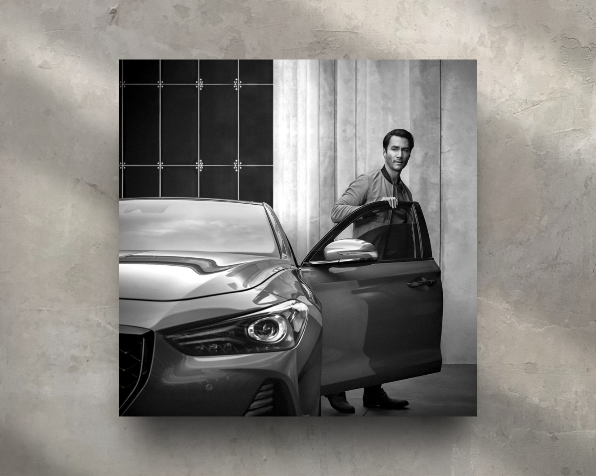
Genesis Instagram Post for Genesis G90
Genesis Motors is a luxury automotive brand renowned for its refined design language, progressive engineering, and elevated brand presence.
Brand Overview
Genesis Motors is a luxury automotive brand renowned for its refined design language, progressive engineering, and elevated brand presence. To support the visual identity of the newly redesigned Genesis G90, the flagship sedan, the brand required a hero image that embodied sophistication and timelessness. The final image would be featured on Instagram, aligning with Genesis’s minimalist, luxury-forward social aesthetic.
Creative Approach
1. Complex Retouching & Scene Clean-Up
The original image, delivered in raw format, featured a strong base composition but required meticulous, high-end retouching to meet luxury brand standards.
Key challenges included:
- Removing plant reflections from the vehicle’s surface—particularly intricate due to curved metallic panels and lighting gradients
- Eliminating unwanted elements from the scene, including physical plants, background clutter, and miscellaneous objects
- Rebuilding and extending architectural elements, such as sections of the wall where visual gaps were left behind
- Extending secondary subjects in the image to rebalance the frame and improve composition
The image was carefully reconstructed using a blend of advanced masking, clone and healing tools, digital painting, and gradient retouching, ensuring that no visual noise disrupted the vehicle's commanding presence.
2. Black & White Conversion for Brand Tone
After completing the technical retouching, I converted the image to black and white, a deliberate stylistic choice to align with Genesis’s timeless and classical brand tone.
- The absence of color allowed the focus to shift entirely to form, light, and material, emphasizing the G90’s sculpted body and distinctive Crest Grille
- Tonal contrast and highlight/shadow dynamics were adjusted to maintain depth, clarity, and visual drama, resulting in a piece that felt elegant, controlled, and editorial
Outcome
The finished image was published on Genesis’s official Instagram account, successfully showcasing the Genesis G90 as a redefinition of luxury.
- The image aligned seamlessly with the brand’s visual tone—clean, bold, and sophisticated
- The technical precision and aesthetic refinement of the final result demonstrated the brand’s commitment to excellence in every visual detail
This project showcases my ability to perform complex image retouching, maintain luxury-level aesthetic standards, and contribute to brand-consistent content for high-profile campaigns in the automotive space.

Freedom Academy Logo Design
Freedom Academy is a transformative wellness and fitness organization focused on empowering individuals to reach their full potential.
Brand Overview
Freedom Academy is a transformative wellness and fitness organization focused on empowering individuals to reach their full potential—physically, mentally, and emotionally. With a mission rooted in personal growth, community, and positivity, Freedom Academy offers Functional Fitness Training, Realistic Martial Arts, and Healthy Living education to help people live their strongest, healthiest lives. The academy is a place of motivation, energy, and purposeful transformation.
Creative Approach
1. Concept & Symbolism
The logo icon features a dynamic symbol that represents both a person with arms uplifted in triumph and a bird in flight. This duality captures the essence of the brand—freedom through discipline, and joy through movement. The raised arms speak to personal achievement, while the bird form reflects liberation, elevation, and limitless potential.
Behind the figure is a bright yellow sun, radiating warmth, energy, and optimism. It represents a new day, a new beginning, and the vibrant community that powers the academy.
2. Color Palette
The sun’s yellow evokes positivity, vitality, and energy. The figure—typically in a bold, grounded hue like deep blue, black, or crimson—offers contrast and strength, reinforcing balance between effort and reward, power and positivity.
Together, the palette creates a sense of motion, clarity, and inspiration—mirroring the emotional atmosphere of the academy itself.
3. Typography & Style
The wordmark is set in a clean, modern sans-serif or bold serif typeface, reflecting strength, clarity, and momentum. “Freedom” may appear more prominent—representing aspiration—while “Academy” supports with structure and credibility. The type complements the uplifting icon with balanced geometry and a grounded baseline.
4. Versatility & Mood
The logo design is highly versatile, designed to appear confidently across:
- Apparel and fitness gear
- Facility signage
- Social media branding
- Printed wellness guides
The upward motion, birdlike posture, and rising sun combine to create a powerful emotional impact, reinforcing a message of hope, achievement, and freedom through personal growth.

Royal Oak Heating and Cooling Logo Design
Royal Oak Heating and Cooling is a trusted HVAC company specializing in residential heating and air conditioning services.
Brand Overview
Royal Oak Heating and Cooling is a trusted HVAC company specializing in residential heating and air conditioning services. Known for reliable expertise and efficient service, the brand serves homeowners seeking year-round comfort and peace of mind. The logo reflects the company’s balanced approach to climate control—delivering warmth in winter, cool relief in summer, and airflow that feels just right.
Creative Approach
1. Concept & Symbolism
The logo icon features two overlapping home silhouettes—one in red to represent heating, and the other in blue to represent cooling. Where the homes converge, a central upward-pointing arrow is formed, symbolizing airflow, circulation, and rising comfort levels. This unified symbol captures the full cycle of HVAC service in a single, smartly constructed mark.
2. Color Palette
The use of red and blue is classic and intuitive—immediately signaling temperature control. The overlapping area subtly blends into a neutral or purple-toned core, giving visual clarity to the center arrow and reinforcing harmony between heating and cooling services. The palette is bold but balanced for both digital and print use.
3. Typography & Style
The wordmark is set in a clean, modern sans-serif typeface, conveying reliability and professionalism. Optional subtle adjustments—like softened edges or increased spacing—keep the type approachable and legible across formats. The name “Royal Oak” is emphasized to reflect regional pride, while “Heating and Cooling” is kept secondary yet strong.
4. Aesthetic & Structure
The overall design is sleek, geometric, and symmetrical, suggesting technical precision and balance. The homes and arrow icon create a sense of structure and movement—making the brand feel solid yet dynamic. The clean lines allow the logo to scale easily, from business cards to vehicle wraps.
5. Versatility
The logo works effectively in both full color and monochrome versions, and the icon can function independently for branding touchpoints such as service badges, technician uniforms, or mobile app icons.

Toledo Harley-Davidson Logo Design
Toledo Harley-Davidson represents the rugged spirit of American freedom, biker culture, and Midwest grit.
Brand Overview
Toledo Harley-Davidson represents the rugged spirit of American freedom, biker culture, and Midwest grit. As a regional extension of the iconic Harley-Davidson brand, this dealership serves as a hub for local riders and enthusiasts—offering bikes, gear, and a place to belong. The custom logo was created to embody bold patriotism, power, and brand loyalty with unmistakable energy.
Creative Approach
1. Concept & Symbolism
The centerpiece of the logo is a fierce cartoon eagle, drawn in a dynamic, action-packed pose, clawing the top of the "Toledo" logotype as if asserting dominance and ownership. This eagle—bold, sharp-eyed, and full of attitude—symbolizes freedom, strength, and national pride, all key themes in the Harley-Davidson lifestyle.
Behind the eagle flies a stylized American flag, rippling in motion to reinforce the sense of speed, freedom, and patriotism. Above the scene sits the classic Harley-Davidson badge, anchoring the design with brand authority and legacy.
2. Illustration Style
The eagle is rendered in a custom cartoon illustration style—bold lines, exaggerated features, and powerful form give it presence and energy. Its claws, feathers, and expression are meticulously detailed to emphasize intensity and attitude, connecting with the raw emotion of the Harley rider.
3. Typography & Layout
The “Toledo” logotype is strong and masculine, built to withstand the force of the eagle clutching it. The composition is tiered vertically:
- Top: Harley-Davidson badge (as a towering banner of brand legacy)
- Middle: Ferocious eagle in motion, American flag waving
- Bottom: Toledo logotype under pressure—suggesting strength and identity
4. Color Palette
Classic Harley orange, black, and white anchor the color scheme, while reds, whites, and blues from the American flag add patriotic flair. The colors are carefully balanced to maintain legibility and high visual impact across patches, signage, apparel, and digital assets.
5. Versatility
Despite its high-energy composition, the logo was designed for scalability and clarity, working well in both full color and single-color variations. It translates seamlessly to merchandise, vehicle decals, event posters, and embroidered jackets—perfect for riders who want to rep their hometown dealership with pride.
Wayne Tree Manor Logo Design
Wayne Tree Manor is a distinguished banquet and wedding venue.
Brand Overview
Wayne Tree Manor is a distinguished banquet and wedding venue. Known for its spacious, remodeled event center and elegant chapel, it has hosted countless weddings, receptions, and cultural celebrations with a legacy of exceptional customer service. Whether for intimate gatherings or grand occasions, Wayne Tree Manor provides a timeless setting for unforgettable events.
Creative Approach
1. Concept & Symbolism
The logo features a stylized black tree silhouette framed inside a traditional Arabic arch design, set against a rich green background. The tree symbolizes life, growth, and lasting memories—perfect for weddings and milestone occasions. The Arabic arch adds a graceful architectural element, suggesting formality, heritage, and the versatility of the venue to host multicultural events.
2. Color Palette
The combination of black and green speaks to elegance and renewal. Green represents celebration, growth, and harmony—while black anchors the design with formality and prestige. The palette enhances the logo's visual weight without overpowering its sense of sophistication.
3. Typography & Style
The wordmark is set in a refined serif typeface, chosen for its timeless and upscale appearance. The typography complements the architectural motif while reinforcing the brand’s professional, classic identity. Optional flourishes or ligatures can be used to evoke a sense of romance and tradition, especially for wedding-related materials.
4. Versatility
The logo was designed to be highly versatile, working across signage, invitations, menus, digital platforms, and embroidered materials. The icon functions beautifully as a standalone emblem, while the full lockup conveys the venue’s full name and refined aesthetic.
Good Look Apparel Boot Designs
Good Look Apparel is a forward-thinking custom boot company redefining footwear as a form of artistic expression.
Brand Overview
Good Look Apparel is a custom footwear brand that designs one-of-a-kind boots for men and women—transforming fashion staples into bold statements of personal style. The brand brings an artistic lens to product development, merging original surface design with high-quality materials to create boots that are both wearable and collectible. Each design draws from a unique visual world, allowing customers to express individuality through form, pattern, and story.
Creative Approach
1. Product Sourcing & Surface Design
At the core of this project was the creation of custom-printed boot designs, developed from the ground up to reflect artistic themes and cultural influences.
- I was responsible for sourcing the base boots, evaluating style, construction, and material compatibility with digital printing processes.
- Each boot design began with a creative concept, which I translated into original surface artwork tailored for precise application to curved, wearable forms.
- Designs ranged from bold graphic patterns to more textured, illustrative motifs—each intended to stand out in both everyday wear and editorial settings.
- Special care was taken to adapt each design to the boot’s structure, ensuring visual flow across seams, heels, and shafts.
This wasn’t just art placement—it was a custom product creation process that balanced creative expression with material constraints and manufacturing feasibility.
2. Product Visualization
To bring the designs to life pre-production, I created a series of high-impact digital composites showing the boots in contextual environments that echoed their artistic roots—urban, abstract, historical, or cultural.
- These composites allowed the brand to showcase each design with a narrative lens, turning each product into part of a larger story.
- I used advanced retouching and compositing techniques in Photoshop to match lighting, texture, and material realism, presenting the boots as both tangible and aspirational.
3. Packaging System Design
With a product this expressive, the packaging needed to feel equally thoughtful.
- I designed a cohesive packaging system that extended each boot’s story into the physical unboxing experience.
- Boxes, tissue paper, and inserts were customized with design elements derived directly from the surface artwork—making every delivery feel intentional and immersive.
- The result was a packaging experience that reinforced the artistic value of the product and aligned with the brand’s identity as both a fashion label and design house.
Outcome
This project unified product sourcing, surface design, brand storytelling, and packaging into a cohesive creative system.
- The boots themselves stood out in a crowded marketplace for their originality, craftsmanship, and art-first aesthetic.
- Visual storytelling through composites and packaging gave customers a deeper connection to the product—and to the brand’s values.
- The work showcases my ability to develop products from concept through design and visual presentation, demonstrating strength in creative direction, product development, and brand expression.

UnderKomfort Collar-Strip Product Design
UnderKomfort is an online-based hygienic product brand focused on creating smart, discreet solutions for garment undercare.
Brand Overview
UnderKomfort is an online-based hygienic product brand focused on creating smart, discreet solutions for garment undercare. The brand offers innovations that enhance personal comfort, protect clothing, and extend garment life—merging functionality with simplicity. With a mission to promote everyday confidence through well-designed essentials, UnderKomfort’s product line addresses real-world wardrobe concerns with clean, modern solutions.
Creative Approach
1. Product Focus – Collar Strip Design
The core product was a collar strip engineered to shield shirt collars from sweat, oil, and friction—a common problem that causes visible wear and discoloration over time.
- I designed a form-fitting strip that accommodates multiple collar sizes while maintaining full coverage.
- The material was soft, flexible, and breathable, ensuring the strip remained discreet and comfortable throughout the day.
- Special attention was given to the shape and adhesive placement to ensure secure positioning without shifting, even with movement.
2. Packaging Design
The product box was designed to reflect hygiene, simplicity, and modern function.
- A sleek, minimal layout was chosen, using clean typography and neutral tones to align with the brand’s identity.
- The packaging clearly showcased the product while reinforcing its purpose and ease of use, perfect for both eCommerce browsing and physical shelf presence.
3. Instructional Guide
To support product education and customer experience, I created a visual guide that explained:
- How to apply and remove the collar strip
- The benefits of consistent use
- Proper care instructions for extended usability
This guide featured simple diagrams, intuitive language, and a layout that matched the overall packaging system—ensuring brand consistency and customer confidence.
4. Outcome
This project reflects my strength in product design, functional packaging, and user education. The final design provided UnderKomfort with a market-ready hygienic garment solution that is both practical and premium—effectively supporting the brand’s mission of delivering discreet comfort through thoughtful design.

Genesis Exclusive Offer G70 Banner Ads
Genesis Motors is a luxury automotive brand renowned for its refined design language, progressive engineering, and elevated brand presence.
Creative Approach
1. Strategic Banner Redesign
Rather than using traditional banner formats cluttered with overlapping elements, I proposed a refined visual hierarchy that emphasized clarity, focus, and brand prestige.
Each banner was structured to guide the user’s eye top-to-bottom in a deliberate sequence of importance:
- Genesis Logo – Prominently placed at the top to immediately establish brand recognition and elevate trust
- Hero Vehicle Image – A bold, unobstructed shot of the G70, given generous space to breathe and make visual impact
- Offer Messaging – Clear, concise, and aligned with the campaign type (e.g., “Year-End Event,” “Genesis Cares,” “Exclusive Offer”)
- Call to Action – Rather than a typical round button, the CTA was designed as a sleek horizontal bar that spanned the width of the banner’s base, subtly evoking digital luxury and confidence
2. Consistency Across Campaigns
Though each campaign had unique messaging, all banners were unified by this shared design language, which:
- Reinforced Genesis’s premium tone
- Allowed the vehicle to remain the visual centerpiece
- Echoed the layout and typography structure seen in Genesis’s larger digital and print campaigns
The G70 model name was also featured prominently and consistently—reflecting how Genesis integrates vehicle identity across its branding ecosystem.
3. UX Consideration & Platform Fit
- Designed in multiple IAB standard sizes (leaderboard, MPU, skyscraper, etc.)
- Optimized for high-resolution display with clean compression and fast load times
- All elements were carefully placed to minimize distraction and maximize elegance, ensuring compatibility with both static and animated versions
Outcome
The redesigned banners delivered a modern, brand-aligned advertising system that emphasized impactful visuals and hierarchy over clutter.
- Genesis benefited from a premium ad presentation that stood out within crowded digital ad spaces
- The banners drove increased engagement while reinforcing the brand’s positioning as refined, innovative, and design-forward
- This project demonstrates my strength in visual hierarchy, UX-informed layout strategy, and translating brand principles into high-performing digital assets
.jpeg)
Pharrell William's Black Ambition Instagram Videos
Black Ambition, launched in 2020, is a national initiative founded to bridge the opportunity and wealth gaps faced by Black and Latinx entrepreneurs.
Brand Overview
Black Ambition, launched in 2020, is a national initiative founded to bridge the opportunity and wealth gaps faced by Black and Latinx entrepreneurs. Focused on industries such as tech, healthcare, design, and consumer services, the organization provides funding, mentorship, and exposure to early-stage ventures. Its flagship competitions—the Black Ambition Prize and the HBCU Prize—seek to elevate founders from underrepresented communities, with the HBCU Prize specifically targeting students and alumni affiliated with historically Black colleges and universities.
In celebration of its third year, Black Ambition required a pair of videos: one to promote the HBCU Prize competition itself and another to capture the energy of the So Ambitious HBCU Tour—a multi-campus event series designed to inspire, engage, and empower student entrepreneurs.
Creative Approach
1. Promotional Video – HBCU Prize: Year 3 Launch
The competition video was crafted to generate excitement and participation for the third year of the HBCU Prize.
- I combined bold text animation, brand-consistent colors, and motion graphics overlays to highlight key messaging around eligibility, sectors supported, and prize opportunities.
- The pacing was designed to be energetic and motivational, with a focus on representation and community impact.
- The visuals were carefully selected to reflect diverse founders, HBCU campus life, and entrepreneurial hustle, reinforcing the authenticity and reach of the initiative.
2. Social Media Recap Video – So Ambitious HBCU Tour
For the tour recap video, I edited a series of still photographs taken at HBCU campuses across the country into a visually rhythmic montage for social platforms.
- Using Premiere Pro, I performed color correction and grading to ensure a consistent look and tone across all photos—despite variable lighting and settings.
- I synced each image transition to the rhythm and beat of the audio, giving the piece a musical, dynamic flow that matched the energy of the live events.
- The final video captured the movement, laughter, engagement, and ambition of students, speakers, and organizers—making it highly shareable and true to the spirit of the tour.
Outcome
Both videos helped extend Black Ambition’s reach and visibility among its core audience of students, founders, and future leaders.
- The HBCU Prize promo video drove interest and applications, serving as a versatile asset for email campaigns, social media posts, and presentations.
- The So Ambitious Tour video energized online audiences and helped tell the story of impact through presence, using music, imagery, and motion to celebrate community and possibility.
This project demonstrates my ability to create brand-aligned, purpose-driven content that fuses technical editing, visual consistency, and cultural relevance—tailored for social platforms and entrepreneurial engagement.
Genesis Instagram Post for Genesis G90
Genesis Motors is a luxury automotive brand renowned for its refined design language, progressive engineering, and elevated brand presence.
Brand Overview
Genesis Motors is a luxury automotive brand renowned for its refined design language, progressive engineering, and elevated brand presence. To support the visual identity of the newly redesigned Genesis G90, the flagship sedan, the brand required a hero image that embodied sophistication and timelessness. The final image would be featured on Instagram, aligning with Genesis’s minimalist, luxury-forward social aesthetic.
Creative Approach
1. Complex Retouching & Scene Clean-Up
The original image, delivered in raw format, featured a strong base composition but required meticulous, high-end retouching to meet luxury brand standards.
Key challenges included:
- Removing plant reflections from the vehicle’s surface—particularly intricate due to curved metallic panels and lighting gradients
- Eliminating unwanted elements from the scene, including physical plants, background clutter, and miscellaneous objects
- Rebuilding and extending architectural elements, such as sections of the wall where visual gaps were left behind
- Extending secondary subjects in the image to rebalance the frame and improve composition
The image was carefully reconstructed using a blend of advanced masking, clone and healing tools, digital painting, and gradient retouching, ensuring that no visual noise disrupted the vehicle's commanding presence.
2. Black & White Conversion for Brand Tone
After completing the technical retouching, I converted the image to black and white, a deliberate stylistic choice to align with Genesis’s timeless and classical brand tone.
- The absence of color allowed the focus to shift entirely to form, light, and material, emphasizing the G90’s sculpted body and distinctive Crest Grille
- Tonal contrast and highlight/shadow dynamics were adjusted to maintain depth, clarity, and visual drama, resulting in a piece that felt elegant, controlled, and editorial
Outcome
The finished image was published on Genesis’s official Instagram account, successfully showcasing the Genesis G90 as a redefinition of luxury.
- The image aligned seamlessly with the brand’s visual tone—clean, bold, and sophisticated
- The technical precision and aesthetic refinement of the final result demonstrated the brand’s commitment to excellence in every visual detail
This project showcases my ability to perform complex image retouching, maintain luxury-level aesthetic standards, and contribute to brand-consistent content for high-profile campaigns in the automotive space.

PGN Agency Harley-Davidson Marketing Brochure
PGN Agency is an award-winning advertising and marketing agency based in Metro Detroit, known for its high-impact campaigns in both consumer and B2B markets.
Brand Overview
PGN Agency is an award-winning advertising and marketing agency based in Metro Detroit, known for its high-impact campaigns in both consumer and B2B markets. With a longstanding reputation for direct-response marketing and measurable results, PGN has carved a niche in the Harley-Davidson dealer network, delivering customized programs that speak to the unique lifestyle, culture, and buying mindset of the Harley rider.
To support outreach to new and prospective Harley-Davidson dealerships, PGN needed a quad-fold brochure that would instantly resonate with dealers and clearly communicate the agency’s expertise in the Harley space.
Creative Approach
1. Design Tone & Format
This piece was intentionally designed to feel bold, aggressive, and distinctly Harley, using a quad-fold format that unfolded like a story—building momentum as readers moved through each panel.
- The brochure utilized Harley-inspired colors (close variations of orange and black) to pay tribute to the brand without infringing on trademarked assets.
- The layout emphasized grit and motion, with angular cuts, dynamic spacing, and confident typography throughout.
2. Custom Illustrations & Footer Details
A standout feature of the piece was the inclusion of hand-drawn sketches of Harley-Davidson models, used as footer artwork on each panel.
- These subtle, fine-line renderings added craftsmanship and authenticity, nodding to the mechanical artistry of the bikes themselves.
- They grounded the layout and visually reinforced PGN’s deep respect for the brand’s heritage.
3. Message Flow & Dealer-Specific Positioning
The content was structured to speak directly to Harley dealers, starting with shared values and ending with performance results.
- Opening Panel: Set the tone with the declaration:
“Now... Let’s Talk Harley.”
This direct approach created immediate alignment with the dealer audience.
- Interior Panels: Detailed PGN’s 15+ year track record with Harley-Davidson dealers—including a feature on a long-time client whose 2005 marked their biggest sales year ever.
- Emphasis was placed on PGN’s deep understanding of:
- The dealer process
- The Harley rider mentality
- The sacredness of the brand
- A highlighted quote summed it up best:
“A Harley isn’t just a motorcycle. It’s a brotherhood, an escape, a declaration of independence.”
4. Final Panel – Call to Action
The closing panel featured a message from PGN’s president—a lifelong rider—along with a confident CTA to “Let us create a program that’s guaranteed to increase your sales.”
Contact info and a bold closing statement reinforced the results-driven, no-nonsense tone of the agency.
Outcome
This quad-fold brochure gave PGN a powerful outreach tool that did more than promote services—it reflected a shared passion for the Harley-Davidson lifestyle and brand legacy.
- It resonated strongly with dealers because it spoke their language, acknowledged their customers, and offered real proof of performance.
- Visually, it captured the spirit of the open road while staying grounded in strategy and measurable results.
This project highlights my ability to craft brand-specific print collateral that balances storytelling, visual culture, and conversion-focused messaging—especially for industries where authenticity is everything.


