
20+
Years Experience

.svg)
Designer | Developer
Carey Davis
I'm a multidisciplinary designer and developer with over 20 years of experience spanning print, digital, web, and interactive media. My background includes roles as a graphic designer, art director, and senior digital creative, with deep expertise in UX, high-end photo retouching, animation, and email development.
I've led client projects, managed teams, trained agencies, and taught design and animation at the college level. With a BFA in Graphic Design and a strong foundation in both design and code, I bring strategic, hands-on leadership across the entire creative and development process.
Multidisciplinary
Portfolio

Genesis Exclusive Offer G70 Banner Ads
Genesis Motors is a luxury automotive brand renowned for its refined design language, progressive engineering, and elevated brand presence.
Creative Approach
1. Strategic Banner Redesign
Rather than using traditional banner formats cluttered with overlapping elements, I proposed a refined visual hierarchy that emphasized clarity, focus, and brand prestige.
Each banner was structured to guide the user’s eye top-to-bottom in a deliberate sequence of importance:
- Genesis Logo – Prominently placed at the top to immediately establish brand recognition and elevate trust
- Hero Vehicle Image – A bold, unobstructed shot of the G70, given generous space to breathe and make visual impact
- Offer Messaging – Clear, concise, and aligned with the campaign type (e.g., “Year-End Event,” “Genesis Cares,” “Exclusive Offer”)
- Call to Action – Rather than a typical round button, the CTA was designed as a sleek horizontal bar that spanned the width of the banner’s base, subtly evoking digital luxury and confidence
2. Consistency Across Campaigns
Though each campaign had unique messaging, all banners were unified by this shared design language, which:
- Reinforced Genesis’s premium tone
- Allowed the vehicle to remain the visual centerpiece
- Echoed the layout and typography structure seen in Genesis’s larger digital and print campaigns
The G70 model name was also featured prominently and consistently—reflecting how Genesis integrates vehicle identity across its branding ecosystem.
3. UX Consideration & Platform Fit
- Designed in multiple IAB standard sizes (leaderboard, MPU, skyscraper, etc.)
- Optimized for high-resolution display with clean compression and fast load times
- All elements were carefully placed to minimize distraction and maximize elegance, ensuring compatibility with both static and animated versions
Outcome
The redesigned banners delivered a modern, brand-aligned advertising system that emphasized impactful visuals and hierarchy over clutter.
- Genesis benefited from a premium ad presentation that stood out within crowded digital ad spaces
- The banners drove increased engagement while reinforcing the brand’s positioning as refined, innovative, and design-forward
- This project demonstrates my strength in visual hierarchy, UX-informed layout strategy, and translating brand principles into high-performing digital assets

Kim Price Realty Website Design
Kim Price Realty is a commercial real estate brokerage based in Orange County, California, with over 20 years of experience in retail, industrial, office, and unique-use leasing.
Brand Overview
Kim Price Realty is a commercial real estate brokerage based in Orange County, California, with over 20 years of experience in retail, industrial, office, and unique-use leasing. As a solo broker in a competitive market, Kim needed a professional, easy-to-navigate website that reflected her credibility, showcased current listings, and helped potential clients quickly understand her value.
Creative Approach
1. Website Strategy & Design
The website, kimpricerealty.com, was designed to function as both a digital brand hub and a lead generation tool, striking a balance between clean aesthetics and commercial real estate utility.
- I crafted a modern, minimal layout that reflects the brand’s sophistication while staying approachable and clear.
- Typography and spacing were carefully considered to enhance readability and elegance, creating a trustworthy user experience.
2. Structure & User Experience
The site was built to communicate quickly and convert efficiently, with a structure tailored for both desktop and mobile users.
Key sections include:
- Home Page – Featuring a strong headline and intro paragraph positioning Kim as a trusted real estate partner in Orange County.
- About – Showcasing Kim’s 20+ years of experience and niche focus areas, reinforcing her expertise.
- Property Listings – A clean and scannable section for featured properties, highlighting square footage, use type, location, and availability.
- Contact Page – Includes a user-friendly form, clickable contact details, and an embedded map for location context.
3. Performance & Usability
- The site was designed with SEO best practices, semantic HTML, and fast-loading assets for optimal performance.
- I integrated a mobile-first responsive layout, ensuring a smooth experience across devices.
- A QR code (also used on business cards and print materials) leads directly to the site, supporting cross-channel consistency and ease of access.
Outcome
The finished website gave Kim Price Realty a credible, polished online presence that matched the professionalism of her in-person brand.
- It supports her day-to-day business by helping prospective clients quickly explore listings, learn about her services, and reach out with confidence.
- The unified design system across web and print has helped build brand recognition and trust, especially with first-time visitors.
This project showcases my ability to design and build clean, strategic websites that serve real business needs while maintaining strong brand alignment.

Genesis Dealer Website Hero Designs
Genesis Motors is the luxury automotive division of Hyundai, known for combining premium craftsmanship, bold design, and next-generation technology.
Brand Overview
Genesis Motors is the luxury automotive division of Hyundai, known for combining premium craftsmanship, bold design, and next-generation technology. As the brand expanded its lineup and presence in the U.S., dealer websites such as Genesis of West Houston and others needed high-impact hero images to promote new models, build excitement around upcoming arrivals, and guide prospective buyers toward inventory and reservations.
These assets played a key role in translating national brand messaging into local, sales-driven experiences that still felt elevated and on-brand.
Creative Approach
1. Hero Image Production & Model-Specific Messaging
I created a series of hero images designed to feature prominently at the top of Genesis dealer websites. Each hero focused on a specific model or seasonal initiative, combining luxury visuals with concise, conversion-focused messaging.
Featured Vehicles Included:
- The All-New Genesis G80 / G90 / GV70
- Genesis GV80 (the brand’s first-ever SUV)
- Full seasonal lineup featuring sedans and SUVs side by side
Each asset was carefully composed to include:
- A bold headline such as “The All-New [Year] Genesis G80”
- A subheadline that highlighted a key feature or value proposition (e.g. “Now with Available AWD and a 14.5” Display”)
- A clear call to action, such as “Reserve Yours Before It Arrives” or “View Inventory”
2. Visual Composition & Image Curation
The design process began with reviewing official Genesis brand photography, selecting imagery that best showcased each model’s design language and complemented the hero’s layout requirements. For the GV80 launch in particular, I emphasized:
- A clean, dramatic layout to mirror the vehicle’s sculpted design
- Cinematic lighting that evoked a sense of arrival and presence
- Positioning that allowed for clear copy overlays without compromising visual balance
For the full-lineup seasonal image, I arranged a progression of Genesis vehicles from sedan to SUV, showcasing the breadth of the brand while maintaining uniform lighting and consistency in visual depth.
3. Copywriting & Brand Voice Adaptation
I wrote and refined short-form promotional copy that stayed true to the Genesis voice—refined, aspirational, yet accessible.
- The tone balanced product excitement with luxury restraint
- Every word was designed to convert interest into action while still maintaining brand dignity
Each CTA was strategically placed to align with user reading flow, and optimized for visibility across both desktop and mobile layouts.
4. Dealer Customization
While the assets aligned with Genesis’ national branding, each hero was adapted to the individual dealer’s needs, with flexible overlays that allowed for:
- Localized vehicle availability
- Dealer-specific promotions
- Real-time inventory CTAs like “Now Arriving at Genesis of West Houston”
Outcome
These hero images played a key role in bridging brand storytelling with dealer-level performance marketing. They helped:
- Build momentum for new model releases, especially the GV80
- Drive early reservations and inventory exploration for dealerships
- Position Genesis as a forward-thinking luxury brand, even at the dealership website level
This project showcases my strength in creative direction, layout design, automotive brand alignment, and high-impact promotional messaging—all while working within strict visual guidelines and performance goals.

Hyundai Social Media Card Designs
Hyundai is a global automotive brand known for its innovation, advanced safety features, and sleek modern design.
Brand Overview
Hyundai is a global automotive brand known for its innovation, advanced safety features, and sleek modern design. For a social media campaign centered on the Hyundai Elantra, the goal was to create a set of engaging, visually striking social cards tailored for Instagram and other platforms, each spotlighting a key vehicle feature. These cards were crafted to align with Hyundai’s bold visual identity while delivering bite-sized, tech-focused content that educates and excites potential drivers.
Creative Approach
1. Clari-Fi™ Music Restoration Technology Card
This card highlighted the Clari-Fi™ audio system, which restores depth and clarity to compressed digital music files.
- The visual concept featured a soundwave motif expanding outward from the Elantra’s interior speaker system, symbolizing immersive, high-fidelity sound.
- The layout paired clean typography with a layered, tech-inspired background, reinforcing the advanced audio engineering behind the feature.
- Subtle gradients and motion-inspired design elements conveyed energy, aligning with the emotional impact of music behind the wheel.
2. Blind Spot Detection + Rear Cross-Traffic Alert Cards (Two Variations)
These two cards each focused on Hyundai’s driver-assist technologies, with different graphic treatments to appeal across varied scroll behaviors and content formats:
Card A – Top-Down Illustration Style
- A bird’s-eye view of the Elantra on a multilane road illustrated blind spot zones and the detection system in action.
- Animated-style motion lines and directional arrows showed where and how alerts are triggered, making the feature visually intuitive.
- The Elantra was highlighted in a vivid color to draw focus amidst a minimal environment.
Card B – Close-Up Rear Perspective
- A dynamic rear-quarter view of the vehicle emphasized the rear cross-traffic alert system.
- Nearby approaching vehicles were shown with glowing alert zones, visually communicating the vehicle’s situational awareness.
- Crisp UI-inspired overlays and icons reinforced Hyundai’s smart tech capabilities in a clean, digestible format.
3. Lane Change Assist Card
This card focused on Lane Change Assist, a feature that extends blind spot detection when merging or changing lanes.
- The visual used stylized lane lines and motion blur effects to convey speed, precision, and safety in one glance.
- Directional indicators and a highlighted side mirror subtly emphasized where the technology is active.
- The tone was confident and composed, mirroring Hyundai’s brand voice.
Outcome
These social cards successfully translated technical vehicle features into compelling, user-friendly visuals.
- Each card adhered to Hyundai’s brand guidelines while introducing creative variation in layout, illustration style, and motion cues.
- Designed for high performance on Instagram, Facebook, and other mobile-first platforms, the cards contributed to increased feature awareness and engagement among Hyundai’s digital audience.

PGN Agency Harley-Davidson Marketing Brochure
PGN Agency is an award-winning advertising and marketing agency based in Metro Detroit, known for its high-impact campaigns in both consumer and B2B markets.
Brand Overview
PGN Agency is an award-winning advertising and marketing agency based in Metro Detroit, known for its high-impact campaigns in both consumer and B2B markets. With a longstanding reputation for direct-response marketing and measurable results, PGN has carved a niche in the Harley-Davidson dealer network, delivering customized programs that speak to the unique lifestyle, culture, and buying mindset of the Harley rider.
To support outreach to new and prospective Harley-Davidson dealerships, PGN needed a quad-fold brochure that would instantly resonate with dealers and clearly communicate the agency’s expertise in the Harley space.
Creative Approach
1. Design Tone & Format
This piece was intentionally designed to feel bold, aggressive, and distinctly Harley, using a quad-fold format that unfolded like a story—building momentum as readers moved through each panel.
- The brochure utilized Harley-inspired colors (close variations of orange and black) to pay tribute to the brand without infringing on trademarked assets.
- The layout emphasized grit and motion, with angular cuts, dynamic spacing, and confident typography throughout.
2. Custom Illustrations & Footer Details
A standout feature of the piece was the inclusion of hand-drawn sketches of Harley-Davidson models, used as footer artwork on each panel.
- These subtle, fine-line renderings added craftsmanship and authenticity, nodding to the mechanical artistry of the bikes themselves.
- They grounded the layout and visually reinforced PGN’s deep respect for the brand’s heritage.
3. Message Flow & Dealer-Specific Positioning
The content was structured to speak directly to Harley dealers, starting with shared values and ending with performance results.
- Opening Panel: Set the tone with the declaration:
“Now... Let’s Talk Harley.”
This direct approach created immediate alignment with the dealer audience.
- Interior Panels: Detailed PGN’s 15+ year track record with Harley-Davidson dealers—including a feature on a long-time client whose 2005 marked their biggest sales year ever.
- Emphasis was placed on PGN’s deep understanding of:
- The dealer process
- The Harley rider mentality
- The sacredness of the brand
- A highlighted quote summed it up best:
“A Harley isn’t just a motorcycle. It’s a brotherhood, an escape, a declaration of independence.”
4. Final Panel – Call to Action
The closing panel featured a message from PGN’s president—a lifelong rider—along with a confident CTA to “Let us create a program that’s guaranteed to increase your sales.”
Contact info and a bold closing statement reinforced the results-driven, no-nonsense tone of the agency.
Outcome
This quad-fold brochure gave PGN a powerful outreach tool that did more than promote services—it reflected a shared passion for the Harley-Davidson lifestyle and brand legacy.
- It resonated strongly with dealers because it spoke their language, acknowledged their customers, and offered real proof of performance.
- Visually, it captured the spirit of the open road while staying grounded in strategy and measurable results.
This project highlights my ability to craft brand-specific print collateral that balances storytelling, visual culture, and conversion-focused messaging—especially for industries where authenticity is everything.

Calumet Harley-Davidson Magazine Mailer
Calumet Harley-Davidson isn’t just a dealership—it’s a local hub for Harley riders and enthusiasts across the region.
Brand Overview
Calumet Harley-Davidson isn’t just a dealership—it’s a local hub for Harley riders and enthusiasts across the region. With a reputation for bold personality, passionate service, and deep community ties, Calumet needed a branded content piece that would feel like it came straight from the heart of the Harley culture. That vision became Blast, a monthly magazine that combined dealership news, sales events, lifestyle content, and featured bikes—all wrapped in a design that hit with the same energy as a revving engine.
Creative Approach
1. Cover Design & Feature Focus
The February issue of Blast kicked off the year with two key focal points:
- A hero feature on the return of the Softail Custom to the 2007 Harley-Davidson lineup
- A promotion for the After Inventory Sale, featuring special deals on gear, parts, and bikes
The cover was designed to capture attention fast, combining:
- A bold cover photo of the 2007 Softail Custom
- Grunge-inspired textures and Harley-esque typography
- Prominent placement of sale dates and event highlights to drive foot traffic
The visual tone was unapologetic, tough yet clean, built to resonate with riders looking for real value and raw power.
2. Layout & Content Design
Inside, the magazine served a dual purpose: celebrating Harley culture and moving inventory.
- Pages were structured to showcase after-inventory specials, including riding gear, parts, and pre-owned models
- Layouts blended lifestyle photography, custom product graphics, and dealer copywriting that reflected Calumet’s no-BS, rider-first tone
- Sections were modular, giving the dealership the flexibility to update or expand specific segments monthly (e.g. featured bikes, rider events, service specials)
I maintained a balance between sales-driven content and editorial storytelling, helping “Blast” feel more like a rider’s insider zine than a generic promo piece.
3. Dealership Voice & Community Connection
The magazine included a letter-style intro echoing Calumet’s casual, community-driven brand voice.
“2006 is a not too distant memory and 2007 beckons with possibility and opportunity... If you didn’t get permission to buy yourself that new Harley—good. You don’t need it.”
This tone ran throughout the magazine—relatable, rebellious, and 100% Harley—reinforcing the idea that riders don’t follow trends, they make them.
Outcome
The “Blast” magazine became a signature branded asset for Calumet Harley-Davidson—part dealership update, part cultural badge for the local riding community.
- It helped move post-inventory product, keeping energy high during the winter sales lull
- It strengthened customer loyalty by offering relevant, rider-driven content in a format that felt personal and authentic
- This project highlights my ability to design multi-page branded editorial materials, capture the voice of a subculture, and align visual storytelling with strategic dealership goals

Jet's Pizza Detroit Tigers Magnet
Jet’s Pizza, a beloved Michigan-based pizza brand, teamed up with the Detroit Tigers to create a bold, collectible refrigerator magnet in celebration of the team’s success as 2006 American League Champions.
Brand Overview
Jet’s Pizza, a beloved Michigan-based pizza brand, teamed up with the Detroit Tigers to create a bold, collectible refrigerator magnet in celebration of the team’s success as 2006 American League Champions. The promotional piece, distributed ahead of the 2007 baseball season, was designed to showcase team pride, Jet’s iconic eight-corner pizza, and the upcoming Tigers game schedule—all in one high-visibility, high-utility format for fans.
Creative Approach
1. Concept & Layout Design
The goal was to create a fridge-worthy design that fans would proudly display all season long—balancing sports energy, brand pride, and schedule convenience.
- The headline “Go Tigers!” set the tone, with a creative twist:
- A baseball graphic replaced the "O" in “Go”
- Each letter in “Tigers” was staggered vertically—the “T” higher than the “I,” the “I” lower than the “G,” and so on—mimicking the rhythm of a crowd chant or vocal excitement, giving the word an animated, roaring quality.
2. Hero Imagery
To reinforce the theme of ferocity and pride, the main image featured:
- A realistic tiger mid-growl, placed prominently over the Jet’s signature eight-corner pizza
- The combination of wild energy and local flavor tied together both brands in a single, emotionally charged visual
3. Functional Design
The lower half of the magnet featured the 2007 Detroit Tigers schedule, clearly organized for quick reference:
- Clean grid layout, legible typography, and team branding in Tigers' official colors
- Balanced the practical need for game-day planning with the bold, collectible nature of the magnet
Outcome
The finished magnet delivered a bold, high-energy promotional piece that fans appreciated both as a useful resource and a keepsake.
- It strengthened Jet’s local brand presence through sports association and everyday kitchen visibility
- The tiger imagery and staggered type brought movement, emotion, and brand synergy to a compact format
- This project demonstrates my ability to blend brand personality, utility, and visual storytelling into a high-impact print piece designed for daily interaction.

Frenchcrete Brochure
Frenchcrete specializes in textured and stamped concrete solutions that transform everyday spaces into works of art.
Brand Overview
Frenchcrete is a full-service concrete and home improvement company with a legacy dating back to 1968. Known for their craftsmanship, competitive pricing, and customer-first values, they specialize in textured and stamped concrete solutions that transform everyday spaces into works of art. From walkways and patios to sunrooms, poolside surrounds, and driveways, Frenchcrete’s work enhances both the beauty and function of residential and commercial environments.
To support their business growth and introduce their Textured Concrete Services, Frenchcrete needed a refined, image-driven brochure that spoke to both the elegance and durability of their work.
Creative Approach
1. Format & Structure
I designed a 4-page brochure that was both elegant and practical, balancing visual storytelling with detailed service information.
- Cover: Featured ornamental graphics, clean layout, and a striking stamped concrete patio photo set in a beautiful yard.
- Inside spread: Divided into two primary sections—
- One showcasing 7 top patterns in swatches (with clear, labeled visuals)
- The other featuring 4 core applications—driveways, patios, walkways, and poolside—each accompanied by a photo example
- Back cover: Reinforced the company’s reputation with a welcome message, contact info, and a gentle invitation to explore Frenchcrete’s additional services like roofing, windows, additions, and decks.
2. Visual Design & Color Strategy
- The brand color—deep red—was used strategically throughout the layout to anchor key content areas and provide warmth.
- I curated imagery that naturally complemented the red tones, selecting photos with rich earth, brick, and clay hues to enhance the brochure’s overall harmony.
- Decorative flourishes and subtle line work added a touch of sophistication while keeping the focus on the concrete artistry.
3. Typography & Hierarchy
- I used a combination of modern serif and clean sans-serif typefaces to balance professionalism with approachability.
- Content was carefully structured into bite-sized sections, allowing homeowners to easily browse patterns, services, and value propositions without feeling overwhelmed.
Outcome
The final brochure provided Frenchcrete with a versatile and visually refined marketing tool that communicates both their technical capabilities and design sensibility.
- It gave potential clients a clear overview of what textured concrete can do for their homes, while highlighting Frenchcrete’s experience, reliability, and commitment to quality.
- The swatch section made it easy for clients to envision design choices, while the lifestyle photography provided emotional appeal.
This project demonstrates my ability to create print collateral that merges visual elegance with practical clarity, reflecting both craftsmanship and customer confidence—perfectly suited for a brand with Frenchcrete’s heritage.
Genesis Dealer Website Hero Designs
Genesis Motors is the luxury automotive division of Hyundai, known for combining premium craftsmanship, bold design, and next-generation technology.
Brand Overview
Genesis Motors is the luxury automotive division of Hyundai, known for combining premium craftsmanship, bold design, and next-generation technology. As the brand expanded its lineup and presence in the U.S., dealer websites such as Genesis of West Houston and others needed high-impact hero images to promote new models, build excitement around upcoming arrivals, and guide prospective buyers toward inventory and reservations.
These assets played a key role in translating national brand messaging into local, sales-driven experiences that still felt elevated and on-brand.
Creative Approach
1. Hero Image Production & Model-Specific Messaging
I created a series of hero images designed to feature prominently at the top of Genesis dealer websites. Each hero focused on a specific model or seasonal initiative, combining luxury visuals with concise, conversion-focused messaging.
Featured Vehicles Included:
- The All-New Genesis G80 / G90 / GV70
- Genesis GV80 (the brand’s first-ever SUV)
- Full seasonal lineup featuring sedans and SUVs side by side
Each asset was carefully composed to include:
- A bold headline such as “The All-New [Year] Genesis G80”
- A subheadline that highlighted a key feature or value proposition (e.g. “Now with Available AWD and a 14.5” Display”)
- A clear call to action, such as “Reserve Yours Before It Arrives” or “View Inventory”
2. Visual Composition & Image Curation
The design process began with reviewing official Genesis brand photography, selecting imagery that best showcased each model’s design language and complemented the hero’s layout requirements. For the GV80 launch in particular, I emphasized:
- A clean, dramatic layout to mirror the vehicle’s sculpted design
- Cinematic lighting that evoked a sense of arrival and presence
- Positioning that allowed for clear copy overlays without compromising visual balance
For the full-lineup seasonal image, I arranged a progression of Genesis vehicles from sedan to SUV, showcasing the breadth of the brand while maintaining uniform lighting and consistency in visual depth.
3. Copywriting & Brand Voice Adaptation
I wrote and refined short-form promotional copy that stayed true to the Genesis voice—refined, aspirational, yet accessible.
- The tone balanced product excitement with luxury restraint
- Every word was designed to convert interest into action while still maintaining brand dignity
Each CTA was strategically placed to align with user reading flow, and optimized for visibility across both desktop and mobile layouts.
4. Dealer Customization
While the assets aligned with Genesis’ national branding, each hero was adapted to the individual dealer’s needs, with flexible overlays that allowed for:
- Localized vehicle availability
- Dealer-specific promotions
- Real-time inventory CTAs like “Now Arriving at Genesis of West Houston”
Outcome
These hero images played a key role in bridging brand storytelling with dealer-level performance marketing. They helped:
- Build momentum for new model releases, especially the GV80
- Drive early reservations and inventory exploration for dealerships
- Position Genesis as a forward-thinking luxury brand, even at the dealership website level
This project showcases my strength in creative direction, layout design, automotive brand alignment, and high-impact promotional messaging—all while working within strict visual guidelines and performance goals.
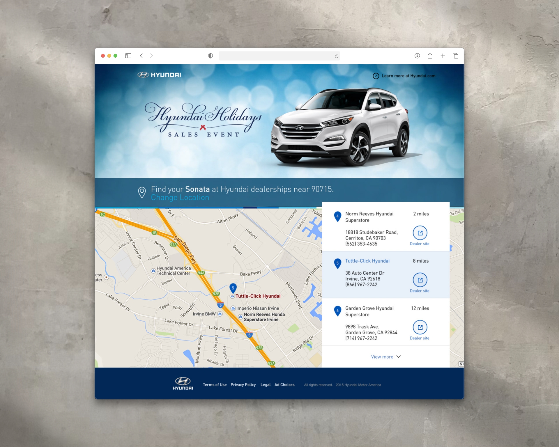
Hyundai Holidays Sales Event Hero Design
Hyundai is a global automotive brand known for its sleek design, innovative technology, and refined approach to value.
Brand Overview
Hyundai is a global automotive brand known for its sleek design, innovative technology, and refined approach to value. Each year, Hyundai launches a high-visibility holiday campaign—formerly the Hyundai Holidays Sales Event, now known as the Hyundai Getaway Sales Event—to promote special seasonal offers across its vehicle lineup. For this campaign, Hyundai aimed to highlight the Hyundai Sonata through a website experience that felt festive, premium, and on-brand.
Creative Approach
1. Animated Header Design
To support the campaign, I designed and animated a hero section for the Hyundai website, balancing brand visibility with seasonal ambiance.
- The layout featured the Hyundai Holidays logo on the left and the Hyundai Sonata on the right, establishing a clear visual hierarchy and product focus.
- The composition was optimized for clarity and elegance, keeping the layout responsive and adaptable across screen sizes and resolutions.
2. Motion Design & Atmosphere
The animation centered around a soft, subtle bokeh effect—a seasonal nod without overwhelming the interface.
- The background featured gently animated bokeh lights in soft whites and cool blues, creating a sense of winter lightness and holiday calm.
- The motion was designed to be minimal and fluid, contributing to a polished experience while staying light on performance.
- The animation helped set an elevated seasonal tone that stood apart from typical retail-style holiday graphics.
3. Brand Alignment
Every visual and motion element was built to adhere closely to Hyundai’s brand and campaign guidelines, focusing on:
- A refined, modern aesthetic
- Clean layout structure that integrated seamlessly with Hyundai’s broader website system
- Subtlety and precision—keeping the focus on the Sonata and the campaign message
Outcome
The animated header contributed a visually immersive and brand-consistent experience to one of Hyundai’s key seasonal campaigns. It brought motion, balance, and atmosphere to the Hyundai Holidays event while reinforcing the vehicle’s appeal. This project reflects my ability to blend motion design, layout composition, and brand sensitivity into a cohesive digital asset for large-scale promotional use.
Hyundai Social Media Card Designs
Hyundai is a global automotive brand known for its innovation, advanced safety features, and sleek modern design.
Brand Overview
Hyundai is a global automotive brand known for its innovation, advanced safety features, and sleek modern design. For a social media campaign centered on the Hyundai Elantra, the goal was to create a set of engaging, visually striking social cards tailored for Instagram and other platforms, each spotlighting a key vehicle feature. These cards were crafted to align with Hyundai’s bold visual identity while delivering bite-sized, tech-focused content that educates and excites potential drivers.
Creative Approach
1. Clari-Fi™ Music Restoration Technology Card
This card highlighted the Clari-Fi™ audio system, which restores depth and clarity to compressed digital music files.
- The visual concept featured a soundwave motif expanding outward from the Elantra’s interior speaker system, symbolizing immersive, high-fidelity sound.
- The layout paired clean typography with a layered, tech-inspired background, reinforcing the advanced audio engineering behind the feature.
- Subtle gradients and motion-inspired design elements conveyed energy, aligning with the emotional impact of music behind the wheel.
2. Blind Spot Detection + Rear Cross-Traffic Alert Cards (Two Variations)
These two cards each focused on Hyundai’s driver-assist technologies, with different graphic treatments to appeal across varied scroll behaviors and content formats:
Card A – Top-Down Illustration Style
- A bird’s-eye view of the Elantra on a multilane road illustrated blind spot zones and the detection system in action.
- Animated-style motion lines and directional arrows showed where and how alerts are triggered, making the feature visually intuitive.
- The Elantra was highlighted in a vivid color to draw focus amidst a minimal environment.
Card B – Close-Up Rear Perspective
- A dynamic rear-quarter view of the vehicle emphasized the rear cross-traffic alert system.
- Nearby approaching vehicles were shown with glowing alert zones, visually communicating the vehicle’s situational awareness.
- Crisp UI-inspired overlays and icons reinforced Hyundai’s smart tech capabilities in a clean, digestible format.
3. Lane Change Assist Card
This card focused on Lane Change Assist, a feature that extends blind spot detection when merging or changing lanes.
- The visual used stylized lane lines and motion blur effects to convey speed, precision, and safety in one glance.
- Directional indicators and a highlighted side mirror subtly emphasized where the technology is active.
- The tone was confident and composed, mirroring Hyundai’s brand voice.
Outcome
These social cards successfully translated technical vehicle features into compelling, user-friendly visuals.
- Each card adhered to Hyundai’s brand guidelines while introducing creative variation in layout, illustration style, and motion cues.
- Designed for high performance on Instagram, Facebook, and other mobile-first platforms, the cards contributed to increased feature awareness and engagement among Hyundai’s digital audience.

Good Look Apparel Boot Designs
Good Look Apparel is a forward-thinking custom boot company redefining footwear as a form of artistic expression.
Brand Overview
Good Look Apparel is a custom footwear brand that designs one-of-a-kind boots for men and women—transforming fashion staples into bold statements of personal style. The brand brings an artistic lens to product development, merging original surface design with high-quality materials to create boots that are both wearable and collectible. Each design draws from a unique visual world, allowing customers to express individuality through form, pattern, and story.
Creative Approach
1. Product Sourcing & Surface Design
At the core of this project was the creation of custom-printed boot designs, developed from the ground up to reflect artistic themes and cultural influences.
- I was responsible for sourcing the base boots, evaluating style, construction, and material compatibility with digital printing processes.
- Each boot design began with a creative concept, which I translated into original surface artwork tailored for precise application to curved, wearable forms.
- Designs ranged from bold graphic patterns to more textured, illustrative motifs—each intended to stand out in both everyday wear and editorial settings.
- Special care was taken to adapt each design to the boot’s structure, ensuring visual flow across seams, heels, and shafts.
This wasn’t just art placement—it was a custom product creation process that balanced creative expression with material constraints and manufacturing feasibility.
2. Product Visualization
To bring the designs to life pre-production, I created a series of high-impact digital composites showing the boots in contextual environments that echoed their artistic roots—urban, abstract, historical, or cultural.
- These composites allowed the brand to showcase each design with a narrative lens, turning each product into part of a larger story.
- I used advanced retouching and compositing techniques in Photoshop to match lighting, texture, and material realism, presenting the boots as both tangible and aspirational.
3. Packaging System Design
With a product this expressive, the packaging needed to feel equally thoughtful.
- I designed a cohesive packaging system that extended each boot’s story into the physical unboxing experience.
- Boxes, tissue paper, and inserts were customized with design elements derived directly from the surface artwork—making every delivery feel intentional and immersive.
- The result was a packaging experience that reinforced the artistic value of the product and aligned with the brand’s identity as both a fashion label and design house.
Outcome
This project unified product sourcing, surface design, brand storytelling, and packaging into a cohesive creative system.
- The boots themselves stood out in a crowded marketplace for their originality, craftsmanship, and art-first aesthetic.
- Visual storytelling through composites and packaging gave customers a deeper connection to the product—and to the brand’s values.
- The work showcases my ability to develop products from concept through design and visual presentation, demonstrating strength in creative direction, product development, and brand expression.
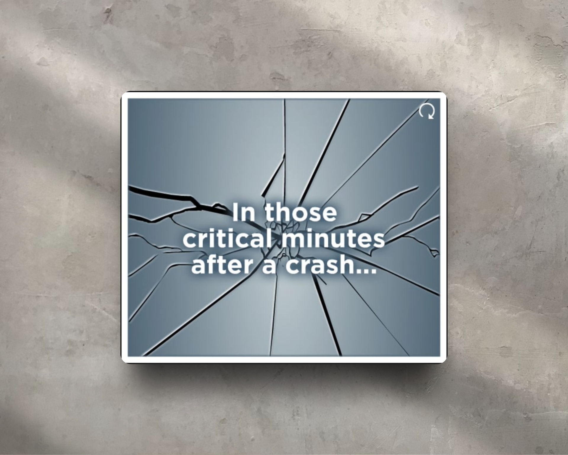
OnStar Emergency Response Banner Ads
OnStar, a subsidiary of General Motors, is a trusted leader in connected vehicle safety and communication services.
Brand Overview
OnStar, a subsidiary of General Motors, is a trusted leader in connected vehicle safety and communication services. Their Automatic Crash Response feature is designed to alert emergency personnel in the event of a collision—even if the driver can’t call for help. This campaign focused on highlighting OnStar’s life-saving capabilities and its close coordination with public safety responders to deliver timely, GPS-enabled assistance.
Strategy Components
1. Objective
To create emotionally resonant and visually impactful animated banner ads that raise awareness about OnStar’s Automatic Crash Response service, emphasizing its critical role in emergencies and its partnership with first responders.
2. Creative Execution
I designed two distinct animated banners to dramatize the urgency and effectiveness of OnStar’s emergency support:
- Cracked Screen Banner: Featured a sudden, sharp screen crack animation symbolizing a vehicle impact—immediately capturing attention and conveying the seriousness of a crash. This visual metaphor reinforced the idea that OnStar is there the moment something goes wrong.
- Emergency Call Waveform Banner: Showcased animated voice frequency waves of a calm emergency responder speaking over a call. This visual represented the real-time, human connection between OnStar and public safety teams, creating a sense of reassurance and precision during high-stress moments.
3. Messaging and Tone
The banners emphasized fast response, GPS accuracy, and seamless communication in emergencies. Messaging was concise and urgent, using phrases like “Help when you need it most” and “We speak to first responders so you don’t have to.” The tone was serious yet hopeful, reflecting OnStar’s mission of protecting lives.
4. Technical and Visual Approach
Animation was subtle but powerful—designed to quickly engage users without being intrusive. Visual and motion design techniques were chosen to reflect real-world urgency while maintaining a polished, brand-aligned look.
5. Outcome
The banners served as powerful awareness tools, helping educate audiences about OnStar’s behind-the-scenes capabilities and real-world life-saving impact. They successfully brought attention to a feature often taken for granted, while visually honoring the essential collaboration between technology and emergency services.

Alltel Wireless Banner Ads
Alltel Wireless was a U.S. mobile service provider known for its value-driven plans and strong regional presence.
Brand Overview
Alltel Wireless was a U.S. mobile service provider known for its value-driven plans and strong regional presence. During the rise of smartphones like the BlackBerry Curve 8530, BlackBerry Tour, and Samsung Freeform, Alltel focused on connecting with younger consumers by offering affordable devices and flexible plans. This campaign aimed to promote these phones through bold, animated banner ads that reflected the tech-forward lifestyle of the emerging mobile generation.
Strategy Components
1. Objective
To create a series of animated, visually engaging banner ads that highlighted Alltel’s smartphone lineup and appealed to younger, digitally savvy users looking for messaging, email, and social media-ready devices.
2. Creative Direction
Each banner was tailored to reflect the personality of its featured phone:
- BlackBerry Curve 8530 & Tour: Focused on mobile productivity, messaging, and on-the-go connectivity. The animation emphasized sleek design, built-in email, and BBM features with stylish, minimal transitions.
- Samsung Freeform: Positioned as a fun and accessible device for texting and media. The visuals leaned more playful, with vibrant colors and youthful motion elements.
3. Animation Style & Tone
The banners featured snappy, energetic animations with bold device reveals, rotating feature highlights, and interactive CTAs. The style was dynamic and clean—leveraging movement and layered effects to catch attention without overwhelming smaller display spaces.
4. Audience Alignment
Designed specifically for the younger demographic, the tone of each ad was casual, energetic, and focused on features that mattered to them: social connectivity, texting, music, and mobile style. Typography and color palettes matched that youthful appeal while still adhering to Alltel’s brand identity.
5. Outcome
The animated banners helped position Alltel as a relevant, budget-friendly wireless option in the competitive smartphone era. They supported increased engagement during promotional periods and reflected the excitement and mobility of early smartphone adoption.

Owens Corning EcoTouch Banner Ads
Owens Corning is a global leader in insulation, roofing, and building materials.
Brand Overview
Owens Corning is a global leader in insulation, roofing, and building materials, widely recognized for its innovation and the iconic Pink Panther mascot. Known for blending performance with sustainability, the brand promotes products that are energy-efficient, easy to install, and built for long-term value. These digital campaigns aimed to highlight key product lines—EcoTouch® Insulation, CommercialComplete™ Wall Systems, and PureFiber® Technology—through bold, engaging banner ads.
Strategy Components
1. Objective
To develop a series of highly visual and interactive banner ads tailored to distinct Owens Corning product campaigns, each focused on increasing product awareness, driving engagement, and reinforcing the brand’s approachable, high-performance identity.
2. Campaign-Specific Execution
- EcoTouch®:
Banner messaging emphasized the ease of use and efficiency—“Easy to Touch. Easy to Install. Easy to Save.” The animation visually reinforced comfort and simplicity with friendly transitions and tactile cues, complemented by a soft, inviting visual palette. - CommercialComplete™ Wall Systems:
This set highlighted technical performance and structural integrity. Animations focused on layering systems and material flow, visually breaking down wall system components to communicate engineering clarity at a glance. - EcoTouch® with PureFiber® Technology:
These banners showcased innovation and sustainability. The creative direction focused on fiber imagery, environmental benefits, and bold movement to symbolize energy savings and technological advancement.
3. Interactive Elements & Visual Appeal
Each banner ad was designed for high interactivity, encouraging hover states, movement, and click engagement. The Pink Panther mascot was integrated playfully yet purposefully—adding brand recognition while guiding the eye toward calls-to-action or reinforcing key messaging.
4. Outcome
The animated banners succeeded in visually distinguishing each product line while maintaining a cohesive Owens Corning brand presence. Engaging and technically sound, the ads helped drive product awareness across B2B and consumer-facing platforms, enhancing digital campaign performance across multiple audiences.

Hyundai Summer Clearance Event Banner Ad
The Summer Clearance Event is a seasonal campaign aimed at boosting sales through bold, engaging promotions that highlight limited-time offers.
Brand Overview
Hyundai is a global automotive brand known for its innovation, reliability, and approachable design. This particular campaign focused on the Hyundai Tucson 2017, targeting Spanish-speaking audiences with culturally relevant, upbeat messaging.
Strategy Components
1. Objective
To create a vibrant, animated Spanish-language banner ad that captured the energy of summer and promoted the Hyundai Tucson 2017 during the clearance event.
2. Creative Execution
I designed and animated a dynamic HTML5 banner with playful motion, vibrant color palettes, and bold type. The headline—“Más divertido que un día de playa” (“More fun than a day at the beach”)—set a lighthearted, aspirational tone aimed at emotionally connecting with viewers while reinforcing the value and versatility of the Tucson.
3. Animation Approach
The animation emphasized smooth transitions, summery visual cues, and a CTA that stood out without disrupting the visual rhythm. The pacing was tailored to catch attention quickly in digital ad placements, especially on mobile devices.
4. Cultural Relevance
The Spanish copy and visuals were designed to resonate with Hispanic markets—maintaining the brand's visual standards while creating a culturally authentic and engaging experience.
5. Outcome
The animated banner aligned with Hyundai’s seasonal campaign goals, helping drive awareness and engagement among Spanish-speaking consumers during a key sales window.
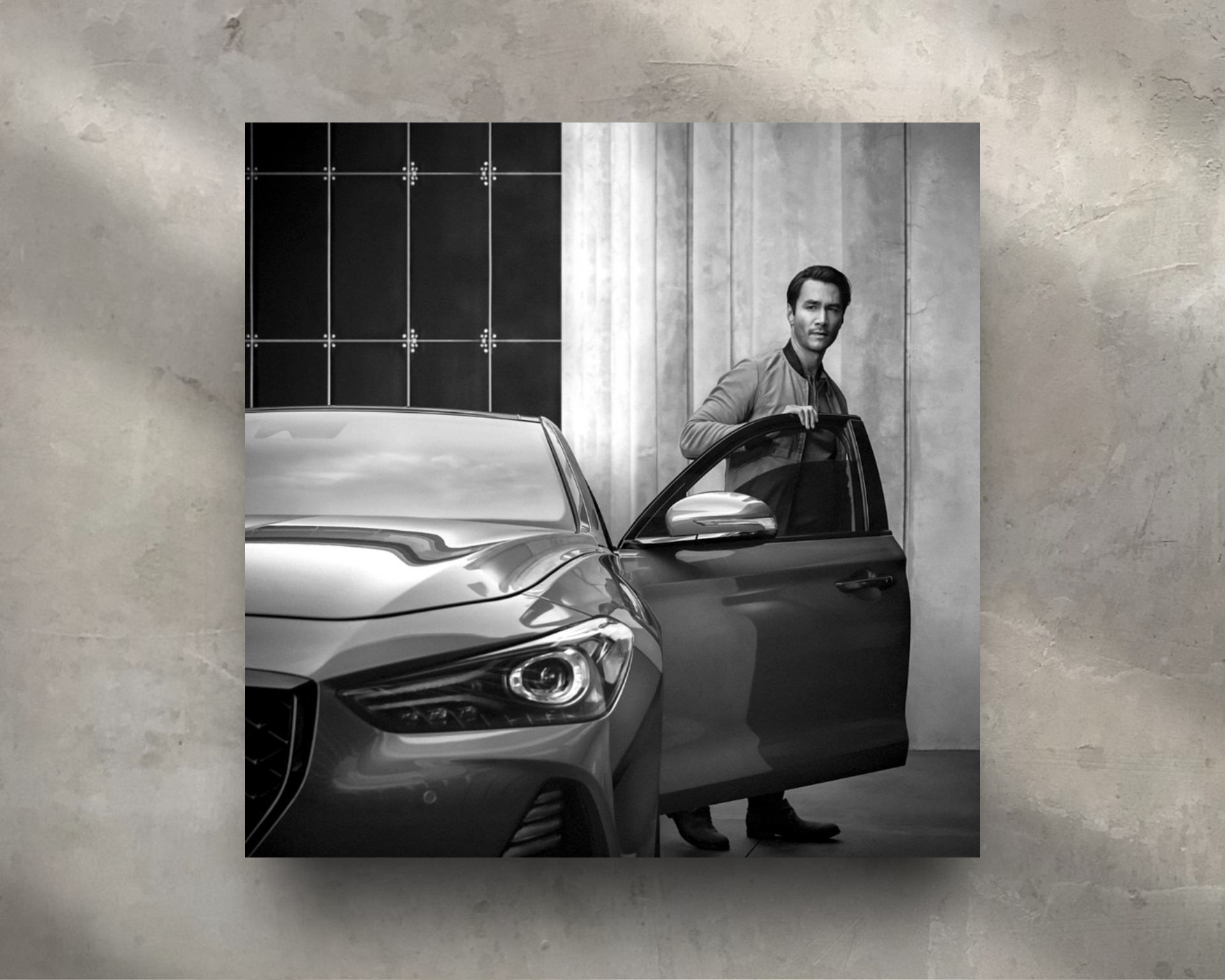
Genesis Instagram Post for Genesis G90
Genesis Motors is a luxury automotive brand renowned for its refined design language, progressive engineering, and elevated brand presence.
Brand Overview
Genesis Motors is a luxury automotive brand renowned for its refined design language, progressive engineering, and elevated brand presence. To support the visual identity of the newly redesigned Genesis G90, the flagship sedan, the brand required a hero image that embodied sophistication and timelessness. The final image would be featured on Instagram, aligning with Genesis’s minimalist, luxury-forward social aesthetic.
Creative Approach
1. Complex Retouching & Scene Clean-Up
The original image, delivered in raw format, featured a strong base composition but required meticulous, high-end retouching to meet luxury brand standards.
Key challenges included:
- Removing plant reflections from the vehicle’s surface—particularly intricate due to curved metallic panels and lighting gradients
- Eliminating unwanted elements from the scene, including physical plants, background clutter, and miscellaneous objects
- Rebuilding and extending architectural elements, such as sections of the wall where visual gaps were left behind
- Extending secondary subjects in the image to rebalance the frame and improve composition
The image was carefully reconstructed using a blend of advanced masking, clone and healing tools, digital painting, and gradient retouching, ensuring that no visual noise disrupted the vehicle's commanding presence.
2. Black & White Conversion for Brand Tone
After completing the technical retouching, I converted the image to black and white, a deliberate stylistic choice to align with Genesis’s timeless and classical brand tone.
- The absence of color allowed the focus to shift entirely to form, light, and material, emphasizing the G90’s sculpted body and distinctive Crest Grille
- Tonal contrast and highlight/shadow dynamics were adjusted to maintain depth, clarity, and visual drama, resulting in a piece that felt elegant, controlled, and editorial
Outcome
The finished image was published on Genesis’s official Instagram account, successfully showcasing the Genesis G90 as a redefinition of luxury.
- The image aligned seamlessly with the brand’s visual tone—clean, bold, and sophisticated
- The technical precision and aesthetic refinement of the final result demonstrated the brand’s commitment to excellence in every visual detail
This project showcases my ability to perform complex image retouching, maintain luxury-level aesthetic standards, and contribute to brand-consistent content for high-profile campaigns in the automotive space.

All Seasons Logo Design
All Seasons Sprinkler and Landscaping is a residential landscaping company focused on creating lush, well-maintained outdoor environments through expert irrigation and year-round yard care.
Brand Overview
All Seasons Sprinkler and Landscaping is a residential landscaping company focused on creating lush, well-maintained outdoor environments through expert irrigation and year-round yard care. The brand emphasizes reliability, natural beauty, and the enjoyment of outdoor living—regardless of the season.
Creative Approach
1. Concept & Symbolism
The logo features a healthy, vibrant tree icon, symbolizing growth, care, and a thriving outdoor space. The tree serves as a universal emblem for life and renewal, reinforcing the brand’s role in nurturing and maintaining beautiful landscapes across all seasons.
2. Aesthetic & Feel
The design evokes a fresh, inviting outdoor feeling, capturing the serenity and vitality of well-kept natural spaces. The rounded, organic shapes of the tree convey approachability and warmth, aligning with the company’s friendly, service-oriented identity.
3. Typography & Composition
The wordmark is clean and professional, with subtle naturalistic touches that complement the icon. The typography supports readability while echoing the organic theme—grounded yet approachable, ideal for both residential appeal and professional trust.
4. Color Palette
Greens and earth tones were selected to reflect health, sustainability, and seasonal richness. The palette reinforces a connection to nature while maintaining visual harmony across digital and print applications.
5. Versatility
The tree icon functions well as a standalone mark for branding materials such as trucks, uniforms, and lawn signage. The full logo works seamlessly in horizontal and stacked formats, ensuring consistency across media.

Crystal Clear Teeth Whitening Logo Design
Crystal Clear Teeth Whitening is a cosmetic dentistry brand specializing in professional teeth whitening treatments that enhance smiles with clarity and confidence.
Brand Overview
Crystal Clear Teeth Whitening is a cosmetic dentistry brand specializing in professional teeth whitening treatments that enhance smiles with clarity and confidence. The brand name evokes purity, brilliance, and visible transformation—offering patients a high-end experience in a relaxed and modern setting.
Creative Approach
1. Concept & Symbolism
The logo centers on an icon of a tooth made of diamond, symbolizing brilliance, strength, and precision. The diamond-cut facets represent clarity and sparkle—mirroring the brand promise of noticeably whiter teeth and a radiant smile. This unique visual metaphor sets the practice apart from more clinical or generic dental identities.
2. Typography & Style
The logotype pairs the icon with clean, modern typography to create a polished and approachable look. The typeface balances luxury and friendliness—conveying professionalism while staying welcoming to everyday clients.
3. Color Palette
Soft whites, icy blues, and subtle silver or chrome tones were chosen to reinforce ideas of cleanliness, clarity, and shine—aligning with both dental care and the gemstone-inspired theme.
4. Application
The logo was designed for strong visibility across digital and print applications, including signage, appointment cards, social media, and treatment kits. The diamond-tooth icon is also adaptable as a standalone mark for badges or watermarks.
Good Look Apparel Boot Designs
Good Look Apparel is a forward-thinking custom boot company redefining footwear as a form of artistic expression.
Brand Overview
Good Look Apparel is a custom footwear brand that designs one-of-a-kind boots for men and women—transforming fashion staples into bold statements of personal style. The brand brings an artistic lens to product development, merging original surface design with high-quality materials to create boots that are both wearable and collectible. Each design draws from a unique visual world, allowing customers to express individuality through form, pattern, and story.
Creative Approach
1. Product Sourcing & Surface Design
At the core of this project was the creation of custom-printed boot designs, developed from the ground up to reflect artistic themes and cultural influences.
- I was responsible for sourcing the base boots, evaluating style, construction, and material compatibility with digital printing processes.
- Each boot design began with a creative concept, which I translated into original surface artwork tailored for precise application to curved, wearable forms.
- Designs ranged from bold graphic patterns to more textured, illustrative motifs—each intended to stand out in both everyday wear and editorial settings.
- Special care was taken to adapt each design to the boot’s structure, ensuring visual flow across seams, heels, and shafts.
This wasn’t just art placement—it was a custom product creation process that balanced creative expression with material constraints and manufacturing feasibility.
2. Product Visualization
To bring the designs to life pre-production, I created a series of high-impact digital composites showing the boots in contextual environments that echoed their artistic roots—urban, abstract, historical, or cultural.
- These composites allowed the brand to showcase each design with a narrative lens, turning each product into part of a larger story.
- I used advanced retouching and compositing techniques in Photoshop to match lighting, texture, and material realism, presenting the boots as both tangible and aspirational.
3. Packaging System Design
With a product this expressive, the packaging needed to feel equally thoughtful.
- I designed a cohesive packaging system that extended each boot’s story into the physical unboxing experience.
- Boxes, tissue paper, and inserts were customized with design elements derived directly from the surface artwork—making every delivery feel intentional and immersive.
- The result was a packaging experience that reinforced the artistic value of the product and aligned with the brand’s identity as both a fashion label and design house.
Outcome
This project unified product sourcing, surface design, brand storytelling, and packaging into a cohesive creative system.
- The boots themselves stood out in a crowded marketplace for their originality, craftsmanship, and art-first aesthetic.
- Visual storytelling through composites and packaging gave customers a deeper connection to the product—and to the brand’s values.
- The work showcases my ability to develop products from concept through design and visual presentation, demonstrating strength in creative direction, product development, and brand expression.

UnderKomfort Collar-Strip Product Design
UnderKomfort is an online-based hygienic product brand focused on creating smart, discreet solutions for garment undercare.
Brand Overview
UnderKomfort is an online-based hygienic product brand focused on creating smart, discreet solutions for garment undercare. The brand offers innovations that enhance personal comfort, protect clothing, and extend garment life—merging functionality with simplicity. With a mission to promote everyday confidence through well-designed essentials, UnderKomfort’s product line addresses real-world wardrobe concerns with clean, modern solutions.
Creative Approach
1. Product Focus – Collar Strip Design
The core product was a collar strip engineered to shield shirt collars from sweat, oil, and friction—a common problem that causes visible wear and discoloration over time.
- I designed a form-fitting strip that accommodates multiple collar sizes while maintaining full coverage.
- The material was soft, flexible, and breathable, ensuring the strip remained discreet and comfortable throughout the day.
- Special attention was given to the shape and adhesive placement to ensure secure positioning without shifting, even with movement.
2. Packaging Design
The product box was designed to reflect hygiene, simplicity, and modern function.
- A sleek, minimal layout was chosen, using clean typography and neutral tones to align with the brand’s identity.
- The packaging clearly showcased the product while reinforcing its purpose and ease of use, perfect for both eCommerce browsing and physical shelf presence.
3. Instructional Guide
To support product education and customer experience, I created a visual guide that explained:
- How to apply and remove the collar strip
- The benefits of consistent use
- Proper care instructions for extended usability
This guide featured simple diagrams, intuitive language, and a layout that matched the overall packaging system—ensuring brand consistency and customer confidence.
4. Outcome
This project reflects my strength in product design, functional packaging, and user education. The final design provided UnderKomfort with a market-ready hygienic garment solution that is both practical and premium—effectively supporting the brand’s mission of delivering discreet comfort through thoughtful design.
Genesis Exclusive Offer G70 Banner Ads
Genesis Motors is a luxury automotive brand renowned for its refined design language, progressive engineering, and elevated brand presence.
Creative Approach
1. Strategic Banner Redesign
Rather than using traditional banner formats cluttered with overlapping elements, I proposed a refined visual hierarchy that emphasized clarity, focus, and brand prestige.
Each banner was structured to guide the user’s eye top-to-bottom in a deliberate sequence of importance:
- Genesis Logo – Prominently placed at the top to immediately establish brand recognition and elevate trust
- Hero Vehicle Image – A bold, unobstructed shot of the G70, given generous space to breathe and make visual impact
- Offer Messaging – Clear, concise, and aligned with the campaign type (e.g., “Year-End Event,” “Genesis Cares,” “Exclusive Offer”)
- Call to Action – Rather than a typical round button, the CTA was designed as a sleek horizontal bar that spanned the width of the banner’s base, subtly evoking digital luxury and confidence
2. Consistency Across Campaigns
Though each campaign had unique messaging, all banners were unified by this shared design language, which:
- Reinforced Genesis’s premium tone
- Allowed the vehicle to remain the visual centerpiece
- Echoed the layout and typography structure seen in Genesis’s larger digital and print campaigns
The G70 model name was also featured prominently and consistently—reflecting how Genesis integrates vehicle identity across its branding ecosystem.
3. UX Consideration & Platform Fit
- Designed in multiple IAB standard sizes (leaderboard, MPU, skyscraper, etc.)
- Optimized for high-resolution display with clean compression and fast load times
- All elements were carefully placed to minimize distraction and maximize elegance, ensuring compatibility with both static and animated versions
Outcome
The redesigned banners delivered a modern, brand-aligned advertising system that emphasized impactful visuals and hierarchy over clutter.
- Genesis benefited from a premium ad presentation that stood out within crowded digital ad spaces
- The banners drove increased engagement while reinforcing the brand’s positioning as refined, innovative, and design-forward
- This project demonstrates my strength in visual hierarchy, UX-informed layout strategy, and translating brand principles into high-performing digital assets
.jpeg)
Pharrell William's Black Ambition Instagram Videos
Black Ambition, launched in 2020, is a national initiative founded to bridge the opportunity and wealth gaps faced by Black and Latinx entrepreneurs.
Brand Overview
Black Ambition, launched in 2020, is a national initiative founded to bridge the opportunity and wealth gaps faced by Black and Latinx entrepreneurs. Focused on industries such as tech, healthcare, design, and consumer services, the organization provides funding, mentorship, and exposure to early-stage ventures. Its flagship competitions—the Black Ambition Prize and the HBCU Prize—seek to elevate founders from underrepresented communities, with the HBCU Prize specifically targeting students and alumni affiliated with historically Black colleges and universities.
In celebration of its third year, Black Ambition required a pair of videos: one to promote the HBCU Prize competition itself and another to capture the energy of the So Ambitious HBCU Tour—a multi-campus event series designed to inspire, engage, and empower student entrepreneurs.
Creative Approach
1. Promotional Video – HBCU Prize: Year 3 Launch
The competition video was crafted to generate excitement and participation for the third year of the HBCU Prize.
- I combined bold text animation, brand-consistent colors, and motion graphics overlays to highlight key messaging around eligibility, sectors supported, and prize opportunities.
- The pacing was designed to be energetic and motivational, with a focus on representation and community impact.
- The visuals were carefully selected to reflect diverse founders, HBCU campus life, and entrepreneurial hustle, reinforcing the authenticity and reach of the initiative.
2. Social Media Recap Video – So Ambitious HBCU Tour
For the tour recap video, I edited a series of still photographs taken at HBCU campuses across the country into a visually rhythmic montage for social platforms.
- Using Premiere Pro, I performed color correction and grading to ensure a consistent look and tone across all photos—despite variable lighting and settings.
- I synced each image transition to the rhythm and beat of the audio, giving the piece a musical, dynamic flow that matched the energy of the live events.
- The final video captured the movement, laughter, engagement, and ambition of students, speakers, and organizers—making it highly shareable and true to the spirit of the tour.
Outcome
Both videos helped extend Black Ambition’s reach and visibility among its core audience of students, founders, and future leaders.
- The HBCU Prize promo video drove interest and applications, serving as a versatile asset for email campaigns, social media posts, and presentations.
- The So Ambitious Tour video energized online audiences and helped tell the story of impact through presence, using music, imagery, and motion to celebrate community and possibility.
This project demonstrates my ability to create brand-aligned, purpose-driven content that fuses technical editing, visual consistency, and cultural relevance—tailored for social platforms and entrepreneurial engagement.
Genesis Instagram Post for Genesis G90
Genesis Motors is a luxury automotive brand renowned for its refined design language, progressive engineering, and elevated brand presence.
Brand Overview
Genesis Motors is a luxury automotive brand renowned for its refined design language, progressive engineering, and elevated brand presence. To support the visual identity of the newly redesigned Genesis G90, the flagship sedan, the brand required a hero image that embodied sophistication and timelessness. The final image would be featured on Instagram, aligning with Genesis’s minimalist, luxury-forward social aesthetic.
Creative Approach
1. Complex Retouching & Scene Clean-Up
The original image, delivered in raw format, featured a strong base composition but required meticulous, high-end retouching to meet luxury brand standards.
Key challenges included:
- Removing plant reflections from the vehicle’s surface—particularly intricate due to curved metallic panels and lighting gradients
- Eliminating unwanted elements from the scene, including physical plants, background clutter, and miscellaneous objects
- Rebuilding and extending architectural elements, such as sections of the wall where visual gaps were left behind
- Extending secondary subjects in the image to rebalance the frame and improve composition
The image was carefully reconstructed using a blend of advanced masking, clone and healing tools, digital painting, and gradient retouching, ensuring that no visual noise disrupted the vehicle's commanding presence.
2. Black & White Conversion for Brand Tone
After completing the technical retouching, I converted the image to black and white, a deliberate stylistic choice to align with Genesis’s timeless and classical brand tone.
- The absence of color allowed the focus to shift entirely to form, light, and material, emphasizing the G90’s sculpted body and distinctive Crest Grille
- Tonal contrast and highlight/shadow dynamics were adjusted to maintain depth, clarity, and visual drama, resulting in a piece that felt elegant, controlled, and editorial
Outcome
The finished image was published on Genesis’s official Instagram account, successfully showcasing the Genesis G90 as a redefinition of luxury.
- The image aligned seamlessly with the brand’s visual tone—clean, bold, and sophisticated
- The technical precision and aesthetic refinement of the final result demonstrated the brand’s commitment to excellence in every visual detail
This project showcases my ability to perform complex image retouching, maintain luxury-level aesthetic standards, and contribute to brand-consistent content for high-profile campaigns in the automotive space.
PGN Agency Harley-Davidson Marketing Brochure
PGN Agency is an award-winning advertising and marketing agency based in Metro Detroit, known for its high-impact campaigns in both consumer and B2B markets.
Brand Overview
PGN Agency is an award-winning advertising and marketing agency based in Metro Detroit, known for its high-impact campaigns in both consumer and B2B markets. With a longstanding reputation for direct-response marketing and measurable results, PGN has carved a niche in the Harley-Davidson dealer network, delivering customized programs that speak to the unique lifestyle, culture, and buying mindset of the Harley rider.
To support outreach to new and prospective Harley-Davidson dealerships, PGN needed a quad-fold brochure that would instantly resonate with dealers and clearly communicate the agency’s expertise in the Harley space.
Creative Approach
1. Design Tone & Format
This piece was intentionally designed to feel bold, aggressive, and distinctly Harley, using a quad-fold format that unfolded like a story—building momentum as readers moved through each panel.
- The brochure utilized Harley-inspired colors (close variations of orange and black) to pay tribute to the brand without infringing on trademarked assets.
- The layout emphasized grit and motion, with angular cuts, dynamic spacing, and confident typography throughout.
2. Custom Illustrations & Footer Details
A standout feature of the piece was the inclusion of hand-drawn sketches of Harley-Davidson models, used as footer artwork on each panel.
- These subtle, fine-line renderings added craftsmanship and authenticity, nodding to the mechanical artistry of the bikes themselves.
- They grounded the layout and visually reinforced PGN’s deep respect for the brand’s heritage.
3. Message Flow & Dealer-Specific Positioning
The content was structured to speak directly to Harley dealers, starting with shared values and ending with performance results.
- Opening Panel: Set the tone with the declaration:
“Now... Let’s Talk Harley.”
This direct approach created immediate alignment with the dealer audience.
- Interior Panels: Detailed PGN’s 15+ year track record with Harley-Davidson dealers—including a feature on a long-time client whose 2005 marked their biggest sales year ever.
- Emphasis was placed on PGN’s deep understanding of:
- The dealer process
- The Harley rider mentality
- The sacredness of the brand
- A highlighted quote summed it up best:
“A Harley isn’t just a motorcycle. It’s a brotherhood, an escape, a declaration of independence.”
4. Final Panel – Call to Action
The closing panel featured a message from PGN’s president—a lifelong rider—along with a confident CTA to “Let us create a program that’s guaranteed to increase your sales.”
Contact info and a bold closing statement reinforced the results-driven, no-nonsense tone of the agency.
Outcome
This quad-fold brochure gave PGN a powerful outreach tool that did more than promote services—it reflected a shared passion for the Harley-Davidson lifestyle and brand legacy.
- It resonated strongly with dealers because it spoke their language, acknowledged their customers, and offered real proof of performance.
- Visually, it captured the spirit of the open road while staying grounded in strategy and measurable results.
This project highlights my ability to craft brand-specific print collateral that balances storytelling, visual culture, and conversion-focused messaging—especially for industries where authenticity is everything.


